Cause and Effect Diagram (Fishbone, Ishikawa): Ultimate Guide with Examples
Last Updated on January 8, 2024 by andrewshih
The Cause and Effect Diagram, also known as the Fishbone or Ishikawa Diagram, is a useful visual tool that aids in identifying and understanding the root causes of a problem.
In this comprehensive guide, we will explore the intricacies of the Cause and Effect Diagram, providing a step-by-step procedure, a practical example, and resources for implementation.

What Is Cause And Effect Diagram
Cause and Effect Diagram is a graphical representation that illustrates the cause-and-effect relationships within a system or a specific problem.
The diagram gets its name from its fishbone-like structure, where the problem statement is placed at the “head,” and various potential causes branch out like the “bones” of the fish.
By visually organizing potential causes into distinct categories, the diagram helps teams and individuals gain a clearer understanding of the relationships between different elements of a system, process, or situation.
When To Use A Fishbone Diagram
Here are some instances when using a Fishbone Diagram is particularly beneficial:
Complex Problem Solving
Quality improvement.
In industries that prioritize quality control, such as manufacturing or healthcare, a Fishbone Diagram is often used to investigate defects, errors, or deviations from standards. It helps teams explore and address the underlying causes affecting product or service quality.
Process Improvement
When analyzing and improving business processes, a Fishbone Diagram can be instrumental in identifying bottlenecks, inefficiencies, or breakdowns in the workflow. By categorizing potential causes, teams can streamline processes for increased efficiency.
Project Planning
Team collaboration.
When teams are working on a shared goal or project, a Fishbone Diagram encourages collaborative brainstorming sessions. It provides a visual platform for team members to contribute their insights and perspectives, fostering a collective understanding of the problem.
Customer Complaints
In customer-centric industries, a Fishbone Diagram can be deployed to investigate and address customer complaints. It helps identify the underlying causes of dissatisfaction and guides the development of strategies to enhance customer satisfaction.
Training and Development
In educational settings or corporate training programs, a Fishbone Diagram can be utilized to analyze challenges or obstacles hindering effective learning and development. It assists in identifying areas for improvement in training processes.
Strengths of Cause and Effect Diagrams
Visual representation.
One of the main strengths of cause and effect diagrams is their ability to provide a visual representation of complex issues. The diagram’s fishbone structure allows for a clear and organized display of potential causes and their relationships, making it easier for teams to understand and communicate.
Systematic Analysis
Cause and effect diagrams promote a systematic approach to problem-solving. By categorizing potential causes into major branches, teams can methodically explore and analyze each factor, leading to a comprehensive understanding of the root causes of a problem.
Collaborative Problem Solving
The creation of a cause and effect diagram often involves collaborative brainstorming sessions. This encourages team members to share their insights and perspectives, fostering a collaborative problem-solving environment that capitalizes on collective knowledge and expertise.
Identification of Multiple Causes
The diagram facilitates the identification of multiple causes contributing to a single problem. This multiperspective analysis helps ensure that the root causes are thoroughly explored, reducing the likelihood of overlooking critical factors.
Weaknesses of Cause and Effect Diagrams
Oversimplification.
One weakness of cause and effect diagrams is the potential for oversimplification. The structured nature of the diagram may not capture the complexity or interdependencies of certain issues, leading to a superficial understanding of the problem.
Subjectivity in Prioritization
Lack of quantitative data.
Cause and effect diagrams are primarily qualitative tools and do not inherently incorporate quantitative data. While they are effective in identifying potential causes, they may not provide a precise measurement of the impact or significance of each cause, requiring supplementary quantitative analysis.
How to Create Fishbone Diagram Step-by-Step
Creating a Cause and Effect Diagram involves systemically identifying and categorizing potential causes of a specific problem. Here are the steps to create a cause-and-effect diagram:
Step 1: Define the Problem Statement
Step 2: identify major categories (fishbone bones).
The next step is to create the main branches, or “bones,” of the fishbone diagram.
Teams using cause-effect diagrams often use additional mnemonic lists to ensure a thorough consideration of potential causes. For example, the manufacturing industry frequently utilizes 5Ms, and the service industry often uses 5Ps.
| Manufacture | Service |
|---|---|
| Manpower | People |
| Materials | Provisions |
| Methods | Procedures |
| Machines | Place or Environment |
| Measurements | Patrons or Customers |
Step 3: Brainstorm Causes Within Each Category
Encourage open discussion and gather as many ideas as possible. There are several techniques that may be helpful during the storming process.
Step 4: Add Subcauses and Details
Continue this process until the team feels that the causes and sub-causes are sufficiently detailed. The team can continue to add additional sub-levels to sub-causes if necessary, although the diagram can become more difficult to visualize with multiple levels.
Step 5: Prioritize Causes
Step 6: review, validate, and implement.
By following these steps, the team can utilize the Fishbone Diagram to systematically analyze complex problems, identify root causes, and drive effective solutions.
Tips for Creating a Cause and Effect Diagram
Tips for creating the diagram, tips for collaboration, cause and effect diagram examples, example 1: production delays in a manufacturing plant.
In this scenario, you are tasked with identifying the various factors contributing to production delays, allowing the team to identify root causes and implement targeted solutions.
Example 2: High Employee Turnover in a Company
In this scenario, you are tasked with identifying the root causes of high employee turnover and guiding the development of strategies to improve retention.
Problem Statement : High turnover rates lead to instability and decreased morale among employees.
While taking a deep dive and examining the potential causes of insufficient recruitment, the team identified poor job descriptions, limited recruitment channels, and a competitive job market.
Example 3: Customer Complaints in a Service Industry
In this scenario, you are tasked with understanding the causes of multifaceted customer complaints and helping the organization to enhance its service quality and address customer concerns effectively.
As the team continued to look into the cause of insufficient staffing, the team identified budget constraints, poor scheduling, and unexpected sickness as the causes.
Cause And Effect Diagram Complimentary Techniques
Affinity diagram.
Together, these tools provide a comprehensive approach to problem-solving, transitioning from idea generation and organization to in-depth cause-and-effect analysis.
5 Whys Analysis
Pareto chart.
How do I prioritize causes in a Fishbone Diagram?
Causes can be prioritized based on their significance or impact. This can be done through team discussion, voting, or using data such as the Pareto Principle to identify the most critical factors that require immediate attention.
Yes, a Fishbone Diagram can be a useful tool in the planning phase of a project. It helps anticipate potential challenges, risks, and issues, allowing teams to develop proactive strategies for successful project outcomes.
What is the difference between an affinity diagram and a fishbone diagram?
An affinity diagram is used for brainstorming and organizing ideas, providing a foundation for a Fishbone Diagram. The Fishbone Diagram then conducts a more detailed analysis of root causes within specific categories identified by the affinity diagram. They work together in a collaborative problem-solving process.
The Fishbone Diagram typically consists of six major elements or “bones.” These elements represent different categories under which potential causes of a problem are grouped. The six categories are People, Processes, Equipment, Materials, Environment, and Management . Each category helps organize and analyze potential causes systematically, providing a comprehensive view of the factors contributing to a specific issue.
RELATED ARTICLES MORE FROM AUTHOR
Resource leveling vs resource smoothing: comprehensive guide, managing conflict in project management: techniques & strategies for success, what is resource breakdown structure: examples, template, tips & more, popular posts, complete guide for pmp project description, 2024 complete pmp resources with free pmp exam questions, pm prepcast coupon code [june 2024], popular category.
- Virtual Brainstorming Sessions: A Comprehensive Overview
- Crossword Puzzles and Sudoku: A Problem-Solving Exploration
- Analyzing Arguments Logically
- Exploring Lateral Thinking: A Comprehensive Guide to Problem Solving Strategies
- Analytical problem solving
- Identifying root causes
- Analyzing consequences
- Brainstorming solutions
- Heuristic problem solving
- Using analogies
- Applying existing solutions
- Trial and error
- Creative problem solving
- Mind mapping
- Brainstorming
- Lateral thinking
- Research skills
- Interpreting information
- Data collection and analysis
- Identifying patterns
- Critical thinking skills
- Recognizing bias
- Analyzing arguments logically
- Questioning assumptions
- Communication skills
- Negotiation and compromise
- Listening skills
- Explaining ideas clearly
- Planning techniques
- SWOT analysis
- Gantt charting
- Critical path analysis
- Decision making techniques
- Force field analysis
- Paired comparison analysis
- Cost-benefit analysis
- Root cause analysis
- Five whys technique
- Fault tree analysis
- Cause and effect diagrams
- Brainstorming techniques
- Brainwriting
- Brainwalking
- Round-robin brainstorming
- Creative thinking techniques
- Serendipity technique
- SCAMPER technique
- Innovation techniques
- Value innovation techniques
- Design thinking techniques
- Idea generation techniques
- Personal problems
- Deciding what career to pursue
- Managing finances effectively
- Solving relationship issues
- Business problems
- Increasing efficiency and productivity
- Improving customer service quality
- Reducing costs and increasing profits
- Environmental problems
- Preserving natural resources
- Reducing air pollution levels
- Finding sustainable energy sources
- Individual brainstorming techniques
- Thinking outside the box
- Word association and random word generation
- Mind mapping and listing ideas
- Group brainstorming techniques
- Synectics technique
- Online brainstorming techniques
- Online whiteboarding tools
- Virtual brainstorming sessions
- Collaborative mind mapping software
- Team activities
- Group decision making activities
- Debate activities and role-play scenarios
- Collaborative problem solving games
- Creative activities
- Creative writing exercises and storyboards
- Imagination activities and brainstorming sessions
- Visualization activities and drawing exercises
- Games and puzzles
- Crossword puzzles and Sudoku
- Logic puzzles and brain teasers
- Jigsaw puzzles and mazes
- Types of decisions
- Structured decisions
- Simple decisions
- Complex decisions
- Problem solving techniques
- Cause and Effect Diagrams: A Problem-Solving Technique
A comprehensive guide to understanding and utilizing cause and effect diagrams for problem solving and root cause analysis.

Cause and effect diagrams are a powerful problem-solving technique that can help you identify the root cause of any issue, from small everyday annoyances to complex organizational problems. By following a systematic process of gathering data, analyzing it and then developing solutions, cause and effect diagrams can be used to effectively tackle any problem that you may face. This article will provide an overview of the cause and effect diagram technique, outlining how it works and the steps involved in using it. We will also look at some examples of how it can be used to solve a variety of problems. When trying to solve a problem, it is important to break down all the possible causes.
A cause and effect diagram is a visual tool used to represent all the possible causes of a problem or event. It can be used to brainstorm different causes in order to identify the root cause of a problem. The process of creating a cause and effect diagram begins by identifying the problem or event, then listing all the possible causes that could be contributing to it. The causes can then be grouped together into categories.
For example, if the problem is a defect in a product, the categories might include “materials”, “suppliers”, “manufacturing process”, “transport”, etc. After the categories have been identified, arrows can be added to show the relationship between each cause and the effect. Once the cause and effect diagram is complete, it can be used to identify potential causes and solutions. By looking at the diagram as a whole, it is possible to identify which causes may have the most impact on the problem.
This can help narrow down potential solutions and make it easier to identify the root cause of a problem. There are several benefits of using cause and effect diagrams in problem-solving. First, they provide an organized way of looking at problems. By breaking down each component of the problem, it is easier to identify potential causes and solutions. Second, cause and effect diagrams can help individuals think more creatively about problems.
Benefits of Cause and Effect Diagrams
• they are useful for documenting problems and their solutions, which can be helpful when troubleshooting future issues., creating a cause and effect diagram.
Next, list all possible causes that could contribute to the problem or event. This includes both direct and indirect causes. Then, similar causes should be grouped into categories . This helps to narrow down the potential causes and makes the diagram easier to read.
After this, arrows should be added to show the relationship between each cause and the effect. Finally, the diagram should be reviewed as a whole to identify potential causes and solutions . Cause and effect diagrams can be an invaluable tool for problem solving and root cause analysis. By taking the time to create a diagram, individuals can better understand the various factors that may be contributing to a problem or event and identify potential solutions.
Cause and effect diagrams are an invaluable tool for problem solving and root cause analysis. By organizing problems into component parts, they allow individuals to think more creatively and identify potential causes and solutions more effectively. Furthermore, they provide a documented record of the problem and its solution for future reference. By following these steps, individuals can use cause and effect diagrams to effectively solve problems.

- Recognizing Bias: A Problem Solving and Critical Thinking Skills Guide
Learn how to identify and address bias in decision making with our guide to recognizing bias in problem solving and critical thinking.

- Questioning Assumptions: A Critical Thinking Skill
Understand the importance of questioning assumptions and learn to use it as an effective critical thinking skill when problem solving.

- Exploring Synectics Technique: A Comprehensive Guide
This article provides an overview of Synectics Technique, a creative problem-solving approach for groups. Learn about the benefits, key concepts and tools of this technique.

- Data Collection and Analysis - Problem Solving Skills and Research Skills
Learn about data collection and analysis, and how it can help you develop your problem solving and research skills.
- Interpreting Information: A Problem-Solving and Research Skills Primer
- Solving Relationship Issues
- Debate Activities and Role-Play Scenarios
- Cost-benefit Analysis: A Guide to Making Informed Decisions
- Word Association and Random Word Generation
- Round-robin brainstorming: Exploring a Group Brainstorming Technique
- Collaborative Problem Solving Games: Exploring Creative Solutions for Teams
- Reducing Air Pollution Levels
- Visualization Activities and Drawing Exercises
- Five Whys Technique: A Comprehensive Analysis
- Identifying Root Causes
- Mind Mapping and Listing Ideas
- Collaborative Mind Mapping Software
- Logic Puzzles and Brain Teasers: A Comprehensive Overview
- Mind Mapping - Creative Problem Solving and Creative Thinking Techniques
- Exploring the SCAMPER Technique for Creative Problem Solving
- Listening Skills: A Comprehensive Overview
- Exploring Online Whiteboarding Tools for Brainstorming
- Simple Decisions - An Overview
- Using Analogies to Solve Problems
- Mind Mapping: A Creative Problem Solving Tool
- Critical Path Analysis: A Comprehensive Guide
- Gantt Charting: A Primer for Problem Solving & Planning Techniques
- Force Field Analysis for Problem Solving and Decision Making
- Value Innovation Techniques
- Exploring Brainwalking: A Creative Problem-Solving Technique
- Fault Tree Analysis: A Comprehensive Overview
- Maximizing Efficiency and Productivity
- Group Decision Making Activities
- Managing Your Finances Effectively
- Design Thinking Techniques: A Comprehensive Overview
- Negotiation and Compromise
- Analyzing Consequences: A Problem Solving Strategy
- Brainwriting: A Group Brainstorming Technique
- Brainstorming Solutions: A Problem-Solving Guide
- Applying Existing Solutions for Problem Solving Strategies
- Structured Decisions: An Overview of the Decision Making Process
Exploring the Serendipity Technique of Creative Problem Solving
- Brainstorming: A Comprehensive Look at Creative Problem Solving
- Reducing Costs and Increasing Profits: A Problem Solving Example
- SWOT Analysis: A Comprehensive Overview
- Jigsaw Puzzles and Mazes: Problem Solving Activities for Fun and Learning
- Creative Writing Exercises and Storyboards
- Finding Sustainable Energy Sources
- Brainwriting: A Creative Problem-Solving Technique
- Imagination Activities and Brainstorming Sessions
- Thinking Outside the Box: An Overview of Individual Brainstorming Techniques
- Round-robin Brainstorming: A Creative Problem Solving Tool
- Paired Comparison Analysis: A Comprehensive Overview
- Preserving Natural Resources
Identifying Patterns: A Practical Guide
- How to Explain Ideas Clearly
- Idea Generation Techniques: A Comprehensive Overview
- Choosing the Right Career: Problem-Solving Examples
- Improving Customer Service Quality
- Making Complex Decisions: A Comprehensive Overview
Exploring Trial and Error Problem Solving Strategies
New articles.

Which cookies do you want to accept?
- Skip to main content
- Skip to primary sidebar
- Skip to footer
Additional menu

Cause and effect diagrams: what they are and how to use them
April 27, 2021 by MindManager Blog
By: Leanna Armstrong
Figuring out what lies at the root of a complicated production or work process challenge is sometimes easier said than done. Fortunately, a cause and effect diagram makes for a handy tool any time you’re called on to solve a problem or prevent one from happening.
What is a cause and effect diagram?
A cause and effect diagram is a visual map that functions as a problem-solving tool . As the name suggests, its main purpose is to help you identify the cause of a troubling situation in relation to the effect (or results) you’ve observed.
To clarify the cause and effect diagram definition further, it may help to understand that this tool is also known as a fishbone diagram . By setting your problem on one side – and radiating out to the various elements that may be causing it on the other – you end up with a diagram loosely resembling the skeleton of a fish.
How to use a cause and effect diagram
If you’re in any way involved in manufacturing or selling a product or service, chances are you can benefit from using a cause and effect diagram tool.
Fishbone diagrams are designed to help you:
- Get clear on the nature of a problem and why it’s occurring
- Identify contributing factors and how they’re connected
- Determine the best course of action for correcting a setback
You’ll get more from your cause and effect diagram if you and your team use it while brainstorming which areas of a particular process are most likely involved.
By visually breaking those areas down into their various components – and noting the impact of specific activities – you can increase your understanding of where things have gone wrong, and find a solution much faster.
You may discover, for example, that you need to:
- Change out materials or suppliers
- Revise the steps in a new or established workflow
- Tweak the tasks carried out by certain departments or individuals
With that in mind, here are 3 key areas where fishbone diagrams are commonly used.
1. Manufacturing a product.
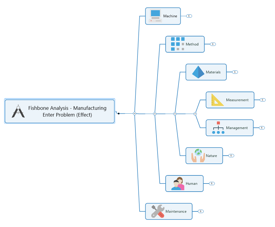
This usually includes analyzing the 6 (or 8) M-factors involved in most production processes (Machinery, Method, Materials, Measurement, Mother Nature, Manpower, Management, Maintenance).
2. Providing a service.
This may include examining the 4 S-factors involved in many service delivery procedures (Surroundings, Suppliers, Skills, Systems).
3. Marketing a product or service.
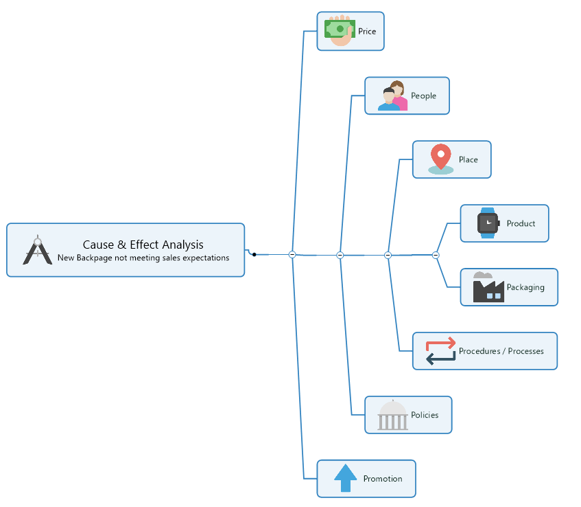
This may include exploring the 8 P-factors involved in many product or service marketing systems (Price, People, Place, Product, Packaging, Procedures/Processes, Policies, Promotion).
No matter the source of your predicament, creating a cause and effect diagram template will help you and your team drill down and sort out the changes required to put it right.
How to create a cause and effect diagram
With a versatile program like MindManager , you can use a fishbone diagram template to capture, view, and organize all the potential causes of a problem – then use (and link to) an idea map for brainstorming ways to resolve it.
Here’s how to create a cause and effect diagram in 4 easy steps.
Label a box or node at one end of your diagram with the name of your issue (this represents the “head” of your fish).
Extend a main “spine” line from this node out to one side.
Add “rib” lines that branch off from either side of your main line, each leading to its own node. Label these nodes with the names of areas or factors that may be contributing to your problem.
Break down and explore each of these potential causes further by branching off to the specific processes, tasks, or resources involved (these are your sub-causes).
And that’s it!
Now, you and your team can spot suspect activity and identify the areas that are most likely causing your issue more easily. To better focus on problem-solving , you might even prioritize these factors by ranking them in the order in which they should be addressed.
Example of a cause and effect diagram
Creating a fishbone diagram is a great way to see what’s behind a particular problem so you can both resolve it and prevent it from occurring again. Here’s a simple cause and effect diagram example to help demonstrate this.
Let’s say you want to build out your line of travel backpacks and have recently launched a second product. Despite the success of your original backpack however, your new, sturdier pack is falling short of sales expectations .
You decide to investigate the problem from a marketing perspective with the help of a cause and effect diagram.
First, you identify the problem at hand by labeling a box on the middle left side of your diagram:

Next, at a loss for where to actually start, you construct the skeleton of your diagram by adding a spine line and branching out to all 8 areas of your marketing process:
At this point, you realize you should probably sit down with your promotional team and examine the key factors affecting these categories.
After some inspired brainstorming, the ribs of your diagram look like this:
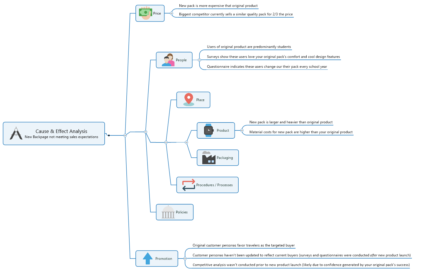
As your team sits back and analyzes their finished diagram, 2 key findings emerge:
- Instead of travelers, your existing customers are predominantly students who love your product but can’t afford – and don’t want or need – a larger, heavier, more expensive version
- The travelers your new product was geared toward can buy a similar quality pack for significantly less from your local competitor
Now that you have a better understanding of the reasons behind your new pack’s lack of success, you can create a plan to resolve the problem (possibly by sourcing less costly materials) and ensure you always perform sufficient marketing research in future.
Cause and effect diagram use cases
Crafting a simple cause and effect diagram template is the best way to shift your team’s focus from the symptoms associated with a problem, to the construction of a practical plan for meeting it head-on.
Here are some simple use cases that illustrate a few more common cause and effect diagram examples.
Company A wants to fix a product quality problem
Production quality at the company’s newest widget manufacturing facility is below that of other locations. After ruling out factors in common, the QC team meets to create a cause and effect diagram around two key areas – Mother Nature (environment) and Manpower (plant workers) – and makes some impactful discoveries: the new plant is located in a very humid location where skilled labor is limited.
Making process adjustments to correct for the humidity and ramping up training allows the company to normalize quality.
Company B wants to resolve an image setback
As a newer massage and body treatment spa, image is especially important to the company. After a promising start, however, customer reviews show their reputation for calm and relaxation has taken a hit. Management sits down to brainstorm the problem and, with the help of a fishbone diagram, resolves that recent renovations and staff turnover have combined to disrupt the spa’s serene surroundings.
The company makes a plan to both confine renos to off-days and improve employee engagement.
Company C wants to overcome a marketing challenge
With a full line of successful breakfast cereals under their belt, the company is at a loss as to why their latest cereal isn’t selling. Working with their marketing department, they use a cause and effect diagram tool to pinpoint the problem and conclude that the only real difference lies in the packaging.
The company creates several new packaging designs and polls their target audience to determine which holds the greatest appeal.
Remember, mapping your way out of a problem is the easiest way to see where you are, how you got there, and what the most promising route is to get back on track.
Downloadable cause and effect diagram templates from MindManager
Click the images below to access the cause and effect diagram example shared above, and a blank template created using MindManager. Click “Menu” in the bottom left corner of your browser window, and then click “Download” to get a copy of the template. Open the template in MindManager to start working.
Don’t have MindManager? No worries! Try it free for 30 days.
Ready to take the next step?
MindManager helps boost collaboration and productivity among remote and hybrid teams to achieve better results, faster.
Why choose MindManager?
MindManager® helps individuals, teams, and enterprises bring greater clarity and structure to plans, projects, and processes. It provides visual productivity tools and mind mapping software to help take you and your organization to where you want to be.
Explore MindManager
Cause and effect diagrams: A Guide

Table of Contents
What is a cause and effect diagram.
A cause and effect diagram is a powerful visual tool that helps identify and organize potential causes of an issue or effect. Also known as a fishbone diagram or Ishikawa diagram, it's widely used in many industries to identify the root causes of issues.
The diagram consists of a central spine, resembling a fishbone, with branches that represent different categories of potential causes. The categories can vary based on the context and nature of the problem.
For example:
In manufacturing, the categories may include people, machines, materials, methods, and the environment.
In healthcare, the categories may include patients, processes, equipment, environment, and staff.
Why use the cause and effect diagram?
The cause and effect diagram is an effective diagramming tool that can help teams tackle complex problems and improve their problem-solving capabilities.
Here are some benefits of using a cause and effect diagram:
It helps teams identify the root cause(s) of a problem, which is crucial for developing effective solutions to address the issue.
The diagram enables teams to leverage diverse perspectives and insights by encouraging collaboration and participation from team members. This helps them to arrive at a more comprehensive understanding of the problem.
The diagram can be used across various industries and sectors, making it a versatile tool for problem-solving and decision-making.
A fishbone diagram can help streamline a free workflow process by identifying bottlenecks or inefficiencies in a process.
Key concepts of cause and effect diagrams
Cause and effect diagrams are a useful tool for problem-solving. However, it's essential to understand their limitations and underlying concepts.
Visual representation of factors contributing to an observed effect
Cause and effect diagrams start with the effect at the center of the diagram, represented by a box or a circle. Then, branches get drawn out from the center, representing possible causes of the effect. This helps teams to identify multiple factors that contribute to an observed effect.
Each branch is a category of causes, such as “manpower,” “machine,” “method,” “measurement,” or “material.”
The branches are further divided into smaller sub-branches that represent specific causes. The diagram can be as simple or as complex as needed, depending on the problem at hand.
Interrelationships among causal factors are clearly shown
This type of diagram can help teams identify the relationships between different factors contributing to the observed effect.
By organizing the possible causes into categories and subcategories, the diagram can reveal the interdependencies among them. This can be particularly helpful when analyzing complex problems.
For example, a healthcare team uses a cause and effect diagram to identify the potential causes of patient falls in a hospital.
The diagram could show multiple branches with subcategories, such as:
Environmental factors
Medication-related factors
Patient-related factors.
The team identifies that patient confusion, environmental factors, and medication side effects can all contribute to falls, and they're interrelated.
One causal factor may appear in several places
A single factor may contribute to the observed effect in multiple ways.
The cause and effect diagram can help identify multiple pathways. It does this by showing where a single factor appears in different categories or subcategories.
A manufacturing team uses a cause and effect diagram to identify the causes of product defects. The diagram shows that a faulty machine part may contribute to defects in the product's size, shape, and color, as well as affect the machine's overall performance. The team realizes that addressing the faulty machine parts could significantly impact the final product's quality.
It’s qualitative and hypothetical
While cause and effect diagrams can provide a valuable visual representation, their qualitative and hypothetical nature limit them.
The diagram doesn't provide any quantitative data, making it difficult to prioritize and compare different possible causes.
However, even with these limitations, the diagram can still be useful as a brainstorming tool for identifying possible causes and interrelationships.
How to create a cause and effect diagram
Creating a cause and effect diagram is a straightforward process that can help teams identify and address problems.
Here are the steps for creating a cause and effect diagram:
1. Identify the problem that needs to be addressed
The first step in creating a cause and effect diagram is to clearly identify the problem that needs to be addressed.
This problem should be clearly defined and specific so that the resulting diagram can accurately reflect the potential causes.
2. Determine the effect that is being observed
After identifying the problem, the next step is to determine the observed effect. This effect is typically a symptom of the underlying problem, and understanding it's crucial to identify the potential causes.
3. Brainstorm potential causes and categorize them into different groups
Once you have identified the problem and effect, the team can begin to brainstorm potential causes. These causes can then be categorized into different groups, such as people, processes, equipment, or materials.
4. Draw the cause and effect diagram using a visual tool like Miro
With potential causes identified and categorized, the team can then draw the cause and effect diagram using a visual tool like Miro.
This diagram should have the effect at the center and the different categories of potential causes branching out from it.
Miro has both fishbone diagram templates that are easy to customize and will help you get started in no time.
5. Review and refine the diagram with input from team members
Finally, the team should review and refine the cause and effect diagram with input from team members.
This feedback can help to identify any missing causes, refine the categorization of causes, and ensure accuracy.
Importance of involving all team members in the process
Involving all team members in the creation of a cause and effect diagram is crucial for identifying and addressing the root causes of a problem.
Each team member brings a unique perspective and expertise to the process, which can result in identifying more potential causes and the evolution of better solutions.
Additionally, involving all team members fosters a sense of ownership and credibility. It can also improve communication and collaboration, leading to more effective problem-solving.
Next, let’s look at how you would make one.
Example of a simple cause and effect diagram and how it was created
To illustrate the process of creating a simple cause and effect diagram, let's consider a scenario.
In this example, we'll create a cause and effect diagram to understand why 40% of users cancel their subscriptions after the first month.
First, we identified the problem: a high cancellation rate after the first month of a subscription.
Next, we determined the effect that was being observed: 40% of users were canceling their subscription after the first month.
We then brainstormed potential causes and categorized them into different groups, including:
Customer Service
Product Quality
We identified the Customer Service category subcategories, such as 'Difficult to Contact,' 'Unhelpful Support Staff,' and 'Long Wait Times.'
We identified subcategories for the Product Quality category, such as 'Technical Issues' and 'Poor User Experience.' For the Price category, we identified subcategories such as 'High Cost' and 'Hidden Fees.' And for the Marketing categories like 'Misleading Information' and 'Inaccurate Targeting.'
After categorizing the potential causes, we drew the cause and effect diagram using a visual tool like Miro. We then reviewed and refined the diagram with input from team members.
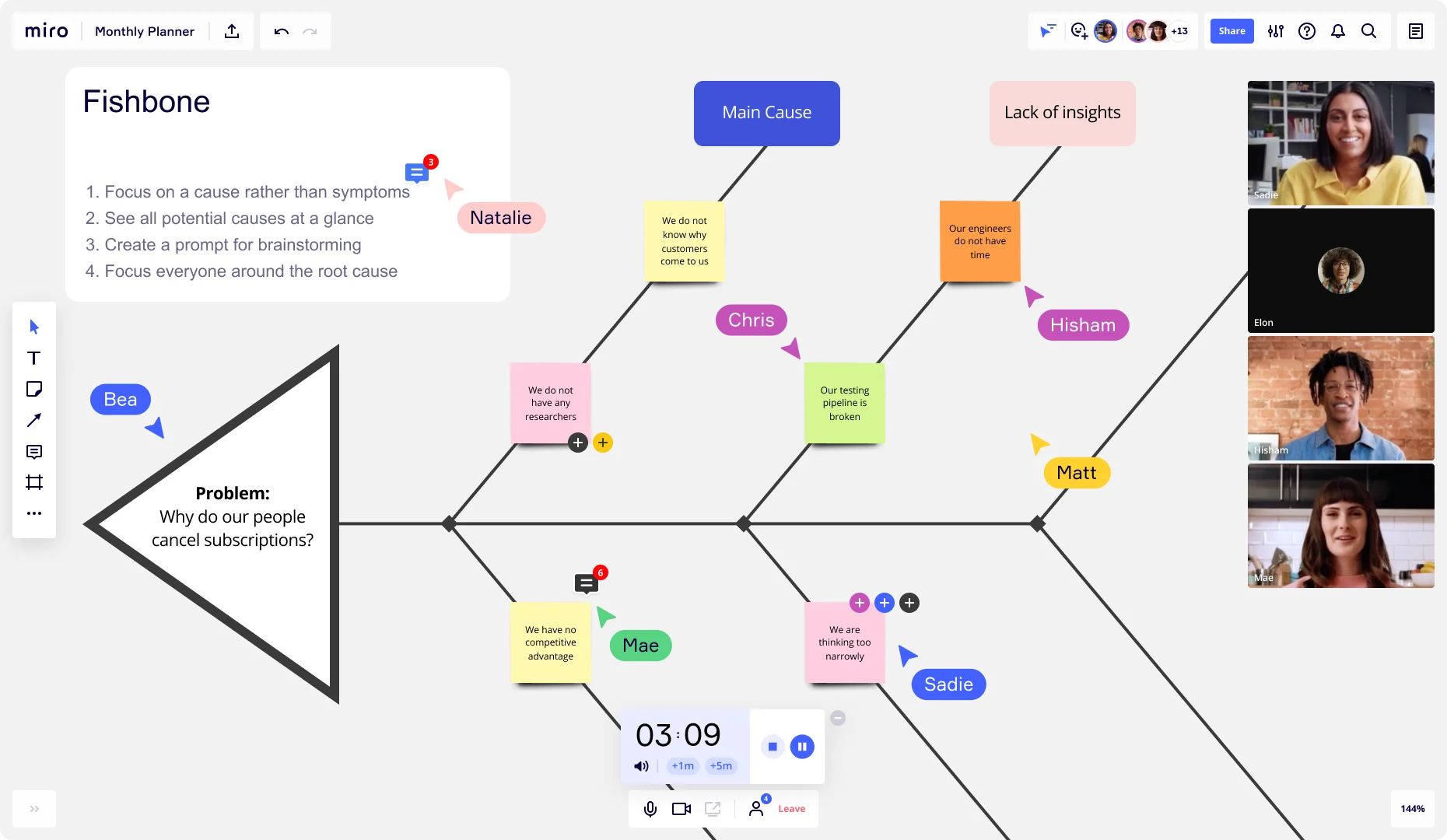
The resulting cause and effect diagram showed that the primary causes of the high cancellation rate were 'Difficult to Contact' and 'Poor User Experience.' These issues were further refined by analyzing the subcategories and identifying specific actions that could be taken to address them.
In the next section, we'll discuss how to analyze and interpret the diagram to identify the most likely causes of the problem.
How to analyze and interpret a cause and effect diagram
After creating a cause and effect diagram, the team needs to review it and identify potential causes that most likely contribute to the problem.
Several techniques can be used to analyze the diagram.
Techniques for analyzing and interpreting the diagram
One technique is to look for patterns or clusters of related causes. For example, if multiple causes in different categories all relate to a particular aspect of the problem, that may suggest that this is a particularly important area to investigate further.
Another technique is identifying potential causes that appear multiple times or in different categories. This can highlight the most important factors contributing to the problem and suggest areas where solutions could be targeted.
Teams can also use hypothesis testing, looking for evidence to support or disprove each potential cause. By testing hypotheses, the team can identify which potential causes are most likely to be the root cause(s) of the problem.
The goal of analyzing the diagram is to identify the most likely root cause(s) of the problem, which can then be addressed with targeted solutions.
Importance of considering both direct and indirect causes
It's essential to consider both direct and indirect causes when analyzing a cause and effect diagram. Direct causes are factors that directly contribute to the observed effect, such as malfunctioning machines. Indirect causes refer to underlying factors, such as insufficient training, that may not be immediately obvious.
An example could be a production problem caused by a broken machine and an untrained operator. While fixing the machine is a direct solution, providing the operator with proper training is indirect.
Addressing indirect causes can be more effective in the long term since they can have a wider impact and can contribute to solving future problems. So, considering both direct and indirect causes can help the team develop more effective solutions to the problem.
Example of a complex cause and effect diagram
A complex cause and effect diagram may include multiple categories with many potential causes or represent a system with many interrelated parts. For instance, a diagram related to supply chain management could include categories such as logistics, inventory, and procurement, with dozens of potential causes under each category.
To analyze such a diagram, the team would need to use techniques like:
Looking for patterns or clusters of related causes
Identifying potential causes that appear multiple times or in different categories
Testing hypotheses by looking for evidence to support or disprove each potential cause
Since complex diagrams can be overwhelming, involving all team members in the analysis is important. This ensures that different perspectives and knowledge can contribute to identifying the root cause(s).
After analyzing the diagram, the team should have a better understanding of the most likely root cause(s) of the problem. This information can then be used to develop targeted solutions to address the problem and prevent it from occurring again.
Use Miro to build an effective cause and effect diagram
Whether you're mapping out the root causes of a problem or analyzing the consequences of an action, Miro makes it easy so visually and collaboratively create a cause and effect diagram.
Using intuitive drag-and-drop functionality you can easily add and connect elements, label branches, and customize your diagram to suit your specific needs. Collaborate in real-time with your team, regardless of their location, and benefit from their insights as you build a comprehensive diagram. Sign up for free to get started!
Discover more
5 Whys: Examples, explanations, and how to find the causes of problems
What is the 5 Whys Framework?
What is a fishbone diagram?
How to create a fishbone diagram and make the most of one
Get on board in seconds
Join thousands of teams using Miro to do their best work yet.

Guide: Fishbone Diagram
Author: Daniel Croft
Daniel Croft is an experienced continuous improvement manager with a Lean Six Sigma Black Belt and a Bachelor's degree in Business Management. With more than ten years of experience applying his skills across various industries, Daniel specializes in optimizing processes and improving efficiency. His approach combines practical experience with a deep understanding of business fundamentals to drive meaningful change.
The Fishbone Diagram, also known by various other names such as Ishikawa Diagram, Cause and Effect Diagram or 6Ms, is a visual tool used in problem-solving and root cause analysis . Originating from the quality management sector, it is used as a systematic approach to identify, explore, and display possible causes of a specific problem.
What is a Fishbone Diagram?
The Fishbone Diagram is a graphical tool used for identifying and organizing possible causes of a specific problem or outcome. The diagram resembles the skeletal structure of a fish, hence its name. At the “head” of the fish is the problem you’re trying to solve, and the “bones” branching off the spine are the multiple potential causes contributing to that problem.
The benefit of a Fishbone Diagram lies in its simplicity. It gives you a structured way to brainstorm and categorize the various factors affecting a specific issue. The diagram can get as detailed as you need it to be, allowing for sub-causes to branch off the main causes, offering even deeper insights.
The Components of a Fishbone Diagram
Head : The fish’s head represents the problem or effect you’re analyzing.
Spine : The long, horizontal line connecting to the head serves as the timeline or sequence of the problem.
Bones : These are the categories of potential causes. They branch off the spine, leading towards the head.
Sub-Bones : These are the more specific factors or sub-causes that stem from the main categories.

Why Use a Fishbone Diagram?
The Fishbone Diagram is a flexible tool that can be used for a range of applications. Here’s why it’s so useful:
1. Easy Visualization:
One of the primary advantages of using a Fishbone Diagram is its ability to simplify complex problems. With all potential causes visually represented in one place, it becomes easier to analyze and discuss the issues.
2. Team Collaboration:
The Fishbone Diagram is excellent for brainstorming sessions. It encourages team members to think critically and contributes to a shared understanding of the problem. It’s collaborative by design, allowing for the collective intelligence of the group to shine.
3. Root Cause Analysis:
Identifying symptoms of a problem is one thing; uncovering the root cause is another. The Fishbone Diagram excels at this by forcing you to dig deep into various contributing factors. By isolating these causes, you’re better positioned to find a lasting solution.
By using a Fishbone Diagram, you’re not just addressing a problem with a short-term fix; you’re conducting a thorough investigation to eliminate issues from the root up.
How to Create a Fishbone Diagram: A Detailed Guide
Creating a Fishbone Diagram might seem like a daunting task, but it’s actually a straightforward process. Here, we’ll break down each step in detail to ensure you can construct a Fishbone Diagram that serves its purpose effectively.
Materials You’ll Need:
- A whiteboard or large sheet of paper
- Markers or pens
- Sticky notes (optional)
- A team of people for brainstorming
Step 1: Identify the Problem
The first and most crucial step is to clearly identify the problem you’re trying to solve. This statement should be specific and concise. Write this problem statement at the far right side of your whiteboard or paper, as it will serve as the “head” of your fishbone diagram.
- Use data to define the problem whenever possible.
- Make sure the problem is mutually understood and agreed upon by all team members.
Step 2: Determine the Main Categories
Now, draw a horizontal line from the problem statement towards the left side of the board. This is the “spine” of your fish. Next, you’ll identify the major categories of causes that could be contributing to the problem. These categories will serve as the main “bones” branching off from the spine.
Common categories often include:
- Measurement
- Environment
- The categories can be industry-specific or general, depending on the problem you’re analyzing.
- Aim for 4-6 main categories for better manageability.
Step 3: Brainstorm Causes
Once you’ve determined the main categories, it’s time to brainstorm potential causes for each category. These causes will be the smaller “bones” that branch off from the main bones. If you’re working with a team, this is an excellent time for a brainstorming session.
- Use sticky notes to write down ideas so you can easily move them around.
- Encourage every team member to contribute; sometimes the most unexpected insights come from diverse perspectives.
The output of the root cause analysis at this point may look something like the below example. With the lack of preventative maintenance being explored with the 5Whys analysis.
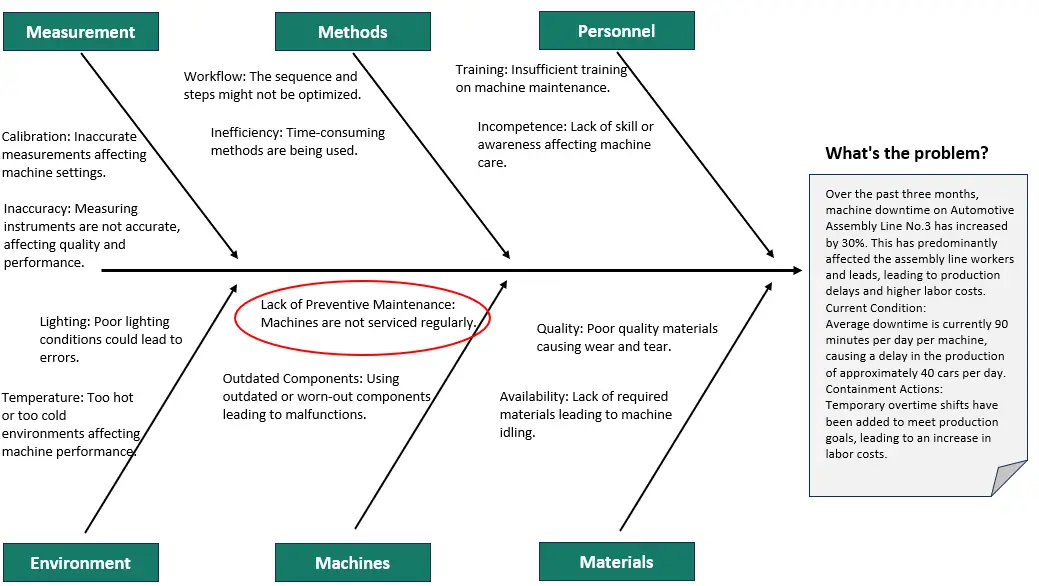
Step 4: Dig Deeper with Sub-Causes
Sometimes, the primary causes can be broken down into smaller, more specific sub-causes. This is where the “ 5 Whys ” technique can be beneficial. For each primary cause, ask “Why?” up to five times to dig deeper into the root of the issue.

- Not all primary causes will need sub-causes; use your discretion.
- Keep the diagram organized to ensure readability.
Step 5: Analyze and Take Action
After all the causes and sub-causes have been identified, it’s time to analyze the Fishbone Diagram as a team. Highlight or circle the causes that seem most likely to be contributing to the problem. These are the areas that will need immediate attention and action.
- Use data or evidence to support your conclusions.
- Create an action plan assigning responsibility for each highlighted cause.
And there you have it! You’ve successfully created a Fishbone Diagram that will help you get to the root of your problem.

Examples and Case Studies: Understanding Fishbone Diagrams in Action
Case study: manufacturing unit with quality issues.
Imagine you run a manufacturing unit, and you’ve been receiving complaints about the quality of your products. You decide to use a Fishbone Diagram to get to the root of the issue.
Step 1: Identify the Problem Problem Statement: “High number of defective products in the last quarter.”
Step 2: main categories.
- People : Untrained staff, high employee turnover
- Process : Inconsistent quality checks, outdated SOPs (Standard Operating Procedures)
- Equipment : Aged machinery, lack of maintenance
- Environment : Poor lighting, extreme temperature fluctuations
Step 4: Dig Deeper (5 Whys)
- Untrained Staff : Why? No formal training program.
- Aged Machinery : Why? No budget allocated for equipment upgrades.
After analyzing the Fishbone Diagram, you realize that untrained staff and aged machinery are your primary culprits. Your next steps could involve investing in staff training programs and allocating budget for machinery upgrades.
By following these steps, you can develop targeted strategies to improve product quality significantly.
Common Mistakes and Tips: How to Make the Most of Your Fishbone Diagram
1. overlooking minor causes.
While it’s easy to focus on the most glaring issues, minor causes can accumulate and have a significant impact.
Tip : Don’t disregard a cause just because it seems minor. Sometimes, fixing smaller issues can lead to big improvements.
2. Ignoring Data
It’s tempting to rely solely on brainstorming and intuition, but data should be your guiding star.
Tip : Use metrics and KPIs to support or refute the causes you’ve identified. This adds credibility to your findings and helps you prioritize effectively.
3. Stopping at Symptoms
Identifying symptoms is just the first step; your ultimate goal should be to uncover the root causes.
Tip : Use techniques like the “5 Whys” to dig deeper into each cause and ensure you’re addressing the root of the issue, not just its manifestations.
Fishbone Diagrams are a fantastic asset in the toolbox of anyone interested in continuous improvement. Whether you’re a seasoned professional or just getting started, this simple yet powerful tool can help you dissect complex problems and develop targeted solutions.
They encourage you to look beyond the obvious and delve into the intricacies that contribute to each problem. So go ahead, grab that pen and paper (or a whiteboard, if you’re feeling fancy), and start your journey towards effective problem-solving.
- Ilie, G. and Ciocoiu, C.N., 2010. Application of fishbone diagram to determine the risk of an event with multiple causes. Management research and practice , 2 (1), pp.1-20.
- Coccia, M., 2018. The Fishbone diagram to identify, systematize and analyze the sources of general purpose Technologies. Journal of Social and Administrative Sciences , 4 (4), pp.291-303.
Q: What is the origin of the Fishbone Diagram?
A: The Fishbone Diagram was originally developed by Dr. Kaoru Ishikawa, a Japanese quality control statistician, in the 1960s. It’s also sometimes referred to as the Ishikawa Diagram in his honor.
Q: Can Fishbone Diagrams be used for non-manufacturing problems?
A: Absolutely! While Fishbone Diagrams are popular in manufacturing and quality management, their application is not limited to these areas. They can be used in healthcare, software development, event planning, and even for personal problem-solving.
Q: How many main categories should my Fishbone Diagram have?
A: The number of main categories can vary depending on the complexity of the problem. However, it’s generally advisable to have between 4-6 main categories for easier analysis and readability.
Q: Can I use software to create a Fishbone Diagram?
A: Yes, there are several software tools available for creating Fishbone Diagrams, such as Microsoft Visio, Lucidchart, and various other project management software options. However, a simple pen and paper or a whiteboard can be just as effective for smaller teams or simpler problems.
Q: How do I know which causes to prioritize after creating a Fishbone Diagram?
A: After creating your Fishbone Diagram, you should analyze it with your team to identify the most likely root causes of the problem. Using data to support your conclusions can be very helpful. You may also employ techniques like the Pareto Analysis to prioritize causes based on their impact.

Daniel Croft
Daniel Croft is a seasoned continuous improvement manager with a Black Belt in Lean Six Sigma. With over 10 years of real-world application experience across diverse sectors, Daniel has a passion for optimizing processes and fostering a culture of efficiency. He's not just a practitioner but also an avid learner, constantly seeking to expand his knowledge. Outside of his professional life, Daniel has a keen Investing, statistics and knowledge-sharing, which led him to create the website www.learnleansigma.com, a platform dedicated to Lean Six Sigma and process improvement insights.

Free Lean Six Sigma Templates
Improve your Lean Six Sigma projects with our free templates. They're designed to make implementation and management easier, helping you achieve better results.
Was this helpful?

Have a language expert improve your writing
Run a free plagiarism check in 10 minutes, generate accurate citations for free.
- Knowledge Base
- Starting the research process
- What Is a Fishbone Diagram? | Templates & Examples
What Is a Fishbone Diagram? | Templates & Examples
Published on January 2, 2023 by Tegan George . Revised on January 29, 2024.
A fishbone diagram is a problem-solving approach that uses a fish-shaped diagram to model possible root causes of problems and troubleshoot possible solutions. It is also called an Ishikawa diagram, after its creator, Kaoru Ishikawa, as well as a herringbone diagram or cause-and-effect diagram.
Fishbone diagrams are often used in root cause analysis , to troubleshoot issues in quality management or product development. They are also used in the fields of nursing and healthcare, or as a brainstorming and mind-mapping technique many students find helpful.
Table of contents
How to make a fishbone diagram, fishbone diagram templates, fishbone diagram examples, advantages and disadvantages of fishbone diagrams, other interesting articles, frequently asked questions about fishbone diagrams.
A fishbone diagram is easy to draw, or you can use a template for an online version.
- Your fishbone diagram starts out with an issue or problem. This is the “head” of the fish, summarized in a few words or a small phrase.
- Next, draw a long arrow, which serves as the fish’s backbone.
- From here, you’ll draw the first “bones” directly from the backbone, in the shape of small diagonal lines going right-to-left. These represent the most likely or overarching causes of your problem.
- Branching off from each of these first bones, create smaller bones containing contributing information and necessary detail.
- When finished, your fishbone diagram should give you a wide-view idea of what the root causes of the issue you’re facing could be, allowing you to rank them or choose which could be most plausible.
Here's why students love Scribbr's proofreading services
Discover proofreading & editing
There are no built-in fishbone diagram templates in Microsoft programs, but we’ve made a few free ones for you to use that you can download below. Alternatively, you can make one yourself using the following steps:
- In a fresh document, go to Insert > Shapes
- Draw a long arrow from left to right, and add a text box on the right-hand side. These serve as the backbone and the head of the fish.
- Next, add lines jutting diagonally from the backbone. These serve as the ribs, or the contributing factors to the main problem.
- Next, add horizontal lines jutting from each central line. These serve as the potential causes of the problem.
Lastly, add text boxes to label each function.
You can try your hand at filling one in yourself using the various blank fishbone diagram templates below, in the following formats:
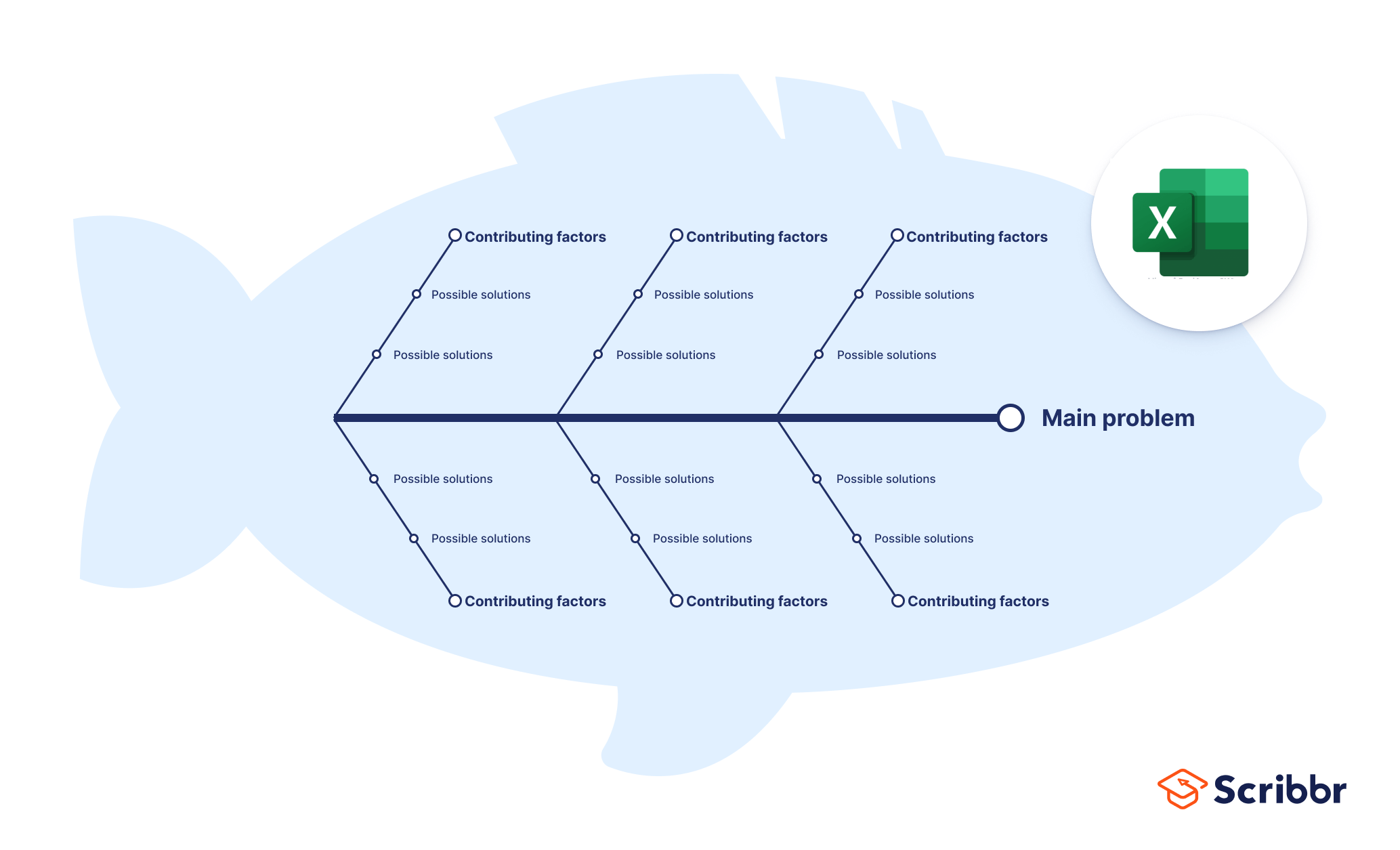
Fishbone diagram template Excel
Download our free Excel template below!
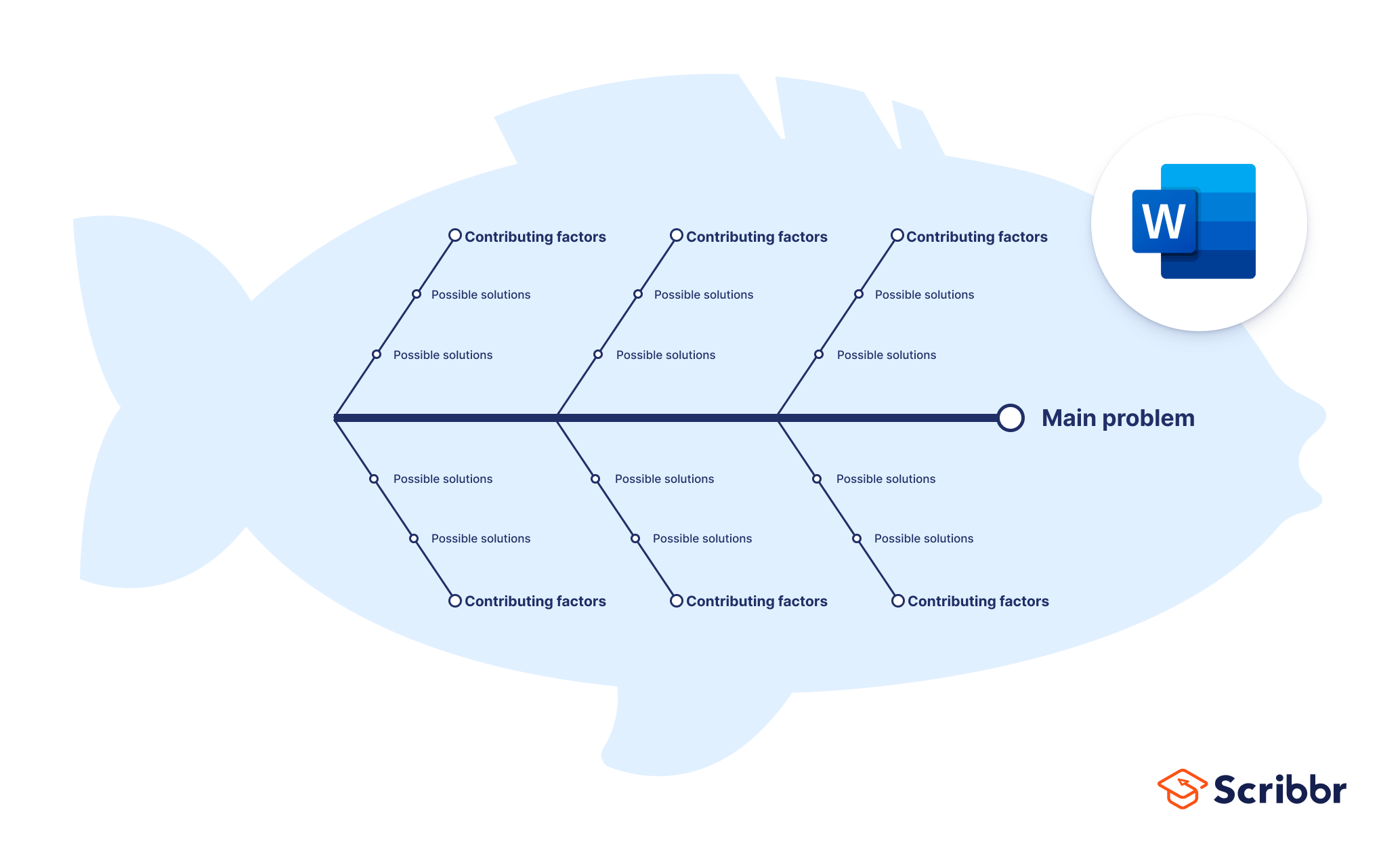
Fishbone diagram template Word
Download our free Word template below!
Fishbone diagram template PowerPoint
Download our free PowerPoint template below!
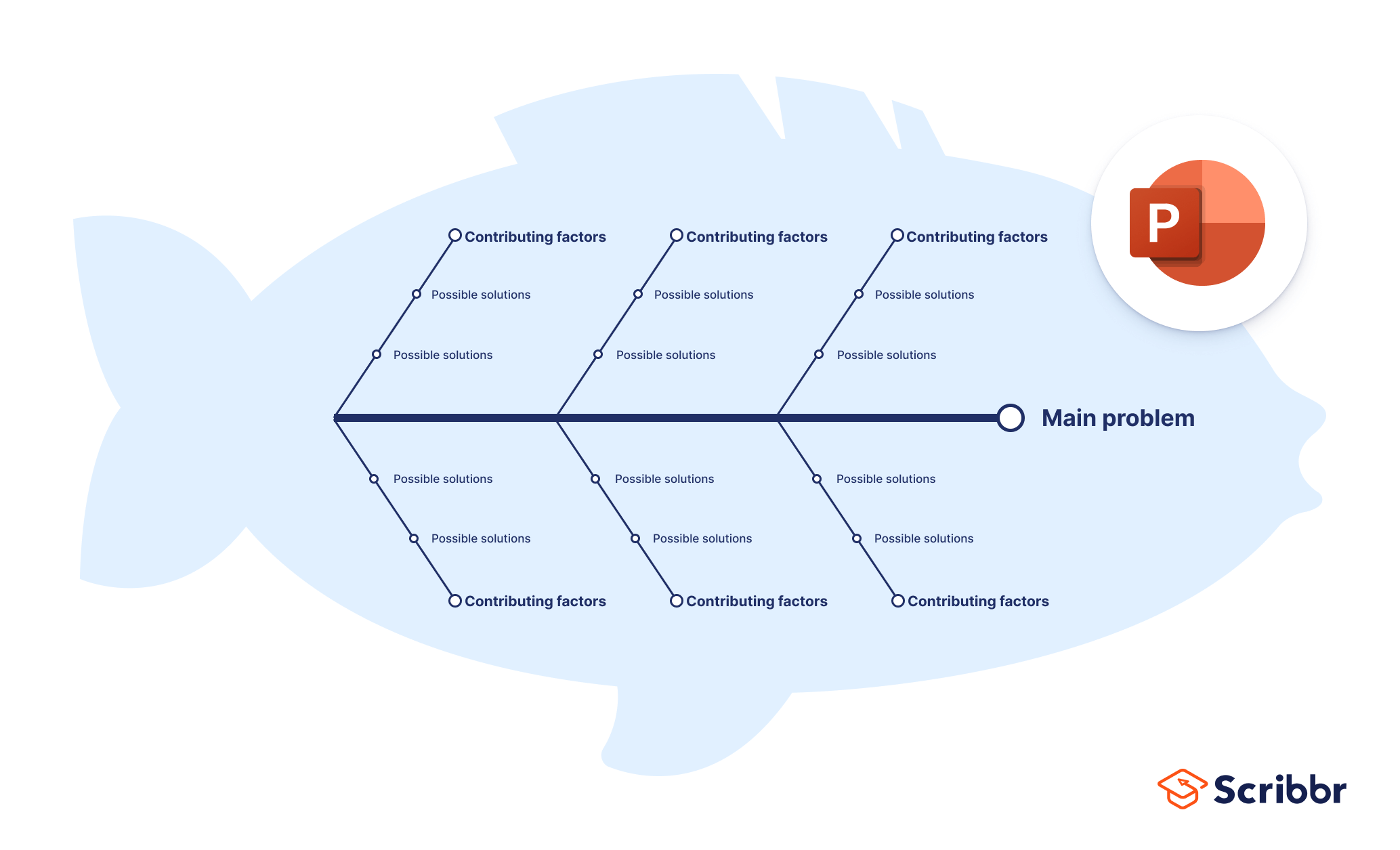
Fishbone diagrams are used in a variety of settings, both academic and professional. They are particularly popular in healthcare settings, particularly nursing, or in group brainstorm study sessions. In the business world, they are an often-used tool for quality assurance or human resources professionals.
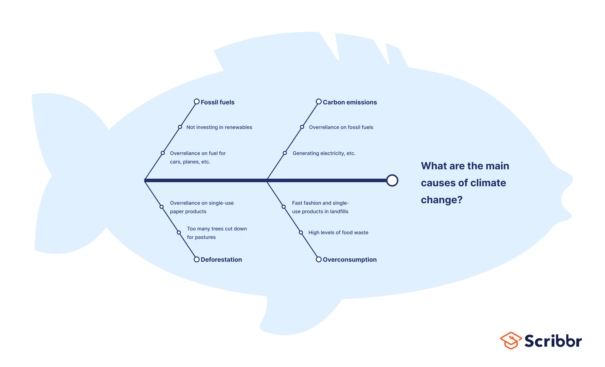
Fishbone diagram example #1: Climate change
Let’s start with an everyday example: what are the main causes of climate change?
Fishbone diagram example #2: Healthcare and nursing
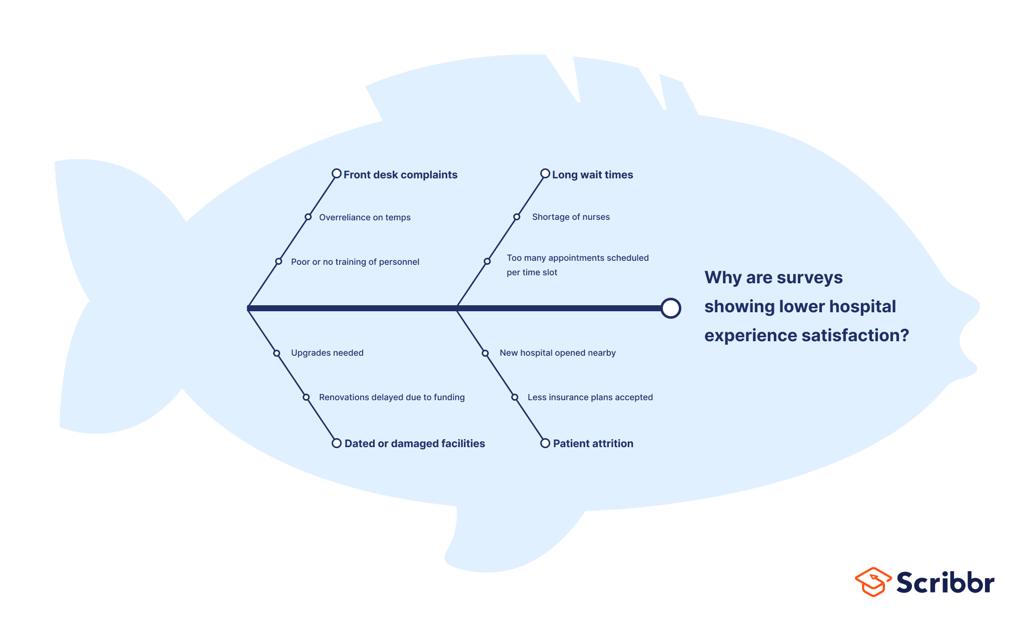
Fishbone diagrams are often used in nursing and healthcare to diagnose patients with unclear symptoms, or to streamline processes or fix ongoing problems. For example: why have surveys shown a decrease in patient satisfaction?
Fishbone diagram example #3: Quality assurance
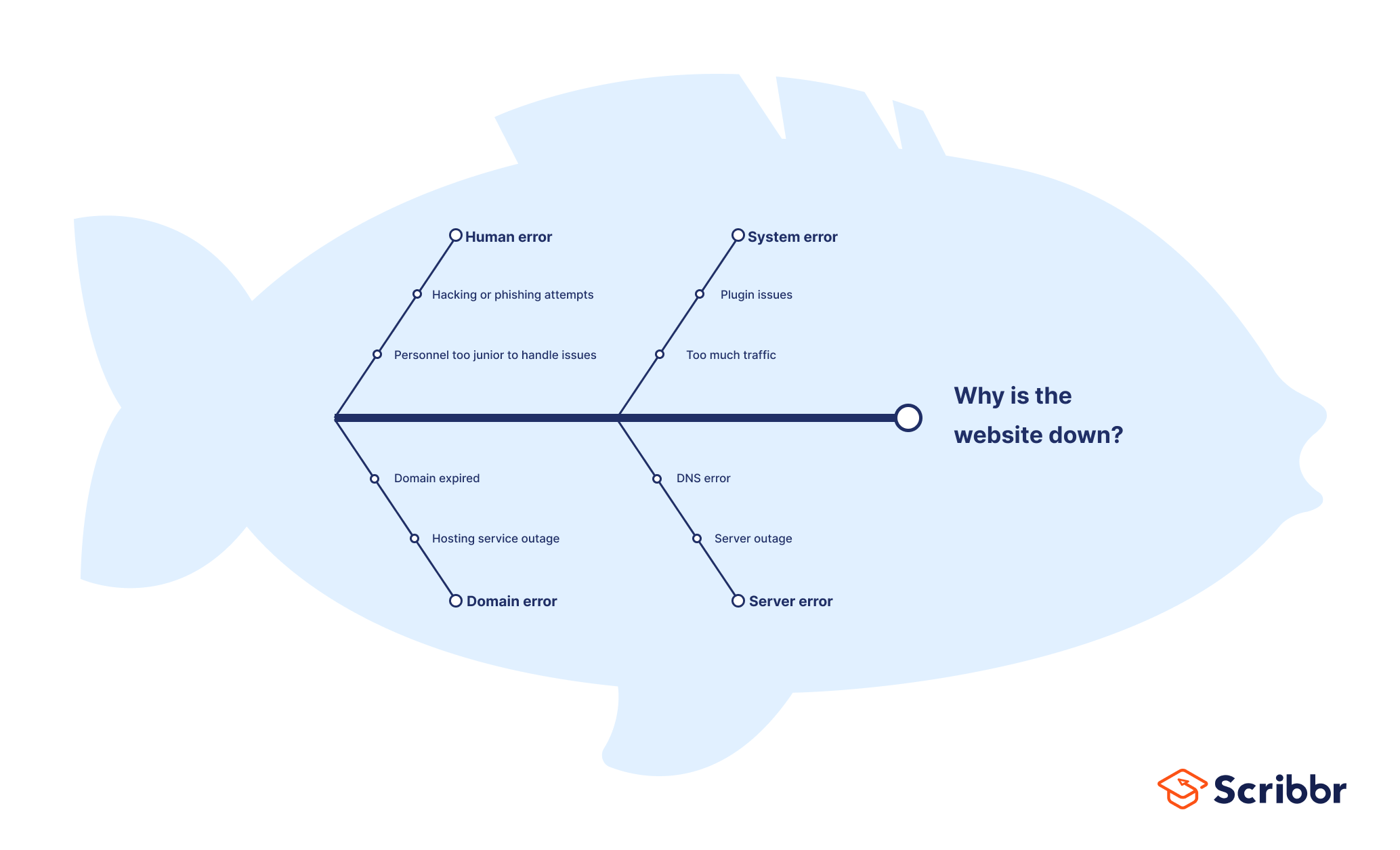
QA professionals also use fishbone diagrams to troubleshoot usability issues, such as: why is the website down?
Fishbone diagram example #4: HR
Lastly, an HR example: why are employees leaving the company?
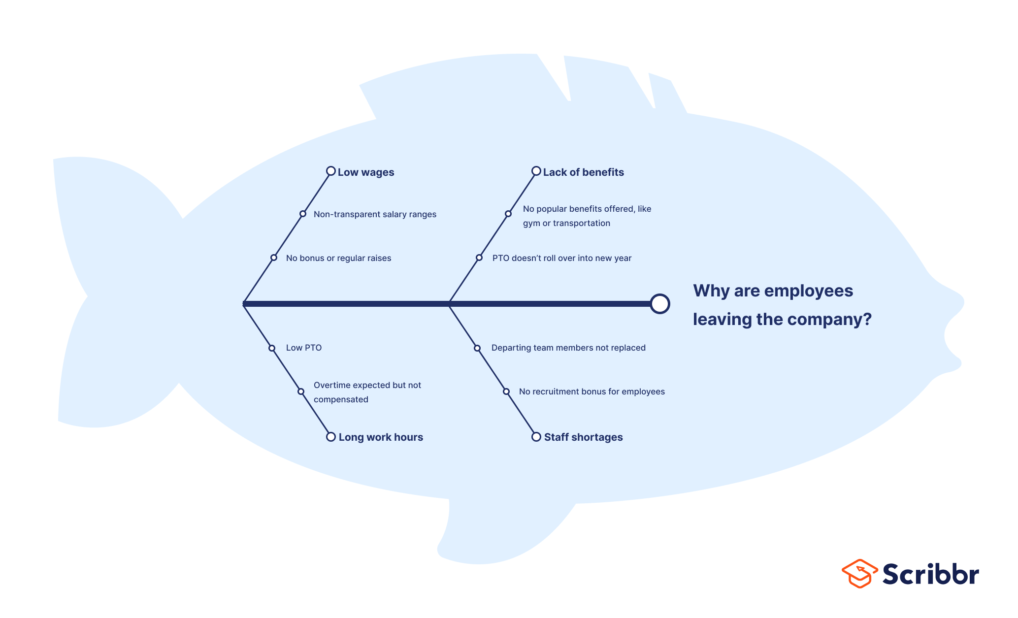
Fishbone diagrams come with advantages and disadvantages.
- Great tool for brainstorming and mind-mapping, either individually or in a group project.
- Can help identify causal relationships and clarify relationships between variables .
- Constant iteration of “why” questions really drills down to root problems and elegantly simplifies even complex issues.
Disadvantages
- Can lead to incorrect or inconsistent conclusions if the wrong assumptions are made about root causes or the wrong variables are prioritized.
- Fishbone diagrams are best suited to short phrases or simple ideas—they can get cluttered and confusing easily.
- Best used in the exploratory research phase, since they cannot provide true answers, only suggestions.
If you want to know more about the research process , methodology , research bias , or statistics , make sure to check out some of our other articles with explanations and examples.
Methodology
- Sampling methods
- Simple random sampling
- Stratified sampling
- Cluster sampling
- Likert scales
- Reproducibility
Statistics
- Null hypothesis
- Statistical power
- Probability distribution
- Effect size
- Poisson distribution
Research bias
- Optimism bias
- Cognitive bias
- Implicit bias
- Hawthorne effect
- Anchoring bias
- Explicit bias
Fishbone diagrams have a few different names that are used interchangeably, including herringbone diagram, cause-and-effect diagram, and Ishikawa diagram.
These are all ways to refer to the same thing– a problem-solving approach that uses a fish-shaped diagram to model possible root causes of problems and troubleshoot solutions.
Fishbone diagrams (also called herringbone diagrams, cause-and-effect diagrams, and Ishikawa diagrams) are most popular in fields of quality management. They are also commonly used in nursing and healthcare, or as a brainstorming technique for students.
Cite this Scribbr article
If you want to cite this source, you can copy and paste the citation or click the “Cite this Scribbr article” button to automatically add the citation to our free Citation Generator.
George, T. (2024, January 29). What Is a Fishbone Diagram? | Templates & Examples. Scribbr. Retrieved June 24, 2024, from https://www.scribbr.com/research-process/fishbone-diagram/
Is this article helpful?
Tegan George
Other students also liked, how to define a research problem | ideas & examples, data collection | definition, methods & examples, exploratory research | definition, guide, & examples, get unlimited documents corrected.
✔ Free APA citation check included ✔ Unlimited document corrections ✔ Specialized in correcting academic texts
How to Use Cause and Effect Analysis to Solve Business Problems
Updated on: 24 July 2023
Every business has its own problems, big and small.
A problem in your business can be an opportunity for the business to grow or can be the setback that leads to failure. It all depends on how you embark on problem-solving.
A good way of preventing the occurrence of undesirable things is by proper analysis of the business situation, identification of the root causes and solving the situation. Hence the need to have an efficient and effective cause and effect analysis . Here we offer you a clear guide on how to go about it.
How to Do a Cause and Effect Analysis

Cause and effect analysis is also known as a fishbone diagram . It was developed by Professor Kaoru Ishikawa, a pioneer professional in the field of quality management in the 1960s.
The diagram is called fishbone as its final look is in the form of a fishbone. It was initially used for quality improvement but it can also be helpful in analyzing business processes through the identification of its causes and hindrances, as well as on ways to improve it.
The cause and effect analysis basically involves two key steps which are looking backward and looking forward.
- In looking backward, the analysis focuses on identifying areas in which mistakes were made or money was lost. It looks into what had happened before. In identifying where the issues are, you are able to work towards avoiding the problem in the future. Another advantage of this is that, you’ll be able to replicate a positive outcome.
- Looking into the future and planning for it, the analysis seeks to find workable solutions that are to be implemented in the future and build on the future success of the business. This analysis enables you to determine your future outcome by planning what to do now to achieve it.
This method is unique in that it encourages creative thinking as well as brainstorming in the process of breaking down issues and aligning them in the process of finding its solutions.
Among the key advantages of this method is that it ensures that you don’t seek out to solve the wrong problems, it also ensures that you solve the problem well enough for it to go away.
Step 1: Problem Identification
The way to use this tool is very simple. You first need to identify the problem area that needs analysis. A good way to do this is by giving a brief description of the current business situation and the consequences as well as the reasons for why they occurred.
Here you can replace the problem with a goal that you want to achieve. For instance, high profitability. You need to be very specific about the problem that you’re facing as this forms the basis of your analysis. If the identification is wrong, then the analysis also tends to be wrong.
You should also identify the people involved as well as what the exact problem is and how it occurs. For example, low productivity due to absenteeism especially in the production department, which includes production personnel and the line manager, for the period from January to November 2017.
Step 2: Main Problem Causes

The next step is identifying the main causes of the problem, for example, the people, the procedures your business utilized as well as the materials or equipment. Here, you will need to do a lot of brainstorming to come up as many reasons as you possibly can.
You can use various models to help you identify as many problems as you can in a clear manner. For example, the McKinsey 7S Framework which includes, Strategy, Systems, the business Structures, Shared values of the business, Staff, Skills, and Style.
Step 3: Identify Plausible Sub-causes of the Main Causes
Thereafter, you can narrow down to further plausible causes of the main problems that you’ve listed. This is important for the problem-solving stage of analyzing the diagram, as you will know what to do exactly to rectify the situation. This can include issues like wrong norms and values that could be as a result of poor training of employees.
Step 4: Analyze the Diagram

By now, your diagram should be showing all the main and minor causes that you’ve thought of.
Depending on how complex the information is, you can do a much deeper investigation on the causes. This can be by conducting a survey as well as drawing up questionnaires.
For example, you can ask your employees to fill in a survey on how much they understand the products you sell in your business. The information you get from this will help you build upon areas of training in order to address the problem of lack or insufficient knowledge.
From here, a corresponding step is developing an action plan with clear priorities that can be implemented immediately. This is made simple as the plans can comprise of actions to solve the subproblem causes.
For the action plan to be effective, it needs to be clear and to be executed aggressively. For example, a sub cause like lack of staff morale can be turned into an action plan, which will be giving incentives for staff motivation, hence, improved productivity and in turn higher profitability which was the main goal.
Ready to Use Cause and Effect Analysis in Business Problem-Solving?
The cause and effect analysis uses brainstorming and critical analysis by way of visual representation to enable problem-solving .
The main problem is drawn out on the left while the main causes are drawn out an extension of the problem. This then calls for a look at the sub causes which are written out as branches of the main problems.
Various models are also used as a guide to identifying the problem-causes. The models look into various business elements including, the people relation the processes, the systems and equipment use, the management as well as the general organizational structure.
Among the advantages of this analysis method include correct identification of problem-causers hence proper problem-solving, better visualization and hence the effectiveness of the problem-solving process.
Would you like to try drawing up your own Fishbone Diagram ?
BIO : Lori Wade is the content writer and a career specialist for college students. She is a content marketer, sharing experience in writing, education, and self-development in her publications, for example, https://eliteessaywriters.com/blog/toefl-essay-topics/ . Connect with her on Facebook and follow her on Twitter .
Join over thousands of organizations that use Creately to brainstorm, plan, analyze, and execute their projects successfully.

More Related Articles

Thanks for sharing your thought! Helps me a lot to do the same thing in my company. I agree that before you decide what o plan you need to have to weigh its cause and effect.
Leave a comment Cancel reply
Please enter an answer in digits: 5 × 1 =
Download our all-new eBook for tips on 50 powerful Business Diagrams for Strategic Planning.
Diagramming Build diagrams of all kinds from flowcharts to floor plans with intuitive tools and templates.
Whiteboarding collaborate with your team on a seamless workspace no matter where they are., data generate diagrams from data and add data to shapes to enhance your existing visuals., enterprise friendly easy to administer and license your entire organization., security see how we keep your data safe., apps & integrations connect to all the tools you use from microsoft, google workspace, atlassian, and more..
- What's New Read about new features and updates.
Product Management Roadmap features, brainstorm, and report on development, so your team can ship features that users love.
Software engineering design and maintain complex systems collaboratively., information technology visualize system architecture, document processes, and communicate internal policies., sales close bigger deals with reproducible processes that lead to successful onboarding and training..
- Getting Started Learn how to make any type of visual with SmartDraw. Familiarize yourself with the UI, choosing templates, managing documents, and more.
- Templates get inspired by browsing examples and templates available in SmartDraw.
Diagrams Learn about all the types of diagrams you can create with SmartDraw.
Whiteboard learn how to combine free-form brainstorming with diagram blueprints all while collaborating with your team., data visualizers learn how to generate visuals like org charts and class diagrams from data., development platform browse built-in data visualizers and see how you can build your own custom visualization., open api the smartdraw api allows you to skip the drawing process and generate diagrams from data automatically., shape data add data to shapes, import data, export manifests, and create data rules to change dashboards that update..
- Explore SmartDraw Check out useful features that will make your life easier.
- Blog Read articles about best practices, find tips on collaborating, learn to give better presentations and more.
Support Search through SmartDraw's knowledge base, view frequently asked questions, or contact our support team.
- Site License Site licenses start as low as $2,995 for your entire organization.
- Team License The SmartDraw team License puts you in control with powerful administrative features.
Apps & Integrations Connect to all the tools you use.
- Contact Sales
What's New?

Solutions By Team
License everyone for as low as $1 per user per month.
Save money, and replace Visio, Lucidchart, Lucidspark, and Miro with a SmartDraw site license.

Getting Started Learn to make visuals, familiarize yourself with the UI, choosing templates, managing documents, and more.
Templates get inspired by browsing examples and templates available in smartdraw., developer resources, additional resources.

Site License As low as $1 per user per month for your entire organization.
Team license get powerful administrative features for your team., solutions for your team.

Cause and Effect
Understand relationships quickly and easily with smartdraw's cause and effect or fishbone diagrams, what is a cause and effect diagram, cause and effect analysis, how to make a cause and effect diagram, cause and effect diagram tutorial, cause and effect chart examples, with smartdraw, you can create many different types of diagrams, charts, and visuals.
A cause and effect diagram examines why something happened or might happen by organizing potential causes into smaller categories. It can also be useful for showing relationships between contributing factors. One of the Seven Basic Tools of Quality, it is often referred to as a fishbone diagram or Ishikawa diagram.
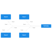
One of the reasons cause & effect diagrams are also called fishbone diagrams is because the completed diagram ends up looking like a fish's skeleton with the fish head to the right of the diagram and the bones branching off behind it to the left.
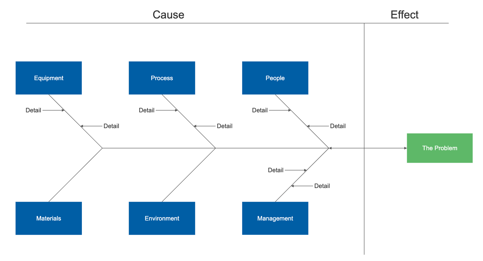
To begin making a cause and effect diagram, write the main issue or problem to be analyzed in a box that is typically on the right edge of the page, halfway down the drawing area or page. A line called the "spine" or "backbone" should extend to the left starting from the edge of the main box (if you're using a SmartDraw template, this will already be there for you). Next, angle branches off of the spine, each representing a cause or effect of the main issue. Each of these branches can contain additional branches.
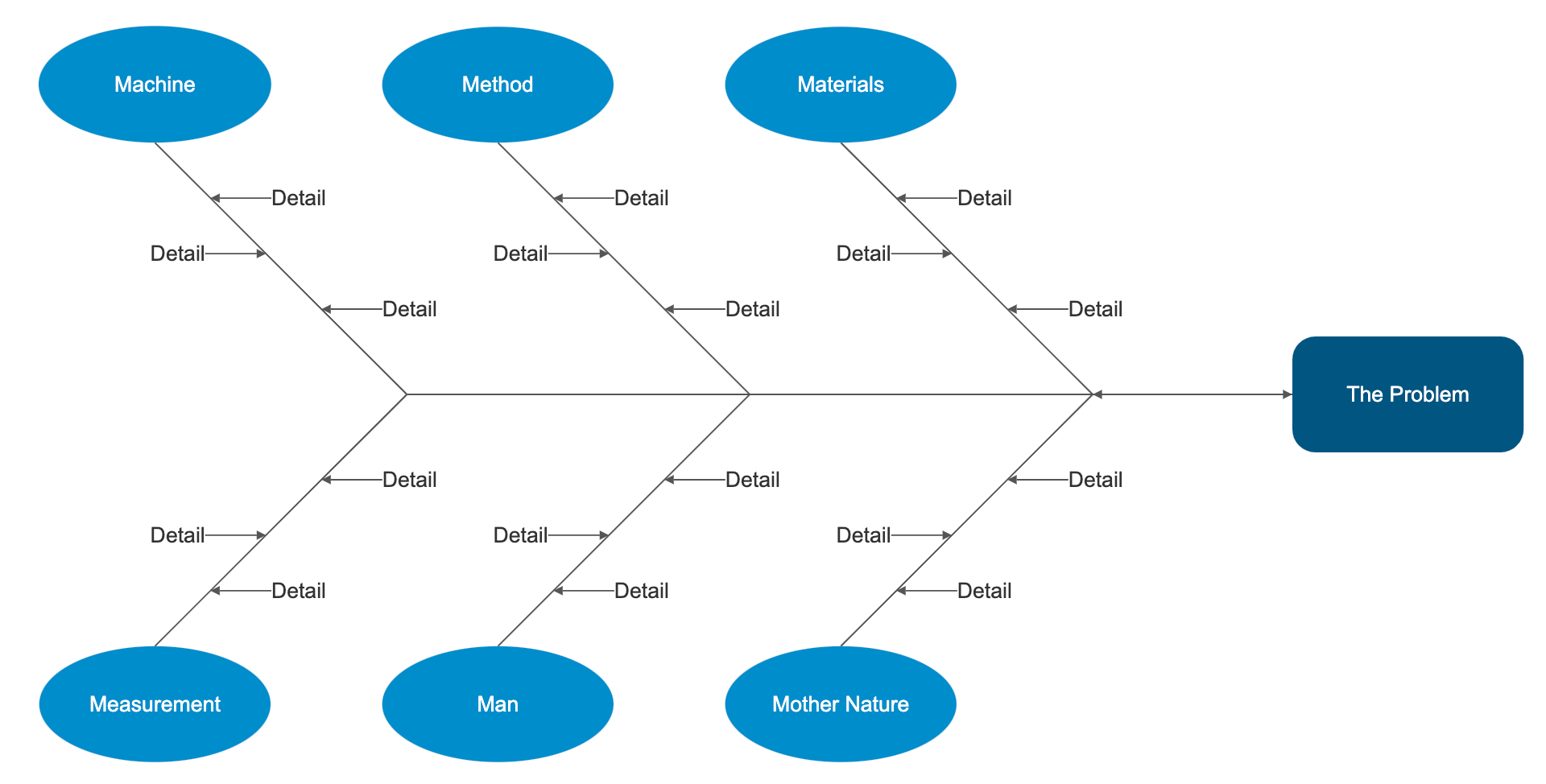
Most cause and effect diagrams examine a similar set of possible causes for any issue analyzed.
In the manufacturing industry, these are referred to as the 6Ms:
- Methods. Are there well-written and appropriate training guidelines in place? Are certain policies or regulations causing slow-downs or creating unnecessary steps?
- Machines. Are there any maintenance issues with the tools used or the number of tools available?
- Materials. Are there any issues getting raw materials from suppliers? Any problems with transportation (timing) or with the quality of the supplies?
- Measurements. Could there be errors in calculation or contamination that caused false readings? Could the way you measure be inconsistent in some way? Is your equipment regularly calibrated and maintained?
- Mother Nature/Environment. Is there too much moisture in the environment? Are temperatures too hot or too cold? Is there excessive dust or other contamination?
- Manpower/People. Do you have too little of your workforce devoted to a process? Are new people adequately trained? Is the training consistent? Are the right people with the right experience being hired or promoted? Is there a specific position creating a bottleneck or making frequent mistakes?
Occasionally, a manufacturing analysis will also include two other categories: Management and Maintenance.
In the service industry, these are described as the 4S:
- Surroundings. Does your establishment project the right image? Is it run-down? Is it impersonal? Is it comfortable?
- Suppliers. Are there any issues delivering your service? Do you have problems with low quality food deliveries? Are there too many dropped phone calls? Can your server handle traffic spikes? Are you getting enough traffic through advertising channels you're paying for?
- Systems. Do you have policies and procedures in place for all scenarios? Do you have modern cash registers that help your servers place orders and deliver checks efficiently?
- Skill. Are your employees properly trained? Do they have the right experience?
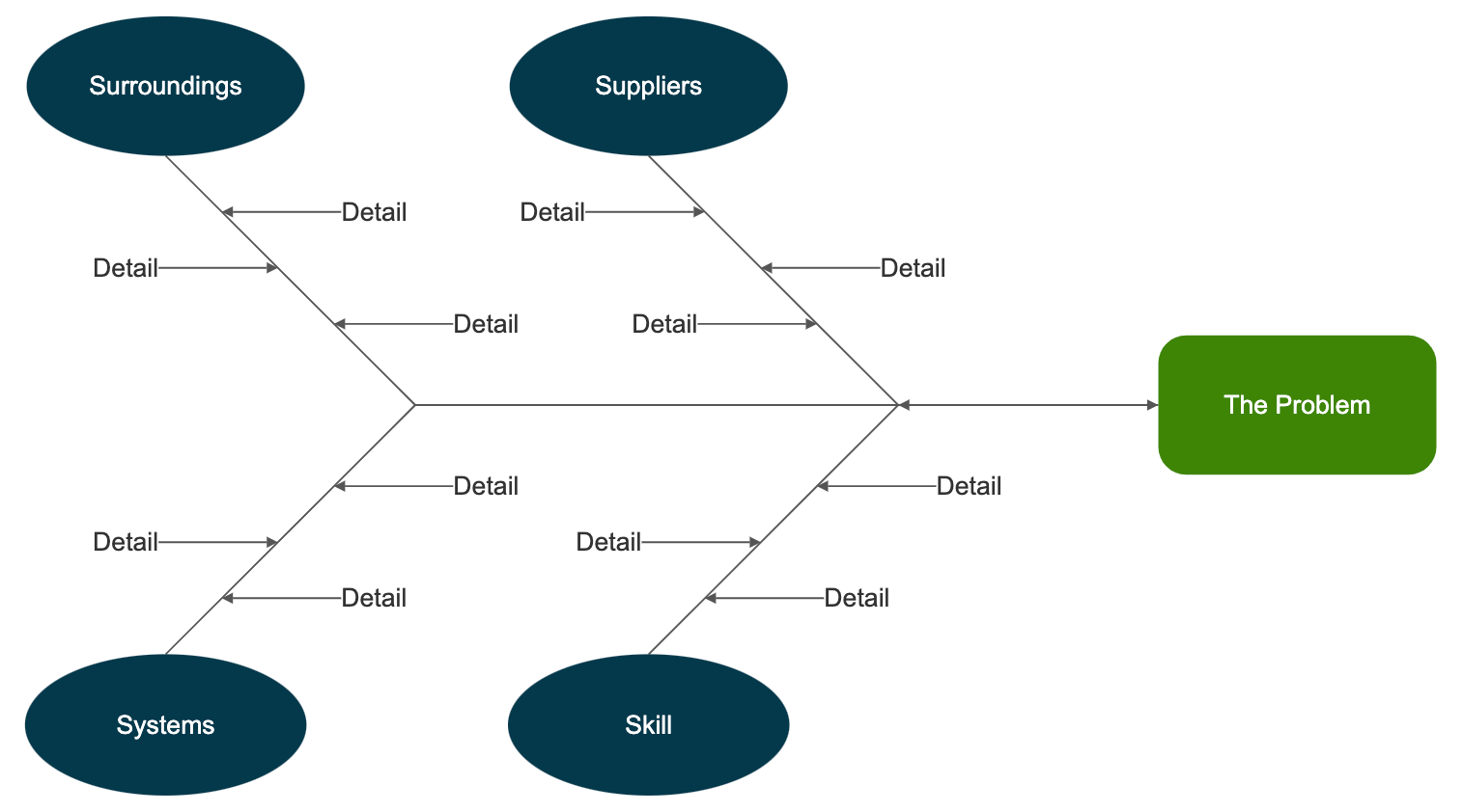
Occasionally, a fifth category will be included called "Safety".
In the marketing industry, cause and effect diagrams will often consist of 7Ps:
- Product. Consider all aspects of what you're selling including its quality, its perceived image, availability, warranties, support and customer service.
- People. When people buy your product or service they may interact with many people: sales people, customer service people, delivery people, and so on. Are there any potential problems with your company culture?
- Process/Procedure. How do you handle problems when they arise? Are they escalated properly? Is your staff trained appropriately and do they follow their training?
- Promotion. Consider advertising, sales, PR, branding, direct marketing, partnerships, and social media.
- Price. How does the price of your product or service compare to competitors? What discounts and payment methods are available?
- Physical evidence/Packaging. How is your product or service consumed? Is how or where you present your product hurting your ability to convert? Are your facilities clean and tidy? Is the packaging cheap or expensive?
- Place/Plant. Is your distribution efficient and cost-effective? Is your product sold in the right stores or neighborhoods? Are your stores convenient for your target customers?
How to Make Cause and Effect Diagrams with SmartDraw
SmartDraw makes creating cause and effect diagrams easy with built-in smart templates that let you add new causes in a single click and format your diagram automatically. Learn how by reading this cause and effect chart tutorial.
Best Practices in Cause and Effect Analysis
These are the best and most common practices when creating cause and effect diagrams.
- Identify the problem. Define the process or issue to be examined.
- Brainstorm. Discuss all possible causes and group them into categories.
- Draw the backbone. Once the topic is identified, draw a straight, horizontal line (this is called the spine or backbone) on the page, and on the right side, draw a rectangle at the end. Write a brief description of the problem in the rectangle.
- Add causes and effects. Causes are added with lines branching off from the main backbone at an angle. Write the description of the cause at the end of the branch. These are usually one of the main categories discussed above. Details related to the cause or effect may be added as sub-categories branching off further from the main branch. Continue to add branches and a cause or effect until all factors have been documented. The end result should resemble a fish skeleton.
- Analyze. Once the diagram has been completed, analyze the information as it has been organized in order to come to a solution and create action items.
Cause and Effect Examples
The best way to understand cause and effect diagrams is to look at some examples of cause and effect diagrams.
Click on any of these cause and effect diagrams included in SmartDraw and edit them:
Browse SmartDraw's entire collection of cause and effect examples and templates
More Cause and Effect Diagram Information
- Cause and effect diagram software
- Fishbone diagram maker
- Fishbone diagram templates
- Quality chart software
Try SmartDraw's Cause and Effect Diagram Software Free
Discover why SmartDraw is the best cause and effect diagram software today.

How to use cause and effect analysis
Reading time: about 4 min
Regardless of the industry you work in, problem-solving will be a part of your job. And when a problem does arise, you can either ignore it and hope it goes away (not recommended) or determine the cause of the problem and find ways to fix it.
It’s more common to ignore issues than you may think. But to maximize your team’s efficiency, you’ll need to establish a method of problem-solving that works for you. A cause and effect diagram is a perfect way to get started.
What is a cause and effect diagram?
A cause and effect diagram (also called a fishbone diagram) is a visual tool that helps you examine the possible causes of a problem. Once you’ve determined the root issue, you can quickly solve it.
Fishbone diagram
The fishbone diagram was developed by Kaoru Ishikawa, a Japanese professor and expert in quality management. It got its name because it looks like a fish skeleton when completed. The “head” is the problem, and the “bones” represent the possible causes branching out from the head.
Fishbone diagrams are often called Ishikawa diagrams, herringbone diagrams, or cause and effect diagrams.
Fishbone diagram template

If you would rather create a fishbone diagram from scratch, follow these basic steps:
- Identify your main issue or problem and write it in a box.
- Draw a long, horizontal line from the left edge of the box. This line is known as the spine.
- From the spine, draw short, angled branches. Each branch represents a potential cause of the main problem. Each branch can also have sub-branches.
How to perform a cause and effect analysis
A cause and effect analysis should be done in a team setting. Working with a team encourages creative thinking and allows you to examine the problem from different angles and perspectives.
If you perform an analysis independently, you risk introducing cognitive biases to the analysis. This can lead to identifying the wrong cause and trying to solve the wrong problem.
When performing a cause and effect analysis, consider:
- The present : What problem do you want to analyze, and what are the significant factors involved?
- The past : What might have caused the problem?
- The future : What are some solutions you can implement to keep the problem from happening again?
Step 1: Clarify the problem
To clarify the problem, you should include information like where and how often the problem occurs and who is involved. The more specific you can be, the narrower your focus is as you problem-solve.
Once you know the real issue, write it in the “problem” box in the diagram.

Step 2: Identify the major factors
What else is contributing to the problem? Factors might include systems or equipment, materials, environment, or people.
On the fishbone diagram, these factors are placed in boxes at the end of each angled branch (or bone) extending up or down the spine. Leave enough room to add possible causes under each.
Step 3: Identify possible causes
For each factor you’ve identified, perform a brainstorming session with your team to list possible causes.
For example, if you’re experiencing a bottleneck, you may have identified team members as one of the possible factors. In this step, you’d take it a step further and determine how team members could be affecting the issue. Maybe their training was inadequate, or their skills were insufficient.
On the fishbone diagram, draw horizontal lines branching from each angled factor line. Add possible causes to these horizontal lines.
Step 4: Analyze your diagram
Your fishbone diagram should now include all the possible causes of the problem. Next, narrow down your list by eliminating the least likely causes. This might require a lot of investigative work, interviews with employees, sending out surveys, and more.
For example, if there seems to be a consistent bottleneck at a specific workstation, your analysis and investigation can help you determine if the root cause is the equipment, the environment, or the employee working at that station.
Once you have identified the most likely root cause, you can create a plan to implement a solution that will fix the problem and prevent it from reoccurring. If you discovered that the cause of the issue was inadequate training, you could implement a standardized training process. That way, all employees—existing or new—would have the same understanding of the work processes.
Collaborate with Lucidspark
Lucidspark is easy to use and fosters creative ideas, effective collaboration, and visual problem-solving. Plus, your documents can be accessed anytime, anywhere in the world, making it perfect for distributed teams to problem-solve efficiently.

Explore hundreds of Lucidspark templates to help you with every use case.
About Lucidspark
Lucidspark, a cloud-based virtual whiteboard, is a core component of Lucid Software's Visual Collaboration Suite. This cutting-edge digital canvas brings teams together to brainstorm, collaborate, and consolidate collective thinking into actionable next steps—all in real time. Lucid is proud to serve top businesses around the world, including customers such as Google, GE, and NBC Universal, and 99% of the Fortune 500. Lucid partners with industry leaders, including Google, Atlassian, and Microsoft. Since its founding, Lucid has received numerous awards for its products, business, and workplace culture. For more information, visit lucidspark.com.
Related articles
Visual problem-solving: the secret sauce of successful teams.
Supercharge your team’s problem-solving skills by implementing visuals to find the most effective solutions faster.
What is the problem-solving process?
Learn the components of the problem-solving process and techniques for problem-solving with your team (plus access free templates).
Bring your bright ideas to life.
or continue with
By registering, you agree to our Terms of Service and you acknowledge that you have read and understand our Privacy Policy .

- Mind Map Maker
- Concept Map Maker
- Bubble Map Maker
- Brace Map Maker
- Sunburst Chart Maker
- Strategy Planning
- Timeline Maker
- Tree Diagram Maker
- Fishbone Diagram Maker
- Organizational Chart Maker
- Gantt Chart Maker
- Spider Diagram Maker
- EdrawMind AI
- AI Summarize
- AI Mind map
- AI Article generation
- AI Copywriting
- AI Translation
- -->> AI Note Taker
- --> --> >--> -->