
By Matt Moran January 3, 2024

22 Best PowerPoint Color Schemes to Make Your Presentation Stand Out in 2024
There’s nothing worse than an amateur PowerPoint presentation. If you’re going into a business meeting or sales pitch, your presentation slides should look as professional as you do. That’s why choosing the right color scheme is so important.
In this post, we’ll be sharing a roundup of 22 of the best PowerPoint color schemes you can use to make your presentation look the part.
All the color schemes on this list have been incorporated into templates created by professional designers, so they’re super-stylish and guaranteed to make your slides stand out.
Whether you’re an educator looking for a color scheme that will keep your students engaged, or a business professional who wants to make an impact in your next meeting, you’re sure to find something suitable below.
Tips for Choosing the Best PowerPoint Color Schemes
Before we jump into the roundup, let’s talk about how to choose the right color scheme for your needs. Here are a few things to bear in mind when you’re comparing your options.
1. Use High Contrast Colors
When it comes to color, contrast is the number one most important consideration. Text, icons, and other important graphics on your slides need to be highly readable, so you need to make sure to use high contrast colors for these elements.
In other words, use a color with a significantly different tone/brightness from your background. Certain colors are inherently lighter/darker than others. For example, blue is much darker than yellow. As such, these colors tend to pair well together.
I’d also recommend never combining warm and cold colors, like bright red on bright blue or vice versa. This is because human eyes have trouble distinguishing interactions between the different wavelengths, which causes eye fatigue.
2. Consider Color Associations (Psychology)
People have certain subconscious associations with different colors. For example, people associate blue with trust, calmness, and reliability, which makes it a safe choice for business presentations.
Green is associated with nature, peace, and organic products, which might make it a good choice if you’re working on a sales pitch for an eco-friendly product.
Black evokes sophistication, seriousness, evil, and mystery, so it can work just as well for spooky Halloween lesson PowerPoints as for high-end fashion brand presentations.
Try to choose a color scheme that fits the kind of associations you want to make. If you’re working on a brand PowerPoint presentation, a safe bet is to stick with your brand colors.
3. Always Use Gradients
In nature, colors rarely appear in solid blocks – they transition gradually from one hue to the next and blend into each other.
Because we’re used to seeing colors naturally act this way, you should try to do the same in your PowerPoint presentations by blending colors into each other using gradients. Blocks of solid color can look amateurish.
The good news is that all the templates on this list are designed by professionals who understand this and therefore use natural color gradients to create a professional look.
4. Choose the Right Color Scheme for Your Screen Type
Finally, don’t forget to consider the screen you plan on showcasing your PowerPoint presentation on. Darker color schemes will look good on close-up screens like tablets and desktops. However, lighter colors work better for projections as they tend to be more readable.
In particular, never use red text if you’re projecting your presentation onto an external screen, as if any kind of unwanted ambient light/glare hits the screen, the color will wash out. In fact, it’s best to avoid any brightly colored text if you’re using a projector.
22 Best PowerPoint Color Schemes
Alright, let’s jump into the list. Below, we’ve listed our top 22 favorite PowerPoint templates with awesome color schemes.
1. Shades of Grey and Yellow – Our Top Pick
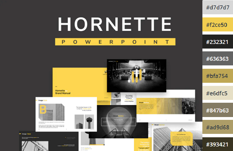
If you’re looking for a darker color scheme to use for a business presentation, you can’t go wrong with the Hornette template. Darker shades of grey and black strike a serious tone that befits a corporate environment, which is offset by bold yellow highlights.
We like how the high contrast between the darker shades and the bold yellow can be used to direct the readers’ gaze to the most important elements on the page and make key messages stand out.
The template itself includes 50 slides, including a gallery and portfolio slide, and features creative layouts and useful graphics. All graphics can be resized and edited.
2. Teal and White
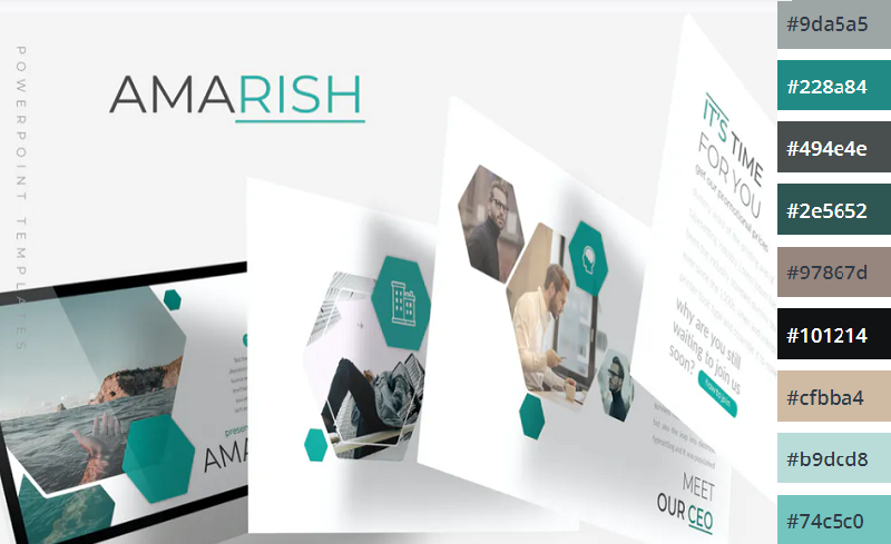
Teal is a color that blends blue’s dependability with green’s optimism and healing properties. The result is a calming, balanced color that’s packed with personality.
This multipurpose PowerPoint template uses teal alongside plenty of whitespaces and is perfect for business and personal presentations. All elements are fully editable, and if teal and white isn’t your style, you can pick another of the 5 included premade color schemes included.
3. Shades of Black

Dark themes are very on-trend right now. If you want to add a touch of sophistication to your presentation or strike a serious tone, you can’t go wrong with this Halbert PowerPoint template.
The all-black color scheme looks slick and elegant, and the white text is highly readable. This template works best when you don’t have to worry about room lighting, and might be a good fit for fashion presentations.
4. Color Fun
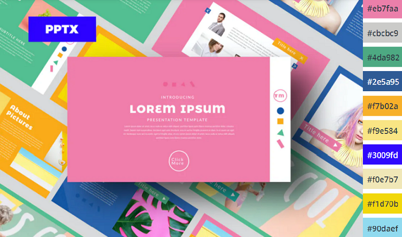
If you want something a little more upbeat, try this Color Fun PowerPoint template. It uses a wide color palette, which can help provide enough variety to better organize the different sections and elements on your slides.
It’s bright, upbeat, and sets a positive tone – without being too overwhelming. The designer has toned down the colors just enough that they’re not distracting and won’t cause eye fatigue.
5. Monochromatic Blue
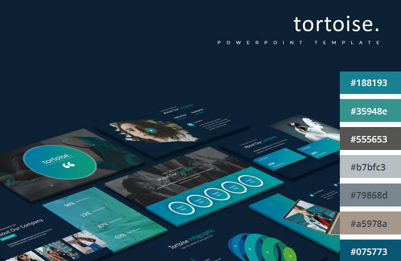
This Tortoise PPT template uses a mix of light and darker blues to create a stylish, professional look. The download includes 150 slides in total, split into 5 colors (30 slides per variation). All graphics included are fully editable and resizable in PowerPoint.
6. Minimalist Light Colors
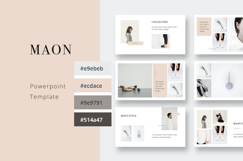
Bold and bright colors can work well but sometimes, it’s best to keep things simple. This clean and modern PowerPoint presentation follows the principle of minimalism, with very light shades like beige and pale green. It comes in a 1920x1080p format and includes a bunch of awesome icons and graphic elements that are fully vector editable.
7. Orange Burst
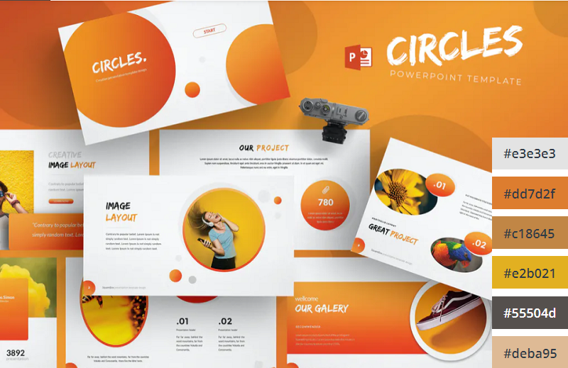
Orange is the most vibrant color in the color spectrum. It’s full of energy and life, so it’s perfect when you want to really get your audience excited about the contents of your presentation. This PowerPoint template from aqrstudio uses orange gradients alongside circular icons and graphics.
8. Yellows and Whites
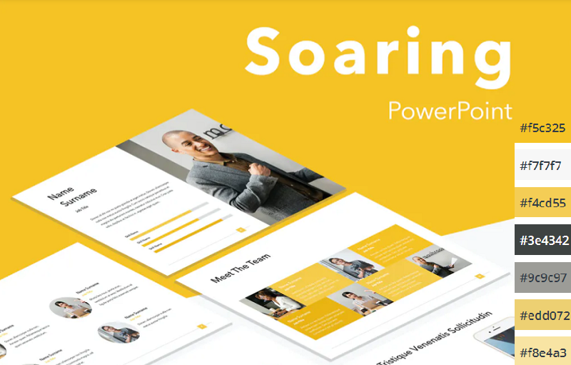
If you’re looking for a yellow template, check out Soaring by Jumsoft. It features an energetic, professional design and includes 20 master slides in the standard 4:3 side, as well as charts, diagrams, tables, and other awesome visual elements. You can choose the layout that’s most suitable for your content and customize more or less everything in MS PowerPoint.

Pastels are the color trend of the year. These lighter, softer shades of colors have been embraced by younger generations like Millennials and Gen Z and have rapidly become associated with self-care for their ‘calming effect’. If you want to incorporate them into your PowerPoint color scheme, check out this pastel template by UnicodeID.
10. Organic Greens
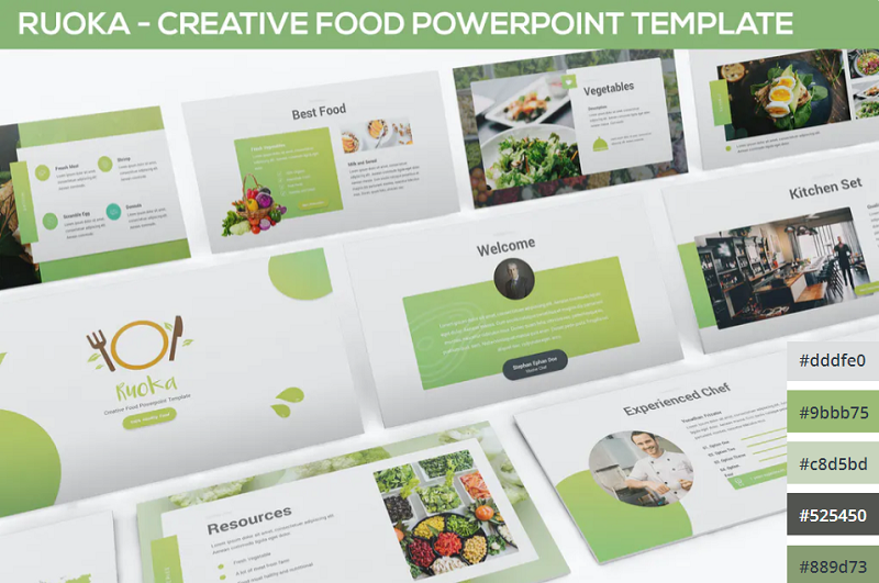
Working on a food-related presentation for a culinary business? Or perhaps you’re putting together a pitch deck on an environmental topic? Either way, this organic green PowerPoint template has the perfect color scheme for you. It’s ideal for health and nature-related slides.
11. Bold Red and Black
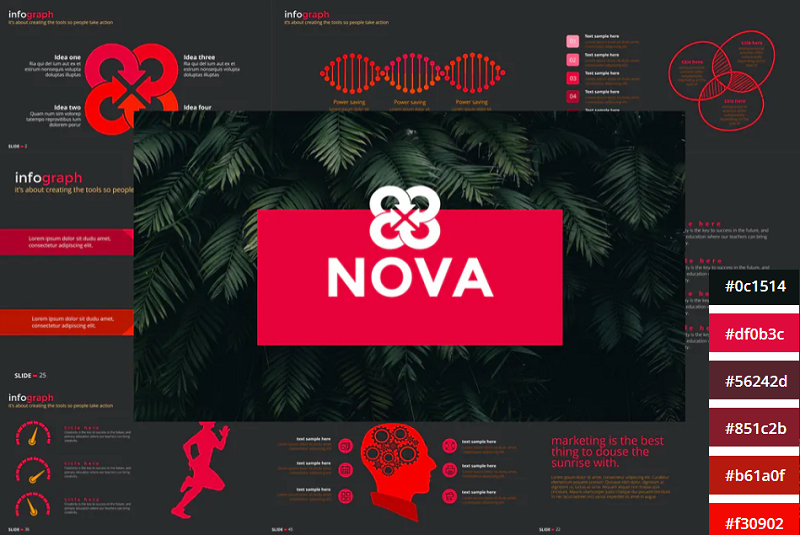
The NOVA PowerPoint template by Artmonk uses a stunning red-on-black color scheme. It’s a bold color combination that packs a punch, so it’s great for presentations in which you’re trying to break the mold and make a statement. It’ll look great on screens but might not show up well on projector displays due to the dark background.
12. Bright Multicolor

Here’s another awesome multi-colored palette that’s upbeat and fun. Wide color palettes like this are great for large slide decks as they give you a lot of options to choose from. I can see this one working really well for creative agencies and personal portfolios.
13. Lime and Dark Blue
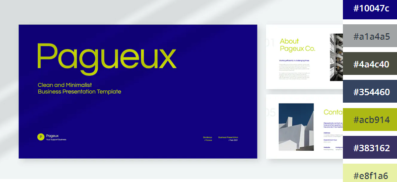
Blue and yellow is a classic combination. This lime and dark blue template offers a new twist on that classic combo to make it a little more exciting. If you already use dark blue as part of your brand color palette, this is a great template to use.
14. Pretty Pink
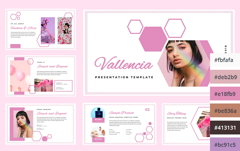
The Pretty Pink color scheme is perfect for creating feminine and youthful PowerPoint presentations. This would be perfect for female-oriented business products, or presentations about beauty, pop culture, and more.

Teal is the perfect color scheme for exuding wealth and intelligence. In color psychology, green connotes wealth and money, whilst blue evokes intelligence. Teal is the perfect blend of the two colors, which makes it a great choice for financial presentations and documentation.
16. Dark with Splashes of Color
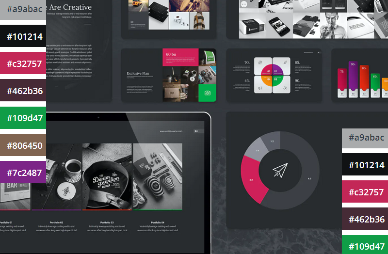
If you want a luxurious and ultra-modern color scheme, Black with splashes of color is just the ticket. The black creates a sleek and professional feel, whilst the bold and colorful highlights make the key information in your presentation pop.

Coral is a bold and vivid color scheme perfect for making an impact on your presentations. This PowerPoint template utilizes coral as the background of each slide which helps the text and other visuals to really stand out.
18. Classic Blue and White
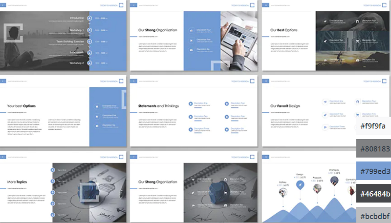
If you’re looking for a clean, modern, and professional color scheme for your PowerPoint presentations, you can’t go wrong with classic blue. The color scheme evokes professionalism and technological prowess and is perfect for tech businesses and startups. The Contact PowerPoint from Envato Elements is a great example of how this color scheme can be used.
19. Pinks and Purples
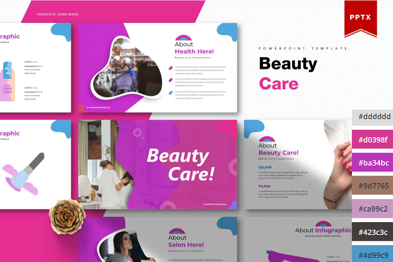
Pinks and Purples is a vibrant and feminine color scheme that would work perfectly for beauty brands and retail stores. The colors are bold and inviting and have a luxurious feel. This Beauty Care template from Envato Elements utilizes this color scheme as well as unique shapes to make for a visually interesting presentation.
20. Winter Watercolors
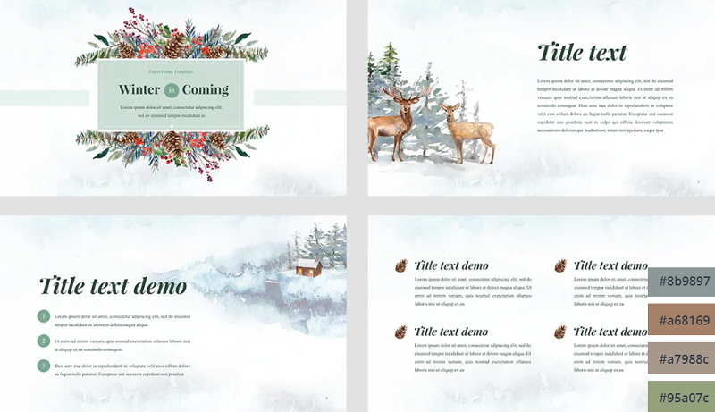
Winter Watercolors is a great color scheme for festive presentations. The muted, blue, and green cold tones are easy on the eye and evoke a homily feeling. This would be perfect for creating slideshows for Christmas parties or other winter-themed events.
21. Coral Highlights
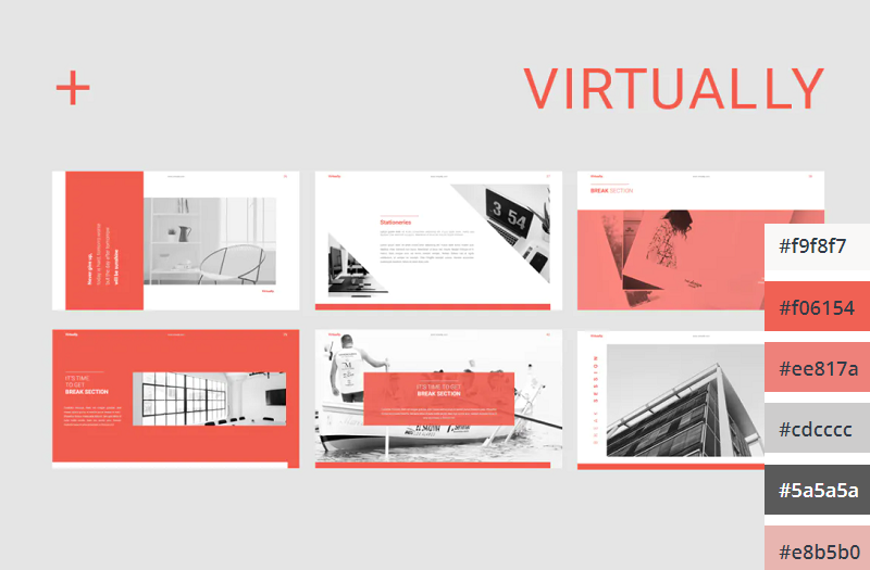
Unlike the last coral color scheme we looked at, which used a coral background with white text, this template uses mostly white slide backgrounds. Coral is used much more sparingly to highlight key elements on the slide. This gives the PowerPoint a more relaxed and feminine touch.
22. Primary Colors
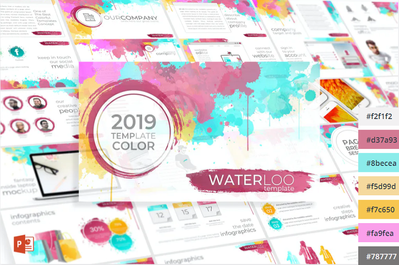
This Primary Colors color scheme is perfect for adding a vibrant touch to your presentations. This color scheme is a modern take on the classic colors of red, yellow and blue, and would be perfect for creating fun and engaging business presentations.
Related Posts
Reader interactions, droppin' design bombs every week 5,751 subscriber so far.
You have successfully joined our subscriber list.
Leave a Reply Cancel reply
Your email address will not be published. Required fields are marked *
Notify me of followup comments via e-mail. You can also subscribe without commenting.
- Slidesgo School
- Presentation Tips
How to Choose the Best Colors for Your Presentations

Choosing colors for your slides is one of the most crucial decisions to make even before starting to work on your Google Slides or PowerPoint presentation. Basically, colors can help you communicate your message more effectively, and they can evoke many different feelings or emotions on your audience. Keep reading to find out how to choose the best colors for your presentation.
Color Psychology
Color temperature, neutral colors, some tips on how to combine colors for your presentation.
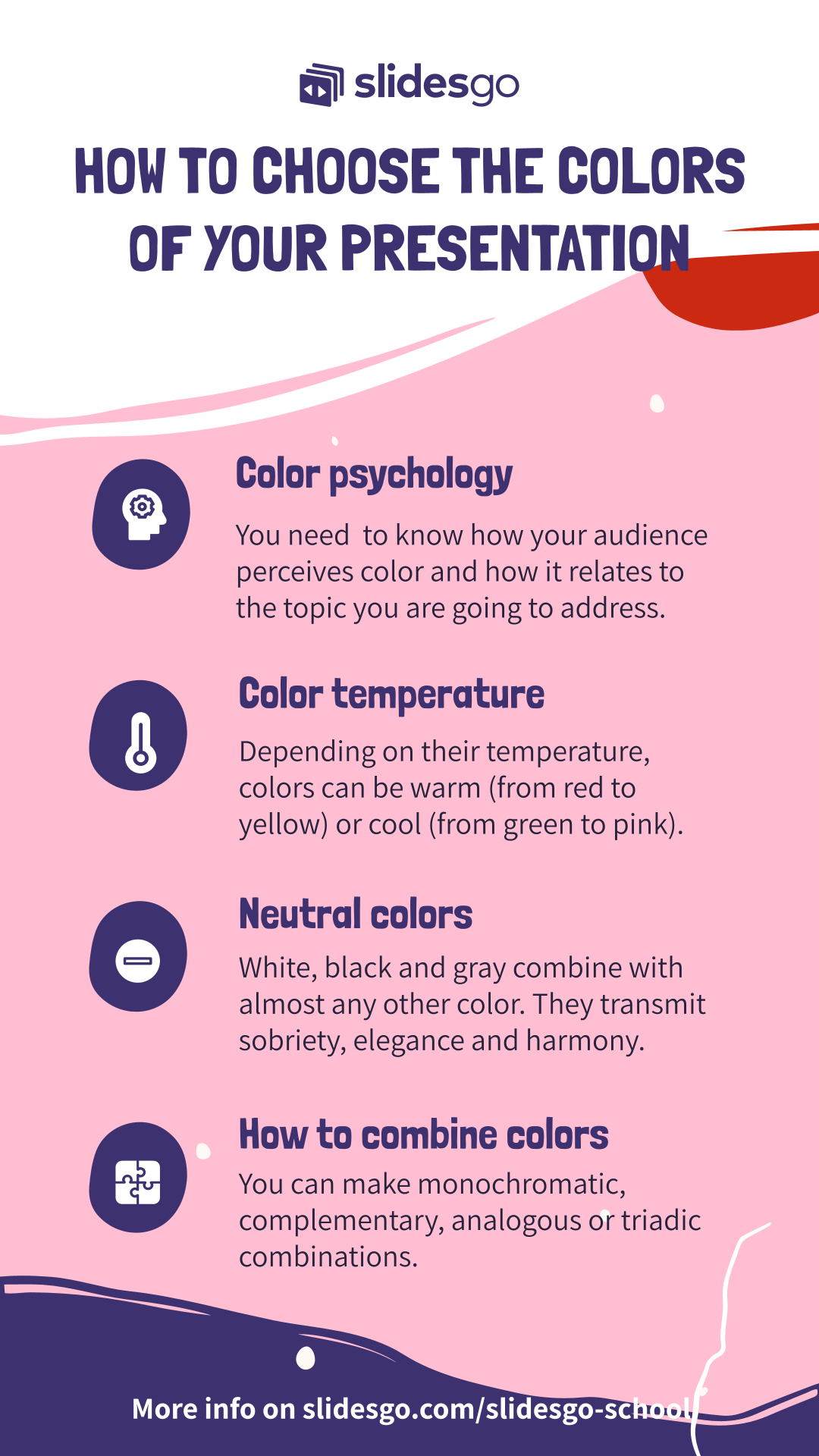
It is quite important to know how your audience perceives colors and how these are related to the topic you are talking about. For example, red can convey a sense of danger, but also love, depending on the context. These are some common connotations that colors have on humans:
- Red : Evokes passion and strength. It’s an energetic and intense color that represents power and determination. It’s usually present on brands related to beverages, gaming and the automotive industry.
- Blue : Conveys a sense of security, confidence, responsibility and calmness. It is the most representative color in the healthcare and finance industries.
- Yellow : This is the color of light. It is a stimulating color that conveys energy, awakes awareness and inspires creativity. You will surely find yellow in the food industry.
- Green : Undeniably, the color of nature, life and peace. This color conveys a sense of growth, balance and stability like no other. It is quite popular among big companies, especially in the energy and tech industries.
- White : It is considered the color of purity and innocence. When it comes to evoking simplicity, optimism and integrity, white is second to none. You will find it for sure in the healthcare industry, and it is making its way in the fashion industry too.
- Black : Even though black is associated with seriousness, it can also convey elegance and courage. Fashion brands and luxury products make good use this color.
Take note of these hints and try to choose the color that best suits your message. For example, in this template we used bright and vibrant colors, since it is an education-themed presentation intended for a very young audience:
Click here to download this template
Colors can be grouped based on their temperature , which can be determined by comparing any given color in the visible spectrum with the light that a black body would emit when heated at a specified temperature. So, according to their temperature, there are two groups of colors:
- Warm colors: These range from red and orange to yellow. If you click on the footer below, you will be able to download one of our templates containing a palette full of warm colors:
- Cool colors: These range from green and blue to violet. Again, click on the footer below to download a template that contains cool colors:
Mainly, warm colors convey energy and optimism—it is like giving a warm reception to your audience. On the other hand, cool colors are associated with serenity and confidence, just what you need to have a peaceful time.
White, black and all shades of gray are not considered neither warm nor cool. In fact, we could say colors such as creme, beige, brown and others with a high amount of gray are also neutral. These colors do not influence others and can actually be combined with almost any color. As for their meaning, elegance and solemnity are pretty much guaranteed, as well as harmony. When combining neutral colors, oftentimes a bright color is used as a contrast to highlight certain elements and bring them to the front. Click on the footer below to see an example of a presentation with neutral colors:
To achieve a nice color harmony and make the most of it, it is best if you take into account the color wheel, as well as the concepts of hue, saturation and brightness.
- Hue is basically what differentiates a color from any other. Thanks to the hue, you can visually tell apart red from blue, for example.
- Brightness defines how light or dark a hue is, and measures its capacity to reflect white light.
- Saturation refers to how pure a hue is. A saturated color appears more vivid, whereas a desaturated color looks duller.
With this information, you can make several different combinations:
- Monochromatic Color Scheme: These contain different shades of a single color. Click on the footer to see one of our monochromatic templates based on red.
- Complementary Color Scheme: These are composed of a pair of opposing colors on the color wheel. If you click on the footer below, you will be able to download a presentation template with this scheme.
Analogous Color Scheme: This scheme includes colors that are adjacent to each other on the color wheel. Click on the footer to see an example of this scheme applied to a presentation:
Triadic Color Scheme: This uses three colors equally spaced on the color wheel. Click on the footer to download a presentation that makes use of the triadic color scheme.
In order to get the best combination, you will need to consider how many colors you will use in each slide and how you will manage the contrast between them. These should also be suitable for your intended message or your brand. Finally, try not to overuse very intense colors—use them only for emphasis. Keep everything consistent by applying the same color to each instance of an element within your presentation (for example, use the same color in all the titles). Include illustrations or pictures that work well with the chosen palette. If you need to apply filters to the pictures, you can refer to our “ How to Apply Filters to the Pictures in Google Slides ” tutorial, or its PowerPoint equivalent. Some of our templates include color variants, making it so much easier for you to adapt them to your topic and/or brand. Just click one of the options that you will find below “Themes” on the right side of the screen.
Selecting color variants
Do you find this article useful?
Related tutorials.
New feature available: edit our templates with Canva
Whenever you need to create, Slidesgo is there. We’re continually enhancing your presentation design process with templates that are primed to impress for any occasion. And in order to let your ideas flow best, comfort is key. How could Slidesgo help you with this? By making you feel right at home with our resources, no matter your preferred platform.You spoke, and we listened. Now, your favorite slides can be accessed on a new platform: Canva! This new format adds to our existing options (PowerPoint and Google Slides), expanding your ways to utilize our first-rate presentation content. We’ve started with a selection of Canva-ready...
How to print PowerPoint notes
Crafting an impactful PowerPoint slideshow and delivering a captivating presentation are distinct skills. The first focuses on designing appealing visuals to convey a clear message, while the second involves employing effective presentation techniques to ensure the audience grasps the idea. The content of this article will help you with the latter part of this process, guiding future presenters on how to print PowerPoint with speaker notes to enhance your presentations success and effectiveness.

Discover Our Online Presentation Software for Free
We have great news for you today! If you’ve been a Slidesgo fan for years (or months, or weeks, or days, or mere hours, we welcome everyone!), you’ll probably know for now that our templates are available mostly in two formats: for use in Google Slides and PowerPoint.Google Slides is a free tool, since you only need a Google account in order to use it. PowerPoint, on the other hand, is part of the Microsoft Office suite, so it’s not a free program, but that didn’t stop it from being one of the most popular options in the world!What if we...

Webinar: Presentation Audit
With more than 15,000 templates released on Slidesgo and a user base composed of millions of people, we estimate that the total number of presentations created adds up to… um, a lot! Our team of professional designers work very hard to provide you with editable slides so that the only thing you need to do is, well, customize the elements to your liking. Starting from any given template, the results may vary a lot depending on the person who edited the contents.Have you ever wondered “Is my presentation good enough?” and wished that an expert on presentations looked at your template...
30+ Stylish PowerPoint Color Schemes 2024
Color is an element that can make or break a design, and that rule holds true for presentation design as well. Choosing the right PowerPoint color scheme is super important.
But there’s one extra thing to consider – where your presentation will be given. A PowerPoint presentation can look quite different on a computer or tablet versus on a projected screen.
When it comes to selecting a PowerPoint color scheme, this is an important consideration. We’ve rounded nearly stylish PowerPoint color schemes as inspiration. While darker color schemes might look great close-up on screens, opt for lighter backgrounds (for enhanced readability) for projected presentations.
Note: The last color in each scheme is for the slide background.
How Does Unlimited PowerPoint Templates Sound?
Download thousands of PowerPoint templates, and many other design elements, with a monthly Envato Elements membership. It starts at $16 per month, and gives you unlimited access to a growing library of over 2,000,000 presentation templates, fonts, photos, graphics, and more.
Minimal PPT Templates
Clean & clear.

Pitch PowerPoint

Maximus Template
Explore PowerPoint Templates
1. Blue, Gray Green & Orange

With a bright overall scheme that’s easy on the eyes, this color scheme can help you create a modern PowerPoint presentation that’s readable and friendly. You can even tweak the colors somewhat to better work with your brand, if necessary.
The best thing about this color palette is that it lends itself to plenty of different presentation styles and applications.
2. Violet Gradient
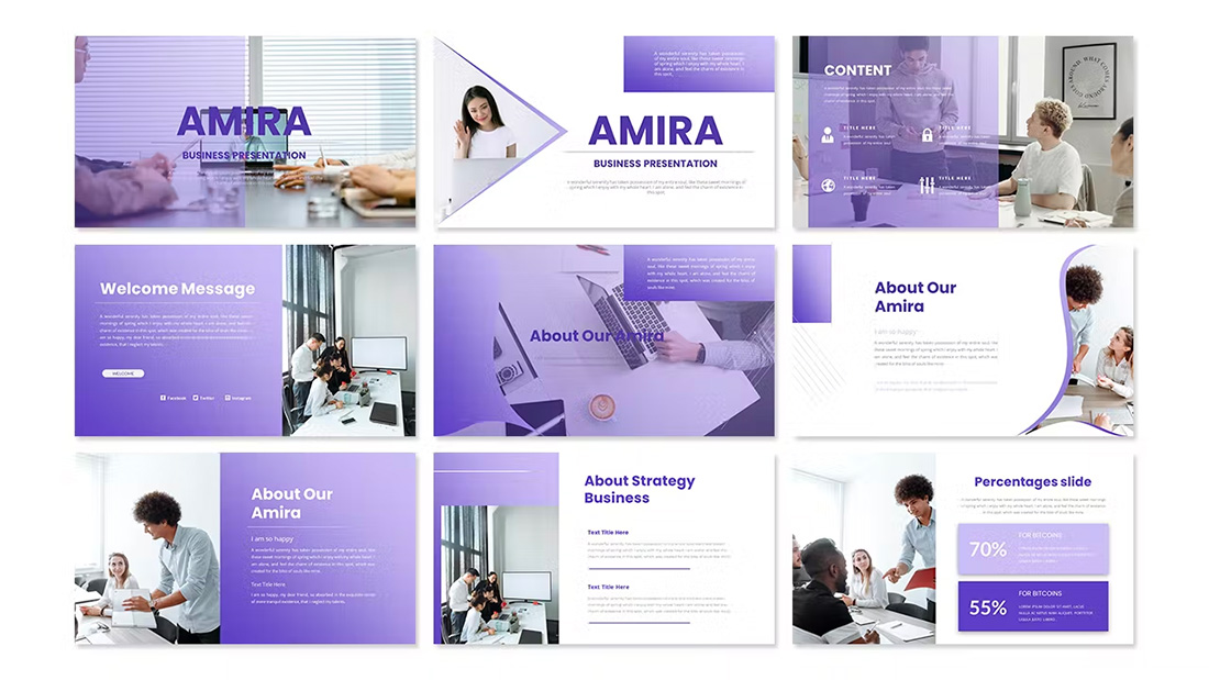
Using the first two colors noted above, you can create a dark-to-light monotone gradient that can make for a modern PowerPoint design style.
Take this concept and expand it to any other colors you like for your spin on this modern color scheme.
3. Mint and Orange

On paper, these colors don’t seem to blend all that well, but with the right application min and orange on a black background can work.
Use a pair of colors like this for presentations where you are trying to make a bold statement or impact. This concept is often great for trendy topics or ideas that are a little unconventional.
4. Bright Blue and Light
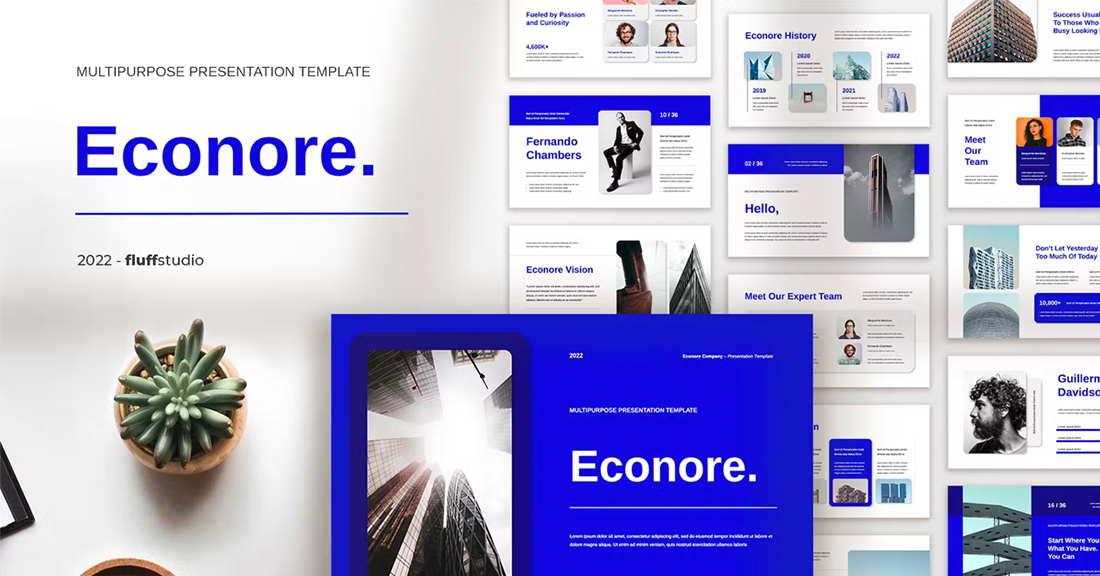
The brighter, the better! Bright blue color schemes are a major trend in PowerPoint design … and for good reason. The color combination creates a bright, light feel with easy readability. Those are two things that pretty much everyone wants in a presentation template design.
The other thing that’s great about a color scheme like this – which focuses on one color – is that it matches practically everything else in the design with ease. It’s great for image-heavy presentations or those where text elements are a key focal point.
5. Teal and Lime

Two colors that you might not expect to see paired create a classy combo that’s interesting and engaging. Both teal and lime are considered “new neutrals” and work with a variety of colors easily. (What’s somewhat unexpected is putting them together.)
What’s great about this PowerPoint color scheme is that the extra interest from the hues can help generate extra attention for slides. The template in the example also mixes and matches teal and green primary color blocks to keep it interesting from slide to slide.
6. Colorful Gradients

Gradients are a color trend that just keeps reinventing and resurfacing. In the latest iteration, gradients are bright with a lot of color. Designers are working across the color wheel for gradients that have more of a rainbow effect throughout the design, even if individual gradients are more subtle.
What you are likely to see is a variety of different gradients throughout a project with different colors, but maybe a dominant color to carry the theme. Use this for presentation designs that are meant to be more fun, lighter, and highly engaging.
7. Light Blue Minimal

This color scheme with light blue and a minimal aesthetic is super trendy and so easy to read. You can add a lot of style with a black-and-white style for images or a deep blue accent for header text.
While a pale blue is ideal here, you could also consider experimenting with other pastels and the same overall theme for a modern presentation design.
8. Bright with Dark Background

The combination of bright colors on a dark background can be fun and quite different from the traditional PowerPoint color schemes that are often on white or light backgrounds. This design style for a presentation is bold and engaging but can be a challenge if you aren’t comfortable with that much color.
When you use a style like this, it is important to think about the presentation environment to ensure that everything will look as intended. A design like this, for example, can work well on screens, but not as well on a projector or in a large room.
9. Navy and Orange

The navy and orange color combination is stylish and classic for presentation design. To add a fresh touch consider some of the effects such as the template above, with color blocking and overlays to add extra interest.
What makes this color combination pop is the element of contrast between a dark and a bright pair. The navy here is almost a neutral hue and works with almost any other design element.
10. Dark and Light Green
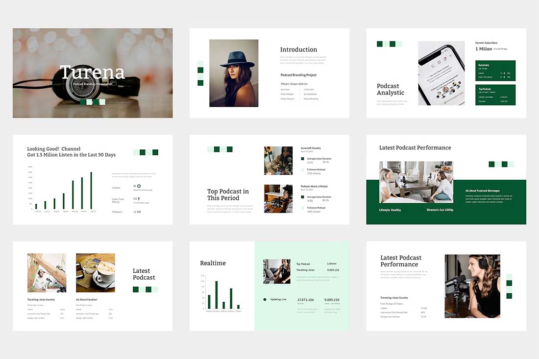
A modern take on a monotone color scheme involves using two similar colors that aren’t exactly tints and tones of one another. This pairing of dark green and light (almost minty) green does precisely that.
What’s nice about this color scheme is that the colors can be used almost interchangeably as primary elements or accents. It provides a lot of flexibility in the presentation design.
11. Bright Crystal Blue
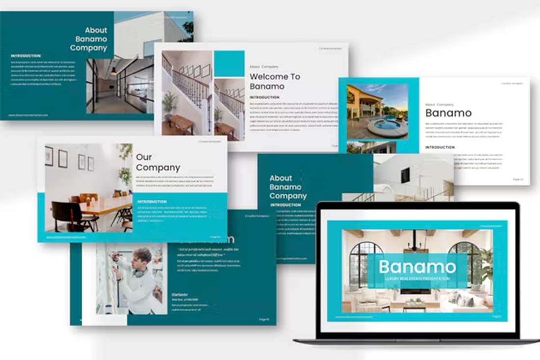
Blue presentation color schemes will always be in style. The only thing that changes is the variance of the hue. This pair of blues – a bright crystal blue with a darker teal – works in almost the same way as the pair of greens above.
What’s nice about this color palette though is that the dark color is the accent here. That’s a modern twist on color design for presentations.
12. Blue and Yellow

Blue and yellow are classic pairings and can make for a striking presentation color combination. With a bright white background, these hues stand out in a major way.
What works here is the element of contrast. A darker blue with a brighter yellow creates an almost yin and yang effect with color. The only real caution is to take care with yellow on a white or light background with fonts or other light elements.

Teal is a personality-packed color choice. If you are looking for a bold statement with a PowerPoint template, start here.
While the above color scheme also includes a hint of yellow for accents, the teal color option is strong enough to stand alone. You could consider a tint or tone for a mono-look. It also pairs amazingly well with black-and-white images.
Teal is a fun color option that will provide a lot of practical use with your slide deck.
14. Bright Coral

This color scheme is one of those that you will either love or hate. The bright coral color is powerful and generates an immediate reaction.
It’s also quite trendy and will stand out from many of the other more bland PowerPoint colors that you may encounter. This is a great option for a startup that wants to present with a bang or a brand that has a similar color in its palette. It may not work so well for more traditional brands or those that are more conservative with their slide designs.
15. Dark Mode Colors

A dark mode color scheme might be the biggest trend in all of design right now, and that also applies to presentation design.
This purple and emerald color paired with black with white text looks amazing. It is sleek, modern, and has high visual appeal without having to use a lot of images.
This works best for digital presentations when you don’t have concerns about room lighting to worry about.
If you aren’t ready to jump into dark mode on your own, the Harber template above is a great start with nice color, gradients, and interesting shapes throughout the slide types.
16. Navy and Lime
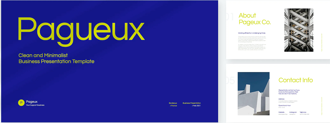
A navy and lime combination is a modern take on colorful neutrals that are anything but boring.
These colors have a nice balance with a white or light background and are fairly easy to use. With so many brands already using blue in their base color palette, this is an option that works and is an extension of existing elements for many brands. (Use your blue and add the lime to it.)
Also, with this color combination, the idea of a minimal overall slide structure is nice so that the power of the colors and impact comes through. They work beside images in full color or black and white.
17. Modern Blue

When you aren’t planning to use brand colors – or maybe as a startup or independent contractor so you don’t have them yet – a modern color combination can add the right flair to a PowerPoint presentation.
The bright grayish-blue in the Lekro PowerPoint template – you can find it here – adds the right amount of color without overwhelming the content. Plus, subtle orange accents help guide the eye throughout this PowerPoint color scheme. https://elements.envato.com/lekro-powerpoint-presentation-67YW3M
18. Blackish and Yellow

While at first pass, black and yellow might seem like a harsh color combination, it can set the tone for a project that should emanate strength. This PowerPoint color scheme softens the harshness of the duo with a blackish color, that’s grayer and has a softer feel.
Pair this combo on a light background or with black and white images for a stylish, mod look.
19. Orange and White

A bright color can soften the harshness of a stark PowerPoint design. Especially when used for larger portions of the content area, such as background swatches or to help accent particular elements.
The Sprint template makes great use of color with a simple palette – orange and white with black text – but has slide ideas that incorporate the color throughout for something with a more “designed” look to it. (And if you aren’t a fan of the orange, change the color for use with this template to keep the modern feel.)
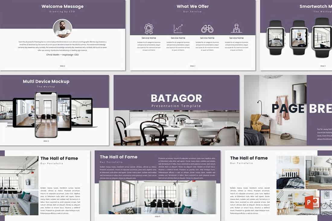
Purple presentations are in. The color, which was once avoided by many in design projects, has flourished with recent color trends.
Because more funky, bright colors are popular, a presentation with a purple focus can be acceptable for a variety of uses. The use in Batagor template has a modern design with a deep header in the featured color, which works best with images that aren’t incredibly bold in terms of color.
21. Blue-Green Gradients

Another trending item in color is the use of gradients. This trend can be applied to PowerPOint presentations as well.
Use a blue-to-green gradient for a soft and harmonious color scheme that won’t get in the way of content. Use each hue alone for accents and informational divots throughout the presentation design.
22. Black and White

Minimalism is a design trend that never goes away. A black-and-white (or gray) presentation screams class and sophistication.
It can also be easy to work with when you don’t want the color to get in the way of your message. And if a design can stand alone without color, you know it works.
23. Reds and Black
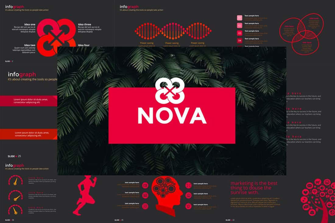
If you are designing a presentation for viewing on screens, such as desktops or tablets, a dark background with bright color accents and white text can work well. (This combination gets a lot trickier on projector displays.)
While reverse text and red aren’t always recommended, you can see from the Nova template that they can be a stunning combination. But note, this modern color scheme is best for specific content and audiences.
24. Blue and Pink
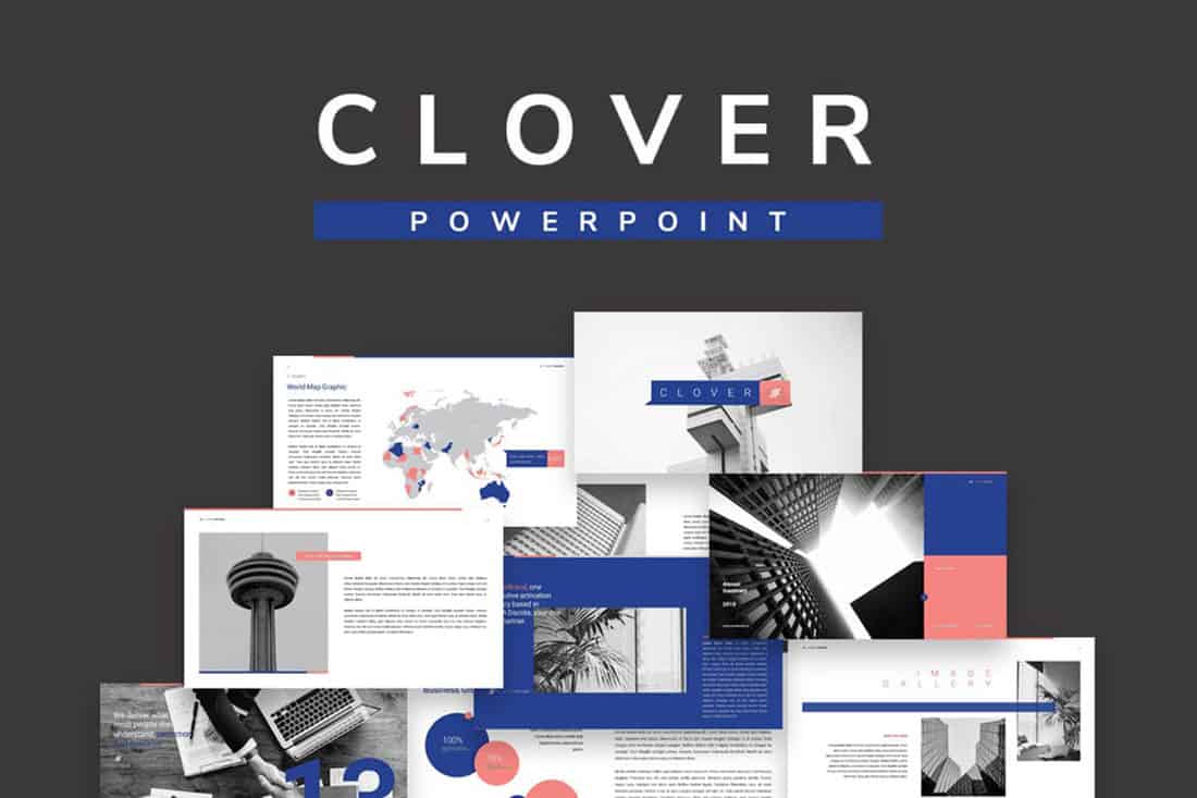
This color scheme is a spin on Pantone’s colors of the year from 2016. https://designshack.net/articles/graphics/how-to-use-the-pantone-color-of-the-year-in-design-projects/ The brighter, bolder versions of rose quartz and serenity and fun and sophisticated.
The unexpected combo sets the tone with a strong, trustworthy blue and adds softness with the paler pink. The colors work equally well with white or darker backgrounds.
25. Blue and Green

Blue and green accents can help a black or white background come to life in a presentation template. The colors here can work with either background style, based on how you plan to display your presentation.
What’s nice about these colors is that they are pretty neutral – since both are found in nature – and can be used with ease for design or text elements in a PowerPoint color scheme.
26. Beige and Gray
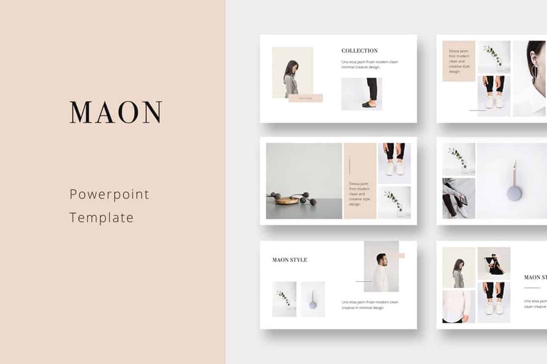
If you are looking for a softer color palette, consider beige and gray. These hues can work well on screens or projected, making them a versatile option.
The nice thing about such a neutral palette is that it gives content plenty of room, so that will be the true focus of the presentation.
27. Tints and Tones
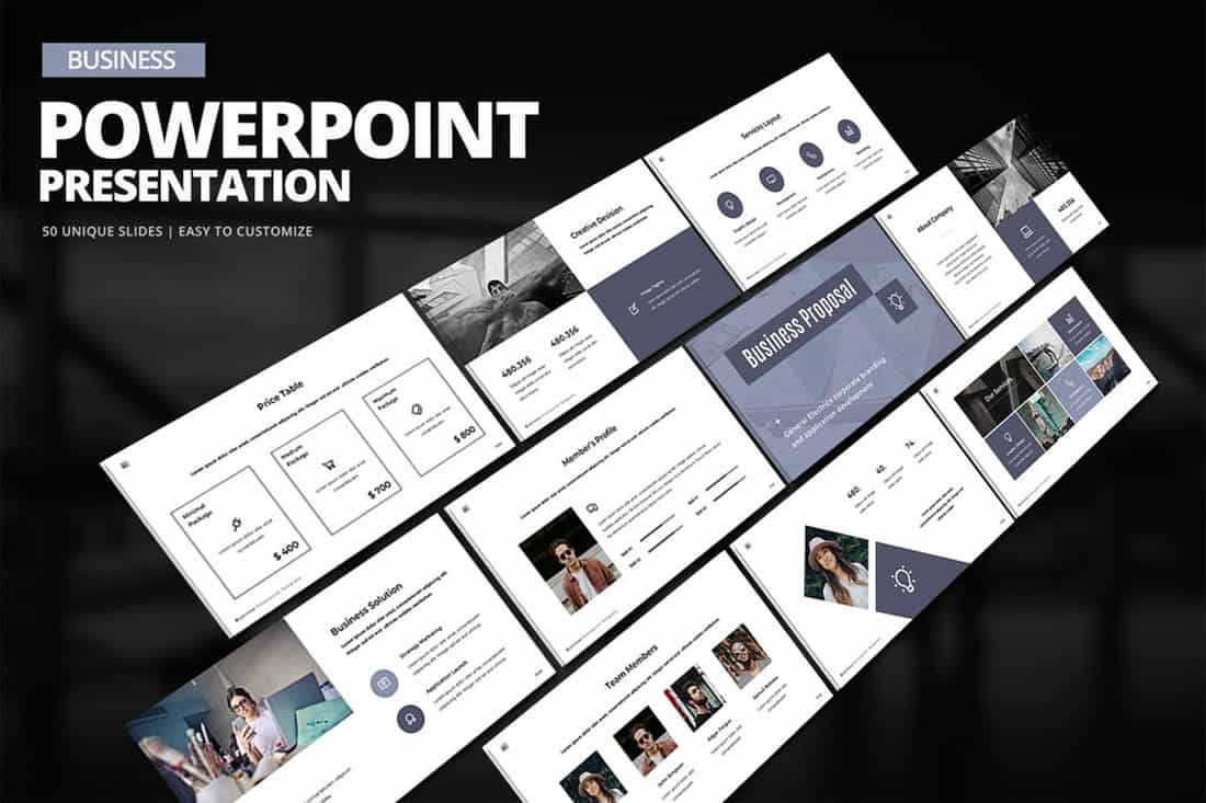
While the purplish blue-gray in the Business PowerPoint Presentation template is stunning, it represents a greater trend in presentation design. Pick a color – maybe your dominant brand color – and use tints and tones for the presentation color scheme.
By mixing the color with white or black and gray, you’ll end up with a stunning set of color variations that match your messaging.
28. Bold Rainbow

While most of the color schemes featured here only include a color or two, bright color schemes with wider color variations are trending.
This distinct “rainbow style” can be somewhat difficult to use without rules for each color. Proceed with caution.
29. Bright Neutrals

Lime green is the brightest “neutral” you might ever use. A fun palette that’s versatile can be a solid foundation for a color palette.
It works exceptionally well in the Rouka PowerPoint template thanks to a pairing with a subtle gray background. Using a light, but not white, background can be great for screens and projected presentations because it takes away some of the harshness of a white background. The subtle coloring is easier on the eyes for reading and viewing.
30. Rich Browns
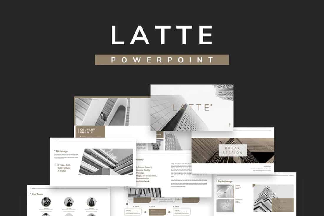
Browns aren’t often what comes to mind when thinking of building a color scheme, but rich browns can be a modern option.
Pair a neutral beige-brown with a darker color for an interesting contrast that works with almost any style of content.
31. Mint Green
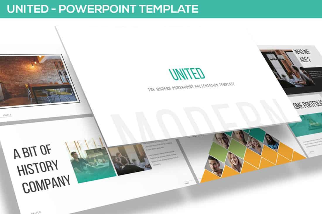
Go super trendy with a modern and streamlined palette of mint green and gray on white. While this combination can have a minimal feel, it also adds a touch of funkiness to the design.
Add another hint of color – think orange – for extra accents.
32. Dark Gray and Blue
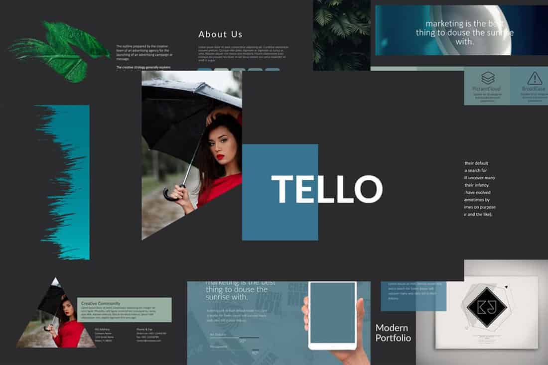
It doesn’t get more classy than a combination of grays and blues. This new take on a classic color scheme adds another brighter blue as well to pick up on modern trends.
Just be careful with text using a dark background such as this one. White is probably your best option for typography (and look for a font with thicker strokes!)

- By Illiya Vjestica
- - January 26, 2023
What are the Best Colours for Your PowerPoint presentation?
Choosing the best colours for PowerPoint isn’t as black and white as it seems. Many factors go into picking a powerful palette – involving everything from your audience’s emotions to your talk’s cultural context and, of course, to how your slides look.
Suppose you’re taking it as seriously as you should. In that case, you need to consider all of these when deciding on your colour scheme – as nailing this aspect of your presentation’s design will help you to communicate your message in the most impactful way possible. Interested? Let’s get stuck in.
Complementary colours
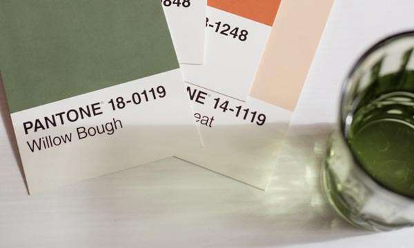
It would help to consider contrast when picking two or more colours for your presentation.
Contrasting colours are valuables when it comes to heightening the visual effect of your slides. They’re instantly impactful – reeling your viewers in by drawing their eyes to the screen. Also, they enhance your slides’ other elements – such as any fonts or tables used – increasing their visibility when used correctly. There’s a reason why black is nearly always paired with white and blue with yellow or orange. Together, they create a powerful impression… and it’s all thanks to contrast.
There’s a simple way to discover contrasting colours, and that’s by using a simple colour wheel. With this tool, you can easily see which colours are the opposite of which… helping you to refine your palette and ensure your presentation has colourful clout.
It also helps to follow the 60-30-10 colour rule . It’s generally for interior decorating but can support picking a colour scheme.
What Colours should not be used in PowerPoint?
When choosing colours for your slides, it’s important to create a contrast between the background and the text. I recommend avoiding using light text on a light background.
For example, a yellow background with white text often makes the text difficult to read. Likewise, with yellow text on a white background, it’s challenging to see.
Make sure your presentation content can be seen at the back of the room. You can use a colour contrast checker to ensure you have a strong contrast ratio to ensure your slides will be readable. This will help make your text more readable and provide a clear contrast between the text and background of your slides to enable your audience to follow along easily.
What are the Most Popular Colours for PowerPoint?
Here are some of the best colour combinations in PowerPoint. You can choose to experiment with your own as well.
Red & Black

Black & Yellow

Others include:
Blue & Yellow
Black & White
Orange and blue
Yellow and purple
Black and white
The selection method is slightly different for more complex presentations using three or more contrasting colours (triadic colours, for those who want to know). Pick three equally distanced colours around the colour wheel to choose the best complementary shades. These colours should, again, work beautifully together – providing that perfect contrast you crave.
Popular triadic choices include:
- Orange, green and purple
- Yellow, blue and red
Generally, we wouldn’t advise throwing a fourth colour into the mix – or more, besides. While using bright colours can have a wonderfully eye-catching effect on your PowerPoint slides, using too many at once could make them too “busy” – overloading the audience and detracting from the potential power of the colour combinations you’ve used. Adhere to the cliche “less is more”, and your simple yet striking presentation should speak for itself.

Colour psychology

You’re probably already familiar with the basic principles of colour psychology. Essentially, it’s been said that specific colours have set effects on people – specifically, causing them to feel a particular way. For instance, red is purported to inspire anger, blue to calm, and yellow to feel joy.
While there’s something to be said for this, colour psychology (as many people understand it) isn’t a flawless theory for one big reason: emotions aren’t quantifiable! Therefore, we can’t honestly claim that specific colours create the same feelings in every person – everybody’s different, and shades carry unique meanings for most of us.
You want to tap into your audience’s context of specific colours and other psychological and physical factors that may come into play. This is where the true magic of colour psychology lies. By understanding what influences your audience when it comes to colour – and knowing which colours are paired up with which emotions and responses in their lives – you can design something that sings. For instance, did you know that while, in Western and Japanese culture, the concept of love is associated with the colour red, it’s symbolised by the colour blue in African culture and yellow in Native American?
You can also your colour choice to the theme of your presentation. More on that later.
Know your audience. Get to know what inspires them, and let that influence your palette. It could make all the difference.
Colour symbolism

So, now you know to look into contrasting colours and your audience’s association with them. But we’re missing one major factor: you. What colours reflect you the best?
There are two ways that you can approach figuring this out. The first is straightforward: looking at your brand’s existing design. If you have a strong image already – of which colours will doubtlessly play a role, used on your website, logo and elsewhere – this is where you should start when designing your presentation. After all, these colours are already associated with you, so using them will create a strong link between your PowerPoint and the rest of your materials. Further, use colours so your audience can recognise you more quickly, and your presentation should look more professional. There are a lot of pros.
Option two requires a bit of decision-making. Suppose your brand doesn’t have any firm affiliations to colour already. In that case, you should consider which colours are associated with what in the context of your presentation and overarching brand ethos. Similarly to the colour psychology we’ve discussed, these hues will help you communicate your message clearly (and colourful). Some colour combinations are considered classic. They go together
Some popular colour associations include:
- Green – nature, the environment
- Blue – the ocean, sadness (referred to as “the blues”!)
- Orange – warmth, autumn
- Red – anger, love, energy
So: what are you talking about? Are there any clear colour associations to that topic already? Drill down to the heart of your presentation’s message, and choose the colours that reflect that the most.
One final thing. Once you’ve discovered your “essential” colour – whether that’s the colour that’s most strongly associated with the topic of your presentation or the colour that you’re hoping will have the biggest influence on your audience – make sure to make it the strongest colour on your palette (for instance, the background of your slides). This should ensure it delivers the impact you’re hoping for… levelling up your talk. Perfection.
Over to Hue
We know that we’ve given you a lot to think about, but if you’re ever feeling confused over colour, remember that it all boils down to the following factors:
Your brand + your audience’s colour associations + visual effect = the best palette
Once you’ve nailed this equation, the rest should come quickly. Good luck!
Choosing the right colours is one thing – putting together a presentation your audience will never forget. That’s another. Get in touch with us today to see how we can help your slides shine.
Illiya Vjestica
Share this post:, leave a comment cancel reply.
Your email address will not be published. Required fields are marked *

Researched by Consultants from Top-Tier Management Companies

Powerpoint Templates
Icon Bundle
Kpi Dashboard
Professional
Business Plans
Swot Analysis
Gantt Chart
Business Proposal
Marketing Plan
Project Management
Business Case
Business Model
Cyber Security
Business PPT
Digital Marketing
Digital Transformation
Human Resources
Product Management
Artificial Intelligence
Company Profile
Acknowledgement PPT
PPT Presentation
Reports Brochures
One Page Pitch
Interview PPT
All Categories
9 Beautiful Color Palettes for Designing Powerful PowerPoint Slides
Anuj Malhotra
Color is fascinating. It is stimulating. It is like the universe itself- Infinite.
No matter how much you read on colors and their meanings, color theories, color wheel and types of color schemes , importance of color in design and what not, it still appears fresh and enlightening. Such is the power of colors- it makes you hungry for more knowledge, more thinking, more feeling and literally more hungry if you use warm colors like the exciting yellow and orange at an eating place. Even more romantic: just recall the abundance of colors and the romantic energy they evoked in La La Land!

Source- YouTube
So when we say, “Color plays an important role in design”, it is actually an understatement. It plays a huge role. It evokes a range of emotions, helps our eye navigate smoothly across the design, and sets the tone for the overall message you want to convey.
Unfortunately, as much as colors and their combinations are put to a wonderful use in web design and graphic design, they are grossly neglected in the presentation business. Half of the presentations are still reminiscent of stone age- dot points and essays thrown on white slide. The other half uses the safe blue (nothing wrong in that as blue represents professionalism) but all the time blue, seriously? Audience begins to feel blue.
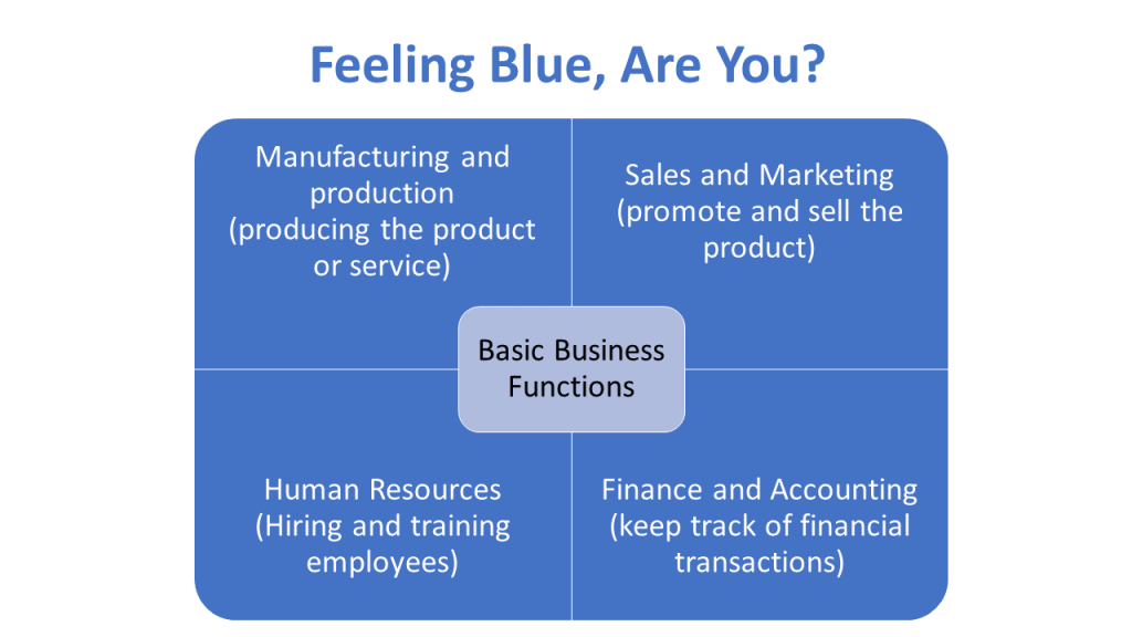
P.S. Did you know Blue is the world’s favorite color ! It is! But I can place a bet of million dollars (not that I have it) that it is not the above blue. This is PowerPoint’s default color when you insert a shape or SmartArt.
It’s time to get creative while using colors in presentation slides! Forget about your brand colors if they are not exciting. Change them too. We desperately need to use this powerful design element and nonverbal communication tool to bring our presentations to life! But how?
We have done the hard work and found 9 awesome color palettes that would work wonders for presentations. Many are a beautiful combination of warm and cool colors (warm colors being red, yellow and orange that seem to approach us while cool colors being violet, blue and green that appear to recede from us). Also sharing the inspiration behind these color palettes. Let’s devour them one by one:
Also Read : A Super-Fast Guide to Business Plan Templates
9 Creative Color Combinations You Can Steal for Your Slides
Color palette #1- powerfully memorable (red and grey).
This color palette comprises basically 2 colors- red and grey and shades of them. This high contrast color scheme is applicable to all types of presentations, especially where you need to pitch your products or services. Red adds energy to the content and the slide, while grey grounds the slide, makes it look professional and lets red be the centre of attraction.
Red is also a great color for a brand since it signifies warmth, confidence and energy. Being such a memorable, emotionally intense color and having high visibility, it boosts brand recognition, and hence, is an integral part of bold color palettes. Here’s the color palette for you:
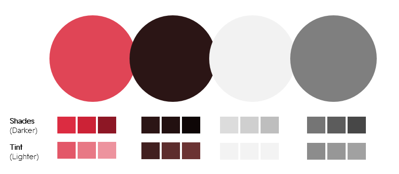
Download this Color Palette
We have also provided the darker variations of each color (called as Shades in color terminology) and lighter versions (called tint) in case you need to highlight or tone down a certain color based on your requirements and company branding.
P.S. To use such color palettes, simply save them and use the Eyedropper tool from the Color menu in PowerPoint:
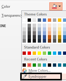
If you want the exact color code in case you are using an older version of PowerPoint, you’ll have to manually enter the RGB color values for each hue. Simply click the More Colors… option given above the Eyedropper option and manually enter these values:
- Color 1- Red (Red- 224, Green- 69, Blue- 86)
- Color 2- Dark Red (Red- 43, Green- 21, Blue- 21)
- Color 3- Grey (Red- 242, Green- 242, Blue- 242)
- Color 4- Dark Grey (Red- 127, Green- 127, Blue- 127)
Inspiration Behind this Color Palette:
DDB Canada created a heartfelt campaign for The Historica Dominion Institute and in support of The Memory Project to pay tribute to its soldiers on 11/11/11. The sombre grey and lots of white space evokes the vacuum caused by the absence of those soldiers. The use of a single bright color- red- creates a dramatic effect and evokes awe in the viewers. Here’s the brilliant print ad:

Source- bestadsontv.com- The Historica-Dominion Institute: Remember 11/11/11
Do not draw the meaning that this combination is for special occasions. Every presentation is special for you. You want your message to be remembered. So use light grey as background and red in the foreground to highlight the most important phrase, icon..basically the core of that slide. Here’s a real estate PPT slide that applies such color palettes beautifully:

Also notice how dark grey has been used for text instead of the standard black. It creates a harmonious look and feel, and the slide overall looks creative and professional at the same time.
Give a Red-Carpet Look with this Color Scheme:
When following color palettes, you can switch the background and foreground colors- red as background and white or light grey as foreground. That will give a red-carpet look to your presentation:

Presentation Rule To Remember: Have High Contrast for Easy Readability
By and large, this rule will save you from making color disasters:
- Light Background Colors- Dark Foreground
- Dark Background Colors- Light Foreground
There was another color in the color scheme- dark red, almost resembling brown which is a very masculine color. You can use that too where you need to use color other than red; as we did in the slide below:

Alternatively, we could replace the serious dark red with the happy bright red in the above slide and use a shade of grey for the remaining 28% as we do not want to highlight that portion. We want to highlight 82% and since red is a perfect accent color (accent colors are colors used for emphasis); let’s use the same:

Which slide would perform better? Tell us later when you are done with this article; let’s move on to our second color palette:
Color Palette #2- Vibrant and Young (Plum, Orange, Teal & Grey)
Why do presentations have to look “old”? Why have they become synonymous with draining life out of audience? Too much text. Check. Bad design and layout. Check. Devoid of color or dull colors. Check, check. Well, for those who cannot chop off content due to some reason and have limited design and layout knowledge, we published an article on 15 Ways To Turn A Very Text-Heavy, Bullet-Ridden Slide Into Amazing! For the last problem i.e. dull colors, we are publishing this article. This color scheme (comprising plum, orange, teal and grey) screams young and is in no way less professional than any other color scheme:
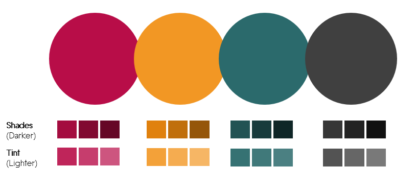
Grab this Color Palette
Color codes for the hues:
- Color 1- Plum (Red- 184, Green- 13, Blue- 72)
- Color 2- Orange (Red- 242, Green- 151, Blue- 36)
- Color 3- Dark Teal (Red- 43, Green- 106, Blue- 108)
- Color 4- Dark Grey (Red- 64, Green- 64, Blue- 64)
The beauty herself and icon of the young generation- Emma Watson- stuns in a color-oozing ad by Lancôme, owned by L'oreal. She is the brand ambassador of Lancôme and her vibrance is matched by the beautiful spring colors in the ad below which you would have surely looked even before reading all this text.

Courtesy: Lancôme
Warm orange, seductive plum, innocent pink, mysterious dark teal- the above ad has all the face-turning colors. Doesn’t look relevant to presentations? That’s what I thought too before I extracted the colors and applied it to my slides. Boy, they look so vibrant!

The dark grey adds a professional touch while the plum and orange colors inject interest into the slide. Plum, very similar to purple, is a rich color that is associated with royalty and romance. Orange is the color of joy and creativity while Teal is the color of sophistication, confidence and serenity. If you feel combining these colors is creating a color riot, just choose any 2 contrasting colors from this palette and make your slides rock like these:
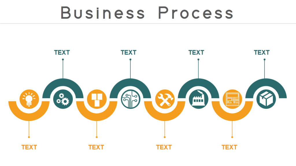
Color plays a very important role of grouping elements here. The reader can easily read the content alternatively as the process goes, or read the dark teal group and orange group separately. A picture will form in his head and if asked to recall the process later, he will remember the color blocks and quickly recall the content too.
The color palettes you choose depend on your preferences totally. That said, try using the brightest color sparingly or else it would overwhelm the audience and overpower everything. In the slide below, we reserved the plum color for the title alone:
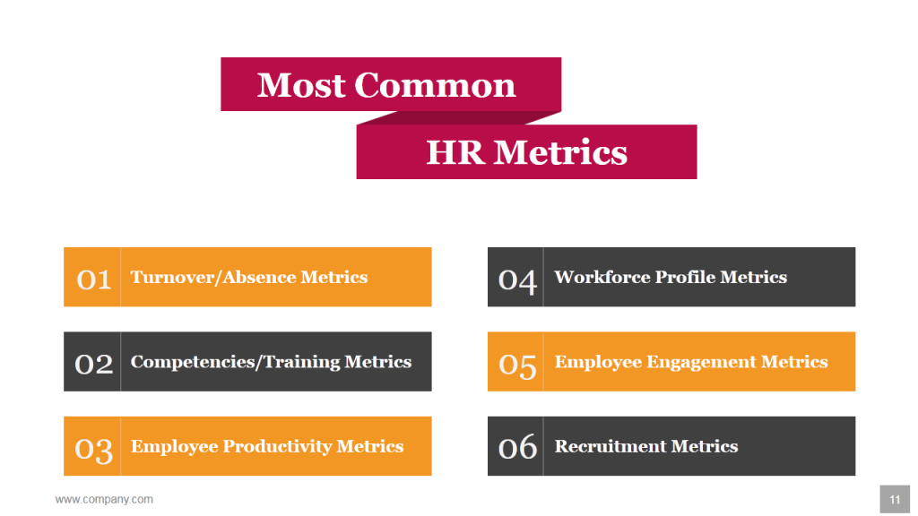
Have you ever seen any Human Resource presentation so vibrant before? I never had. Let’s move to color palette 3:
Color Palette #3- Retro Rocks (Dark Blue, Tan & Green)
As conflicting as it may sound, your presentations can look old but it has to be stylishly old! Yes, I mean retro. Who doesn’t like the retro look and feel whether it is fashion, art or presentations for that matter. Here’s a color palette (comprising dark blue, tan and green colors) to give that retro vibe to your presentations!
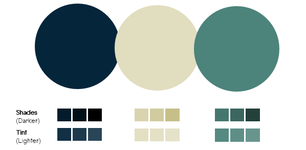
Download this Color Scheme
Here’s the color code for each hue:
- Color 1- Dark Blue (Red- 4, Green- 37, Blue- 58)
- Color 2- Tan (Red- 225, Green- 221, Blue- 191)
- Color 3- Green (Red- 76, Green- 131, Blue- 122)
“Home is wherever you park.” A beautiful vintage poster I came across on the web immediately caught my attention thanks to its classic and nostalgic color scheme.

It’s dreamy quality comes from the dark blue sky, the green ground and the moon and the stars. The best color palettes mirror real life- they are relatable and thus more “human”. Since Dark Blue signifies power and knowledge, it is a perfect color for corporate presentations. Let’s apply it to our slides and see how it looks:

The slide looks a poster, doesn’t it! What better do you want. Each PowerPoint slide should be worthy of sharing on social media networks like Facebook, Twitter, Pinterest and LinkedIn. Since the look is so classic, your presentations also get the timeless look and feel. Here’s another presentation slide that is so poster-ish and larger than life:

Color Palette #4- Dominating Duo (Teal & Red)
This brings two of my favorite design colors together- Teal and Red. Color experts, interior designers and graphic designers can’t get enough of Teal. It is trendy and unique- neither blue nor green. It appears as if it has been discovered only recently, especially where presentations are concerned. I see Teal dominating infographics but can’t recall even one in presentations!
Teal, as we said before, signifies trustworthiness, serenity and reliability. Complementing it and conflicting it is the energetic and sexy red. Use the lighter version of Teal which is Aqua as your slide background and you have a soothing, calm effect while red grabs the audience eyeballs.
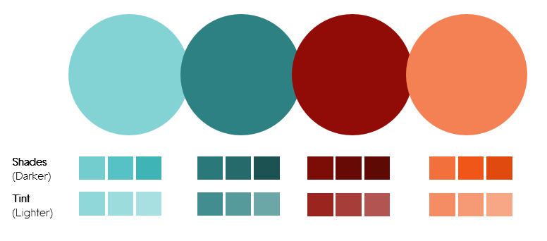
Use the Eyedropper tool to extract these colors or apply the following color code:
- Color 1- Aqua (Red- 131, Green- 211, Blue- 212)
- Color 2- Dark Teal (Red- 45, Green- 129, Blue- 131)
- Color 3- Dark Red (Red- 145, Green- 12, Blue- 7)
- Color 4- Orange (Red- 244, Green- 129, Blue- 83)
A movie poster. Didn’t know my search for comedy movies would land me to the colorful and lively movie poster of Nacho Libre . The red flowing cape is understood and nothing out of the box but the hero’s teal tights surely caught my attention. Red looks all the more ravishing thanks to the ample teal in the background. Have you watched this movie? If you judge a book by its cover and correspondingly a movie by its poster, then the movie surely appears interesting.

Well, presentation mostly is not a comedy affair or a showbiz. But like any other visual communication, it has to attract audience attention and sustain it. Let’s replicate this color combination in our presentation slides and see how it looks:

The font is awesome but even an ordinary italic font in bold red could hardly go unnoticed. The darker shades of teal and red add mystery to the look and feel making one curious to see what comes next. This scheme is great for your Title slide and Section Header slides.
If you are using images in your text slides like in the one below, you can use just one color since the image already contains its own colors and adding teal and red would make the slide look busy. So you can use shades of teal and create a beautiful slide like the one below:

Color Palette #5- Authoritative Punch (Dark Green & Tan)
It’s said that age also influences your color preferences. Probably, the audience of your presentation is not the millennials but the investors and C-suite executives. You do not want to risk using orange and reds and appear non-serious. You want to look dead-serious and super-professional. Blue is a safe choice as I said. However, color palettes like this comprising 2 colors- Tan and Dark Green- are a better alternative and makes your slides look different from others:
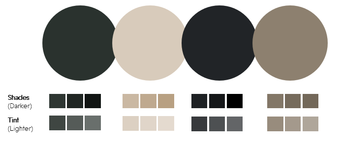
Use this Color Palette Template
- Color 1- Dark Green (Red- 42, Green- 50, Blue- 46)
- Color 2- Tan (Red- 216, Green- 203, Blue- 187)
- Color 3- Blue-Gray (Red- 33, Green- 36, Blue- 39)
- Color 4- Brown (Red- 141, Green- 128, Blue- 111)
We have all searched for breathtaking wallpapers for our laptops and phones. What makes them breathtaking? Amazing landscape and colors. Here’s one such wallpaper I found on Pixabay. It is magical and mysterious. The forest dark green evokes awe, especially when it is surrounded by plenty of white space and light colors.

Let’s apply this color scheme to a serious presentation topic such as Customer Relationship Management:

Since dark green is an established army color as it camouflages with surroundings, you can leverage this association to your advantage. Use shades of green and tan in the slides that follow and give an authoritative look and feel to your presentation:

Color Palette #6- Crystal Clear (Turquoise, Teal & Blue)
If you have been using sky blue in your presentations, you can continue doing that. It is a refreshing and calming color that instantly brings to mind images of sky and sea. Also want to add a touch of sophistication to your presentations? Choose the Turquoise color instead. It is a combination of pale blue and green and brings to mind the turquoise gemstone.
Like blue, it is also refreshing and calming and symbolizes depth, stability and wisdom. More importantly, it’s crystal clarity signifies open communication, healing and emotional stability. A shade of turquoise is Teal that we used a little while back along with red. A lighter version of turquoise is aqua which when contrasted with white looks all the more pure and relaxing.
Color palettes like this one however puts turquoise against its darker shades like dark blue, teal and green to add authority, wisdom and sophistication to your presentation.
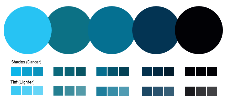
Grab this Beautiful Color Scheme
- Color 1- Turquoise (Red- 39, Green- 195, Blue- 243)
- Color 2- Dark Teal (Red- 12, Green- 113, Blue- 133)
- Color 3- Dark Teal (Red- 5, Green- 112, Blue- 145)
- Color 4- Dark Blue (Red- 3, Green- 52, Blue- 83)
- Color 4- Black (Red- 0, Green- 0, Blue- 0)
One can watch marine life for ages. The colorful beings inhabiting the crystal clear waters are a treat to watch. So, when I stumbled upon this BBC One documentary on tiny Japanese fish “pufferfish” designing a sculpture on the seabed, I was awestruck. It proved useful for my color palettes inspiration too. Here’s the cute fish:

Source- Youtube (BBC One Documentary)
Imagine this is as the background for your presentation- Lovely! The fish’s piercing black eye, dark blue shadow, the specks of green on its tail and skin wonderfully complement to create this natural color scheme. Let’s steal it for our PowerPoint presentation:

White looks the perfect contrasting color for blue. But the Teal color lends more power to the word “grow”. Of course, the typography also plays its part in reinforcing the message. By the way, if you want to add typography to your skill arsenal, do check out these 11 Typography Tweaks And Text Effects To Spice Up Your Presentation Content .
There is a lot of blue in this color palette but it won’t make anyone feel the blues. Take a look at this business slide to adapt to the right color palettes:

Color Palette #7- It’s American-ish (Red & Blue)
Fourth of July is around the corner. So why not use a color palette inspired by it.
There’s a reason America adopted red and blue along with white for its national flag. Red symbolizes courage and sacrifice, blue symbolizes vigilance and justice while white represented innocence and purity. The beloved American superheroes wear their patriotic colors with pride. See Spiderman's suit- red and blue. What about Superman and WonderWoman! Their traditional outfits too had dominantly red and blue combination.
That does not mean you have to be an American to use the color palette that we are sharing. We are using a totally different variation of red and blue. So use the following color palette without any hesitation:
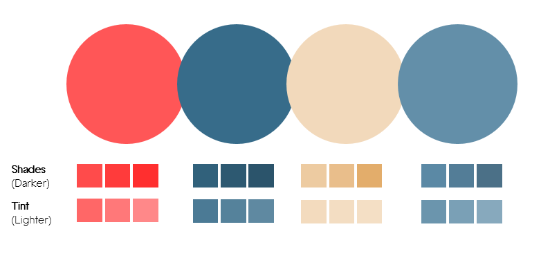
Download this Dynamic Color Palette
RGB values for each hue:
- Color 1- Rose (Red- 255, Green- 86, Blue- 87)
- Color 2- Dark Teal (Red- 55, Green- 108, Blue- 138)
- Color 3- Light Orange (Red- 242, Green- 217, Blue- 187)
- Color 4- Blue-Grey (Red- 99, Green- 143, Blue- 169)
Never knew surfing on Facebook during office hours could also be productive. A video on my timeline “7 Signs You Are Perfect For Each Other” by FilterCopy got me glued with its beautiful color scheme.
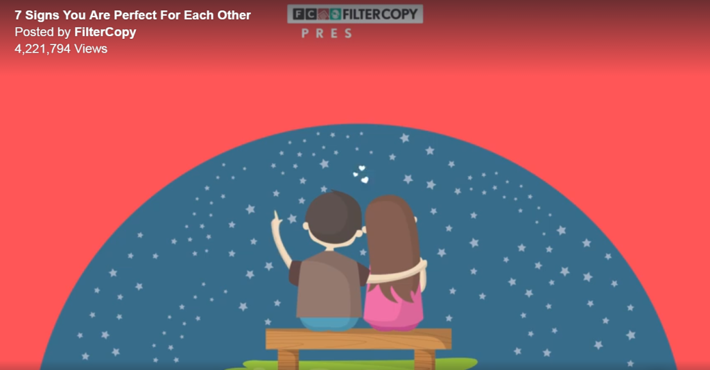
Let’s apply this dynamic color scheme to our slides. Here is a slide which looks bold and powerful. There is a beautiful balance of masculinity and femininity too with dark blue and soft red.

White is a perfect contrasting color for easy readability, whether you take red and white combination or blue and white. Blue on red doesn’t look bad either. It scores a little less on readability as compared to white but if font size is not too small, you can carry off red and blue together with style like in the slide below:

Color Palette #8- Opposite Attraction (Blue & Yellow)
Opposites attract. So let’s take 2 opposite color forces- one that is attention-grabbing and one that is conservative. One that represents summer and the other winter. Yellow and blue. A warm and cool color in one single slide gives you the perfect balance- the youthful energy and the professional touch.
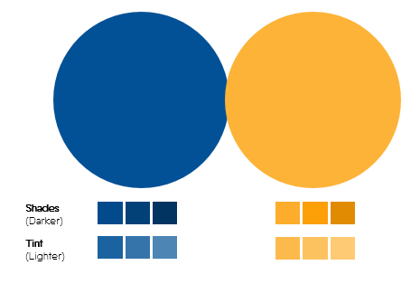
Use this Color Palette
Color 1- Dark Blue (Red- 2, Green- 81, Blue- 150)
Color 2- Orange/Mustard (Red- 253, Green- 179, Blue- 56)
Inspiration Behind This Color Palette:
A newsletter from an online shopping portal in my inbox coaxing me to shop for Father’s Day definitely convinced me (to steal the color palette for this article). It was perfect for the occasion as blue is considered the color of men and yellow calls for celebration.

So, if you love using blue for your presentations, please do. But try yellow or mustard this time as in the color palette and breathe life into your corporate presentations! Yellow is also the color of innovation; so we felt the color palette was perfect for this slide:

The yellow used here is not the bright yellow or the bright orange that professionals detest using. It is soft orange or mustard that does not look childish from any angle. Use shades of blue and yellow to avoid making the slides look too colorful. Notice how dark blue has been used for human face instead of a new color:

Color Palette 9- Down to Earth vs. Royal (Brown & Gold vs. Dark Purple)
How about using earthy colors for our presentation that gives an impression we are grounded in our roots! Earth tone color schemes include combination of browns and tans. The soil, clay, dirt and rocks give us neutral colors that can be used to give a down-to-earth look to our presentation. Here’s such a scheme that contains all the neutral colors except one- dark purple that is a color of royalty:
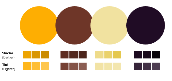
Grab this Color Scheme
According to your choice of color palettes, here are the values to get the exact hue:
- Color 1- Gold (Red- 254, Green- 174, Blue- 2)
- Color 2- Brown (Red- 110, Green- 54, Blue- 42)
- Color 3- Light Yellow (Red- 241, Green- 226, Blue- 160)
- Color 4- Dark Purple (Red- 32, Green- 12, Blue- 37)
An image of a yellow excavator on a construction site on Pixabay had all the feel-good earthy colors. You could also extract the sky blue color from this image although it is mostly covered by yellowish clouds. Wonder where we got the purple from? See the excavator’s shadow and the front portion where vehicle number is displayed:

Source: Pixabay
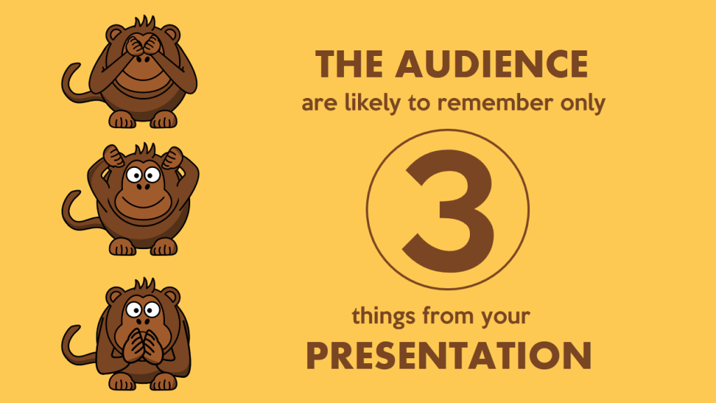
Let’s take the first 2 colors from such color palettes and apply this to a presentation slide- golden background and brown foreground. The gold color adds spark and prestige to the slide while the masculine brown gives power to the content:
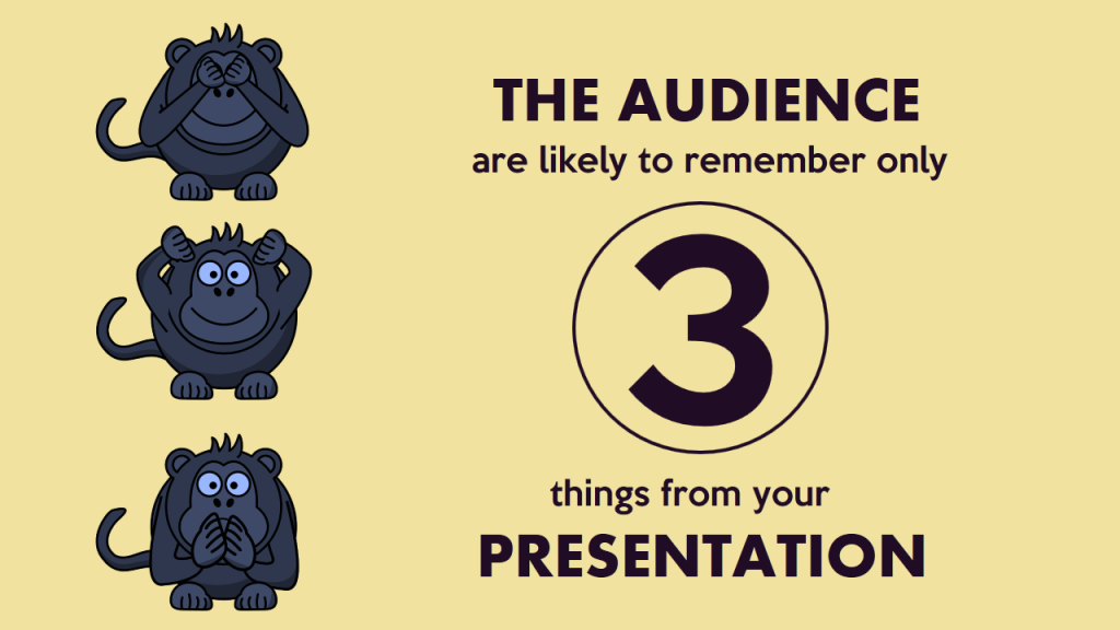
Now, let’s apply the last 2 colors from this palette- pale yellow and dark purple. It’s a high contrast scheme and gives a royal look and feel to the slide. Let’s use the pale yellow as the background on the same slide and replace brown with purple. Which looks better?
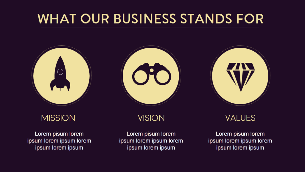
Want to make your presentation look more royal and sophisticated? Use purple as the presentation background and use the soft yellow for your content, shapes and icons:
That’s all we had to share on color palettes with you for today. As we said in the beginning, color combinations can be infinite. Hope you exploit the power and psychology of color palettes to inject vitality into your PowerPoint presentations and other designs!
And hey, which color palette(s) did you like the most? Please give us your valuable feedback in the comments below. And if you found the article useful, spread the word. Here’s a pre-populated tweet to get you started:
Tweet This Post To Your Followers
Related posts:.
- 19 Colors from Pantone 2000-2018 Color of the Year [Design Inspiration]
- Shape Lives with Top 25 PowerPoint Backgrounds for School
- [Updated 2023] 25 Best Aviation PowerPoint Templates for the Air Transport Industry
- [Updated 2023] Top 10 Sales and Marketing Google Slides Templates for Sure Shot Business Success
Liked this blog? Please recommend us

31 thoughts on “9 Beautiful Color Palettes for Designing Powerful PowerPoint Slides”
This form is protected by reCAPTCHA - the Google Privacy Policy and Terms of Service apply.

Digital revolution powerpoint presentation slides

Sales funnel results presentation layouts
3d men joinning circular jigsaw puzzles ppt graphics icons

Business Strategic Planning Template For Organizations Powerpoint Presentation Slides

Future plan powerpoint template slide

Project Management Team Powerpoint Presentation Slides

Brand marketing powerpoint presentation slides

Launching a new service powerpoint presentation with slides go to market

Agenda powerpoint slide show
Four key metrics donut chart with percentage

Engineering and technology ppt inspiration example introduction continuous process improvement
Meet our team representing in circular format

How-To Geek
8 tips to make the best powerpoint presentations.
Want to make your PowerPoint presentations really shine? Here's how to impress and engage your audience.
Quick Links
Table of contents, start with a goal, less is more, consider your typeface, make bullet points count, limit the use of transitions, skip text where possible, think in color, take a look from the top down, bonus: start with templates.
Slideshows are an intuitive way to share complex ideas with an audience, although they're dull and frustrating when poorly executed. Here are some tips to make your Microsoft PowerPoint presentations sing while avoiding common pitfalls.
It all starts with identifying what we're trying to achieve with the presentation. Is it informative, a showcase of data in an easy-to-understand medium? Or is it more of a pitch, something meant to persuade and convince an audience and lead them to a particular outcome?
It's here where the majority of these presentations go wrong with the inability to identify the talking points that best support our goal. Always start with a goal in mind: to entertain, to inform, or to share data in a way that's easy to understand. Use facts, figures, and images to support your conclusion while keeping structure in mind (Where are we now and where are we going?).
I've found that it's helpful to start with the ending. Once I know how to end a presentation, I know how best to get to that point. I start by identifying the takeaway---that one nugget that I want to implant before thanking everyone for their time---and I work in reverse to figure out how best to get there.
Your mileage, of course, may vary. But it's always going to be a good idea to put in the time in the beginning stages so that you aren't reworking large portions of the presentation later. And that starts with a defined goal.
A slideshow isn't supposed to include everything. It's an introduction to a topic, one that we can elaborate on with speech. Anything unnecessary is a distraction. It makes the presentation less visually appealing and less interesting, and it makes you look bad as a presenter.
This goes for text as well as images. There's nothing worse, in fact, than a series of slides where the presenter just reads them as they appear. Your audience is capable of reading, and chances are they'll be done with the slide, and browsing Reddit, long before you finish. Avoid putting the literal text on the screen, and your audience will thank you.
Related: How to Burn Your PowerPoint to DVD
Right off the bat, we're just going to come out and say that Papyrus and Comic Sans should be banned from all PowerPoint presentations, permanently. Beyond that, it's worth considering the typeface you're using and what it's saying about you, the presenter, and the presentation itself.
Consider choosing readability over aesthetics, and avoid fancy fonts that could prove to be more of a distraction than anything else. A good presentation needs two fonts: a serif and sans-serif. Use one for the headlines and one for body text, lists, and the like. Keep it simple. Veranda, Helvetica, Arial, and even Times New Roman are safe choices. Stick with the classics and it's hard to botch this one too badly.
There reaches a point where bullet points become less of a visual aid and more of a visual examination.
Bullet points should support the speaker, not overwhelm his audience. The best slides have little or no text at all, in fact. As a presenter, it's our job to talk through complex issues, but that doesn't mean that we need to highlight every talking point.
Instead, think about how you can break up large lists into three or four bullet points. Carefully consider whether you need to use more bullet points, or if you can combine multiple topics into a single point instead. And if you can't, remember that there's no one limiting the number of slides you can have in a presentation. It's always possible to break a list of 12 points down into three pages of four points each.
Animation, when used correctly, is a good idea. It breaks up slow-moving parts of a presentation and adds action to elements that require it. But it should be used judiciously.
Adding a transition that wipes left to right between every slide or that animates each bullet point in a list, for example, starts to grow taxing on those forced to endure the presentation. Viewers get bored quickly, and animations that are meant to highlight specific elements quickly become taxing.
That's not to say that you can't use animations and transitions, just that you need to pick your spots. Aim for no more than a handful of these transitions for each presentation. And use them in spots where they'll add to the demonstration, not detract from it.
Sometimes images tell a better story than text can. And as a presenter, your goal is to describe points in detail without making users do a lot of reading. In these cases, a well-designed visual, like a chart, might better convey the information you're trying to share.
The right image adds visual appeal and serves to break up longer, text-heavy sections of the presentation---but only if you're using the right images. A single high-quality image can make all the difference between a success and a dud when you're driving a specific point home.
When considering text, don't think solely in terms of bullet points and paragraphs. Tables, for example, are often unnecessary. Ask yourself whether you could present the same data in a bar or line chart instead.
Color is interesting. It evokes certain feelings and adds visual appeal to your presentation as a whole. Studies show that color also improves interest, comprehension, and retention. It should be a careful consideration, not an afterthought.
You don't have to be a graphic designer to use color well in a presentation. What I do is look for palettes I like, and then find ways to use them in the presentation. There are a number of tools for this, like Adobe Color , Coolors , and ColorHunt , just to name a few. After finding a palette you enjoy, consider how it works with the presentation you're about to give. Pastels, for example, evoke feelings of freedom and light, so they probably aren't the best choice when you're presenting quarterly earnings that missed the mark.
It's also worth mentioning that you don't need to use every color in the palette. Often, you can get by with just two or three, though you should really think through how they all work together and how readable they'll be when layered. A simple rule of thumb here is that contrast is your friend. Dark colors work well on light backgrounds, and light colors work best on dark backgrounds.
Spend some time in the Slide Sorter before you finish your presentation. By clicking the four squares at the bottom left of the presentation, you can take a look at multiple slides at once and consider how each works together. Alternatively, you can click "View" on the ribbon and select "Slide Sorter."
Are you presenting too much text at once? Move an image in. Could a series of slides benefit from a chart or summary before you move on to another point?
It's here that we have the opportunity to view the presentation from beyond the single-slide viewpoint and think in terms of how each slide fits, or if it fits at all. From this view, you can rearrange slides, add additional ones, or delete them entirely if you find that they don't advance the presentation.
The difference between a good presentation and a bad one is really all about preparation and execution. Those that respect the process and plan carefully---not only the presentation as a whole, but each slide within it---are the ones who will succeed.
This brings me to my last (half) point: When in doubt, just buy a template and use it. You can find these all over the web, though Creative Market and GraphicRiver are probably the two most popular marketplaces for this kind of thing. Not all of us are blessed with the skills needed to design and deliver an effective presentation. And while a pre-made PowerPoint template isn't going to make you a better presenter, it will ease the anxiety of creating a visually appealing slide deck.
- Palette Generator
- Explore Palettes
- Image Picker
- Contrast Checker
- List of Fonts New
- Other tools
- List of colors New
- Browse Gradients
- Create a Gradient
- Make a Gradient Palette
- Color Picker
- Collage Maker
- Image Converter
- Android App
- Figma Plugin
- Chrome Extension
- Instagram Page
It seems we can’t find any results based on your search.
You're all set!
We updated our Terms and Privacy . Please read them and accept to continue.
- You can save up to 10 palettes
- You can have only 1 project and 1 collection
- You can save up to 5 colors to favorites
- Remove ads and popups to enter the heaven of colors
- Generate palettes with more than 5 colors automatically or with color theory rules
- Save unlimited palettes , colors and gradients, and organize them in projects and collections
- Explore more than 10 million color schemes perfect for any project
- Pro Profile , a new beautiful page to present yourself and showcase your palettes, projects and collections
- Get advanced PDF export options like shades, hues, color blindness, etc.
- Unlock additional tools like the new Palette Visualizer to check your colors on real designs
- Support me as an indie developer
- And more...

Coolors Adobe Extension
Before you cancel your subscription, please share with me what made you cancel today. Your honest feedback will help me improve a lot! Thanks.
Allow the ads
Hey, I'm Fabrizio, the guy behind this website. Please help me to keep most of the site free by allowing ads or consider subscribing to enjoy even more features. Your support truly matters.
I don't care, close popup
- What is a slide master? Article
- Add, rearrange, duplicate, and delete slides in PowerPoint Article
- Apply a slide layout Article
- Add color and design to your slides with Themes Article
- Start with a template Article
- Get design ideas for slides Article
- Customize a slide master Article
- Change the page orientation in PowerPoint between landscape and portrait Article
- Organize your PowerPoint slides into sections Article
- Add a DRAFT watermark to the background of slides Article
- Create, merge, and group objects on a slide Article
- Guides for arranging things on a slide in PowerPoint Article
- Change the order in which stacked objects, placeholders, or shapes appear on a slide Article
- Rotate or flip an object Article

Add color and design to your slides with Themes
PowerPoint provides a variety of design themes —including coordinated color schemes, backgrounds, font styles, and placement of placeholders.
Note: You may be looking to learn about using the Design Ideas button available for Microsoft 365 subscribers. See about working with PowerPoint Designer.

Pick a theme when you do File > New to start a new presentation.
These built-in themes are great for widescreen (16:9) and standard screen (4:3) presentations. To change the slide size, see Change the size of your slides .
If offered, choose a color variation, and then select Create .
If you change your mind, you can always change the theme or variant later on the Design tab.
On the Design tab, pick a theme with the colors, fonts, and effects that you like.
To apply a different color variation of a particular theme, in the Variants group, pick a variant.
Note: If you don't see any variants, it could be because you're using a custom theme, an older theme designed for earlier versions of PowerPoint, or because you imported some slides from another presentation with an older or custom theme.
Select right arrow in the Variants group to select different Colors , Fonts , Effects , or Background Styles and choose from built-in options or customize your own.

Create and save a custom theme
You can create a custom theme by modifying an existing theme or by starting from scratch with a blank presentation.
Select your first slide, and then on the Design tab, select the down arrow in the Variants group.
Select Colors , Fonts , Effects , or Background Styles and choose from built-in options or customize your own.
When you're done customizing styles, select the down arrow in the Themes group, and then select Save Current Theme .
Give your theme a name, and select Save . By default, it is save with your other PowerPoint themes and will be available in the Themes group under a Custom header.
Use or create themes in PowerPoint
Combining colors in PowerPoint: Mistakes to avoid .
Apply multiple themes to a presentation
Apply a template to your presentation
What is color theory?

Need more help?
Want more options.
Explore subscription benefits, browse training courses, learn how to secure your device, and more.

Microsoft 365 subscription benefits

Microsoft 365 training

Microsoft security

Accessibility center
Communities help you ask and answer questions, give feedback, and hear from experts with rich knowledge.

Ask the Microsoft Community

Microsoft Tech Community

Windows Insiders
Microsoft 365 Insiders
Was this information helpful?
Thank you for your feedback.
Home Blog Design How to Create Effective Call to Action Slides for Presentations
How to Create Effective Call to Action Slides for Presentations

When concluding a presentation , it’s essential to prompt attendees to take action. This is where a specific slide type, the call-to-action slide or CTA slide, comes into play. Depending on your context, this slide can incorporate various graphical elements, such as compelling images, charts, or diagrams, to evoke emotions or simply be attractive with information on how to contact the presenter.
In our experience, a call-to-action slide is an element that has one-third of the influence factor for decision-making, especially in contexts of business pitch or sales presentation . For this reason, this article will guide you through the essentials of creating powerful, attention-grabbing call-to-action slides for presentations. We will illustrate each point with examples and include a list of eye-catching PPT templates that can make the job easier.
Table of Contents
What is a Call to Action Slide?
What are the elements of a call to action slide, how to write a call to action slide, recommended cta templates for powerpoint and google slides, final words.
A call to action slide is a presentation slide type designed to prompt an immediate response or encourage the audience to take a specific action (purchase, connect, sign-up, etc.). Typically, call-to-action slides are placed at the end of a presentation, as they capitalize on the audience’s interest in the presented topic and the expectations built up throughout the presentation.
The same guidelines applied in marketing for call-to-action features in e-commerce are valid for call-to-action slides, as they must be clear, concise, and focus on an actionable verb to instruct the audience what to do next. Bold colors and strong contrast indicate what action to take, and in some cases, visual elements like buttons, arrows, or even animations help guide the audience to that specific keyword.
Let’s analyze the contents of a call to action slide through this infographic.

The Visuals
All call-to-action slides ought to include an image. This can be a vector graphics illustration , a photo displaying the desired typical scenario (for example, for an e-commerce brand, the call to action is a computer placed on top of a desktop with the website opened), or a product image.
The visuals must be prominent and in high-quality format—meaning no pixelation and clear-to-understand imagery. In terms of importance inside the slide, they can take up to a third of the layout.
The Container
This is the area where the written call to action is placed. We have to work with a box format (although it can feature organic shapes if the context requires it) where the information is displayed. Gradients are particularly helpful as we create smooth transitions between sections of the container and don’t induce sharp contrast between text, icons, and the container’s background.
Besides the specific verb that incites to take action, we have to include a concise text that gives the call-to-action a context. What’s the reason for that? Picture it this way: you want your call to action to be actionable, regardless of when that’s bound to happen. If attendees of your presentation get a copy of the slide deck , they can share it with colleagues or friends, boosting the reach of your call to action slide. But what if your call to action doesn’t give any context? People who didn’t connect with the presentation or didn’t attend the event may not feel prompted to take action on something they cannot grasp how it will benefit their lives.
To further illustrate this point, let’s imagine this scenario: You deliver a presentation on cybersecurity for large corporations. Your agency exposes the risks of continuing to operate under the same standards and adds a call to action slide at the end of the presentation to encourage stakeholders to hire your services. Which one of the slides is going to work best?
- Scenario A: A computer screen image with a button that says “Hire Us Now.”
- Scenario B: A minimalistzic slide showcasing a picture of a locked computer due to ransomware with a text box that states, “54,000 customer accounts can be leaked at any minute. Protect their assets now” – and a button with the text “Secure Your Data.”
Yes, scenario B is a well-thought case of a call-to-action slide.

Visual Cues
If your slide is cluttered with multiple visual elements, as in webinars, you can use arrows, icons, or eye-catching buttons to highlight the area where the CTA is placed. Use bold colors to contrast with the container’s background, but be mindful of your selected color palette.
You can learn more about the importance of colors in presentations in our color theory for presentations article.
A Clear Directive
The call to action doesn’t have to be lengthy. Your best approach is a clear and direct command that tells the audience exactly what to do. Consider the following list of call-to-action examples to guide you:
- Register Now
- Download Now
- Let’s Connect
- Start Your Free Trial Today!
- Schedule Your Free Demo!
Urgency or Incentive
Sometimes, your message might not be perceived as imperative as you expect. In highly competitive niches, marketers work with taglines that add an extra incentive, inciting a sense of urgency to acquire the product or service. Examples of these are:
- Limited Time Offer
- Only 10 Units Left
- (Timeclock) Minutes Left
- Unlock Premium Features Now
Follow this step-by-step instruction to create your call to action slide, regardless of your presentation’s niche.
Identify the Objective
The approach you need to take depends on the topic of your presentation. If you aim to sell a product, the call to action slide can invite the audience to try a demo or to become one of the first buyers and receive an exclusive 40% discount.
If, on the other hand, you promote a service, you can invite them to connect, discover customer success stories, or schedule a meeting to discuss a custom-made offer.
Craft a Compelling Message
Your call to action slide must be written in an active language tone to ensure audience engagement . It is important to use strong verbs that connect your message and the value your product or service brings to the potential buyer’s life. For that purpose, you should personalize the message to be directed to the audience attending your presentation on that specific day. How can you do that? Bring in relevant facts that interest your attendees and use recent factual information about your offer.
The CTA has to be concise yet powerful. Font size matters on this behalf, so you need to test the readability from several distance rows or opt for a complementary speech CTA. Technically speaking, use no less than 24pt as font size to write the text for the CTA button and 18pt for the contextual text.

The Emotional Value
Storytelling in presentations is an excellent aid when you need to create a CTA without making the slide look self-promotional. You can articulate the graphics and the presentation’s speech as different chapters of a narrative, where the CTA is the epilogue of your story. This approach requires aligning all the graphics to your narrative, avoiding technical jargon that might distract the audience from your story’s core value, and creating a summary slide that exposes the benefits of taking action now.
General Recommendations for High-Quality CTA Slides
We want to conclude this section with tips from our experience creating effective call-to-action slides. First and foremost, you can only add one CTA per slide. If your presentation has multiple objectives requiring a CTA, something is not working. Less is more, and you dilute the message if you distract the audience with multiple options to choose from.
That being said, the layout for the call to action slide has to be minimalistic. All elements must direct attention to the CTA section, and ample white space is extremely important so the audience focuses on that key point. This is not an extra slide on your deck. It has to remain consistent with the slide deck’s style regarding color palette, font pairing options, and graphics; otherwise, it feels disconnected. Visual hierarchy principles indicate that the human eye scans content from left to right, top to bottom in the Western culture (languages that are read right to the left invert the horizontal axis but preserve the vertical one). Place your content accordingly, making the CTA the final element that attracts the user. You can test the correct placement of your call to action by checking the slides across different devices.

In this section, you can find our selection of Google Slides and PowerPoint templates that are fit to create call to action slides in just a couple of minutes. Download and customize them for any kind of presentation topic.
1. Corporate CTA Slide Deck

Secure business deals by inviting your clients to reach out in a clean and professional layout. This call to action template for PowerPoint features an array of icons to indicate address, phone number, email, and website.
Use This Template
2. Dropshipping Call-to-Action Slide

For any kind of dropshipping business that seeks to close partnership deals with fellow entrepreneurs, this slide deck contains all the graphical elements to depict your business model and invite to get in touch.
3. Product Presentation Call to Action Slide

Highlight the key features of your product with a creative call to action slide layout. Four different arrangements to tailor your product presentation for maximum sales performance. Check it out!
4. IT Consultancy Call to Action Slide
A slide deck intended for IT agencies delivering services to both clients and corporations. You can craft a compelling presentation describing your team, the services you offer, your expertise, strategy to implement, and summarize it with a carefully designed call to action slide.
5. CTA Slide for Business Presentations

Ideal for company presentations, product sales pitches (as we’ve seen in our example above), and more. Customize the slides of this presentation deck in just minutes.
Creating persuasive CTAs can transform your presentations from informative to persuasive content, even when you don’t feel such a transition is forced. Your audience is inspired to act because of the quality of your presentation, making the CTA slide the final touch to convince them of your expertise on the matter.

Like this article? Please share
Design Inspiration, Sales, Slides Filed under Design
Related Articles

Filed under Design • December 1st, 2023
Best 23 PowerPoint Templates to Start 2024
2023 is around the corner, and for that very reason we want to list a selection of PowerPoint templates to start your projects in style.
Filed under Business • November 24th, 2023
Sales Battle Cards Guide: A Strategic Tool for Sales Success
Get to know an exceptional tool for your sales team: battle cards. Enhance conversations, address objections, and deliver consistent messaging.

Filed under Business • November 6th, 2023
Crafting an Effective Sales Pitch: A Presenter’s Guide
In this article, we explore what a sales pitch is and how to create an effective one.
Leave a Reply
Make an Image Your Background in PowerPoint: Step-by-Step Guide
- Recent Posts
- How to Add Bullet Points in PowerPoint: A Step-by-Step Guide - May 25, 2024
- Where is Slide Master in PowerPoint: A Comprehensive Guide for Beginners - May 25, 2024
- How to Use Copilot in PowerPoint: A Step-by-Step Guide - May 25, 2024
Have you ever wanted to add a personal touch to your PowerPoint presentations? One way to do this is by adding an image as the background. It’s a simple yet effective way to make your presentation stand out and engage your audience. In this article, I’ll share with you my knowledge and experience on how to make an image the background in PowerPoint.

First, it’s important to note that there are different ways to add an image as the background in PowerPoint. One way is to go to the “Design” tab and select “Format Background.” From there, you can choose “Picture or Texture Fill” and select the image you want to use as the background. Another way is to simply right-click on the slide and select “Format Background,” then follow the same steps.
When selecting an image to use as the background, it’s important to choose one that is high-quality and relevant to your presentation. Avoid using images that are too busy or distracting, as this can take away from the main message of your presentation. Additionally, consider the color scheme of your presentation and choose an image that complements it well.
Overall, adding an image as the background in PowerPoint is a simple yet effective way to make your presentations more engaging and memorable. By following these tips and using your own creativity, you can create presentations that stand out and leave a lasting impression on your audience.
JUMP TO TOPIC
Choosing the Right Background Image
Incorporating transparency and texture, high-resolution images, applying color schemes and gradients, utilizing artistic effects and graphics, using slide master for consistent design, organizing slides for optimal flow, best practices for powerpoint backgrounds, crafting a visually appealing powerpoint presentation.

As a professional, I know that crafting a visually appealing PowerPoint presentation is essential to engage the audience and convey the message effectively. Choosing the right background image, incorporating transparency and texture, and using high-resolution images are some of the critical factors that contribute to a visually appealing presentation.
The background image plays a crucial role in setting the tone and mood of the presentation. It should be relevant to the topic and complement the content. One way to choose the right background image is to consider the color scheme of the presentation and select an image that matches or contrasts with it.
Another way is to use images that evoke emotions and connect with the audience. For example, if the presentation is about a charity event, using images of happy children or volunteers can be a powerful way to engage the audience.
Incorporating transparency and texture can add depth and visual interest to the presentation. One way to do this is to use the Format Background option and choose the Picture or Texture Fill option. From there, you can select an image and adjust the transparency to create a layered effect.
Using textures such as wood, paper, or fabric can also add a tactile element to the presentation. For example, using a wood texture as the background can create a warm and inviting atmosphere, while a paper texture can give a more professional and academic feel.
Using high-resolution images is crucial to ensure that the presentation looks sharp and professional. Low-resolution images can appear blurry and pixelated, which can detract from the overall quality of the presentation.
When selecting images, it’s essential to choose ones that are at least 1920×1080 pixels in size. This will ensure that the images look crisp and clear, even when projected on a large screen.
In conclusion, crafting a visually appealing PowerPoint presentation requires careful consideration of the background image, transparency, texture, and image quality. By following these tips, you can create a presentation that engages and captivates your audience.
Enhancing Slides with Advanced Formatting
As a designer, I know how important it is to create visually appealing slides. In this section, I will show you how to enhance your slides with advanced formatting techniques.
One of the easiest ways to make your slides look professional is by using color schemes and gradients. PowerPoint has built-in color schemes that you can use, or you can create your own. To apply a color scheme, go to the Design tab, click on the drop-down arrow, and select Colors. From there, you can choose a pre-set color scheme or create your own.
Gradients are another great way to add depth and interest to your slides. To apply a gradient, select the object you want to apply it to, go to the Format tab, and click on Shape Fill. From there, select Gradient Fill, and choose the type of gradient you want to use. You can also adjust the angle, direction, and colors of the gradient to fit your design.
Artistic effects and graphics can also enhance your slides and make them stand out. PowerPoint has a variety of artistic effects that you can apply to images and shapes. To apply an artistic effect, select the object you want to apply it to, go to the Format tab, and click on Artistic Effects. From there, you can choose from a variety of effects, such as Pencil Sketch, Watercolor, and Cutout.
Graphics can also add interest to your slides. PowerPoint has a library of built-in graphics that you can use, or you can import your own. To insert a graphic, go to the Insert tab, click on Pictures, and choose the image you want to use. You can also adjust the contrast and brightness of the image to fit your design.
By utilizing these advanced formatting techniques, you can take your slides to the next level and create visually appealing presentations that will captivate your audience.
Efficient Slide Management Techniques
As a PowerPoint user, I have found that efficient slide management techniques are essential to create a professional and engaging presentation. In this section, I will share some of my personal tips on how to use slide master for consistent design and organize slides for optimal flow.
The slide master is a powerful tool that allows you to create a consistent design for your entire presentation. By using the slide master, you can apply a specific design to all of your slides, including font style, size, and color, background color or image, and alignment of objects.
To access the slide master, go to the “View” tab and select “Slide Master.” Here, you can add, insert, and format slide layouts that can be used throughout your presentation. By using the slide master, you can ensure that your presentation has a professional and polished look.
Organizing your slides is crucial to ensure that your presentation flows smoothly and engages your audience. When organizing your slides, it’s essential to consider the content of each slide and the order in which they will be presented.
One way to organize your slides is to group them into sections based on the content. This can help your audience understand the structure of your presentation and make it easier for them to follow along.
Another way to organize your slides is to use transitions and animations to create a seamless flow between slides. This can help keep your audience engaged and interested in your presentation.
In conclusion, using slide master for consistent design and organizing slides for optimal flow are two essential techniques for efficient slide management in PowerPoint. By using these techniques, you can create a professional and engaging presentation that will leave a lasting impression on your audience.
As someone who has created countless PowerPoint presentations, I have learned a few best practices when it comes to selecting and using backgrounds. Here are some tips to keep in mind when choosing a background for your next presentation:
Keep it simple: Your background should not overpower your content. Choose a background that is subtle and not too distracting. Avoid using busy patterns or bright colors that clash with your text.
Use high-quality images: If you choose to use an image as your background, make sure it is high-resolution. Low-quality images will look pixelated and unprofessional.
Consider custom backgrounds: You can create your own custom backgrounds by inserting shapes or images and formatting them to your liking. This can give your presentation a unique look and feel.
Be careful with watermarks: If you choose to use a background with a watermark, make sure it is not too distracting. Watermarks can be a great way to add a professional touch to your presentation, but they can also be a distraction if they are too prominent.
Use transparent overlays: If you want to add text or other content over your background, consider using a transparent overlay. This can help your content stand out while still allowing your background to be visible.
Reset or remove backgrounds: If you change your mind about your background, you can easily reset it to the default white background or remove it altogether. To reset your background, go to the Design tab and click on the Reset Background button. To remove your background, go to the Design tab and select the Hide Background Graphics option.
Use color overlays: If you want to change the color of your background, you can use a color overlay. This can be a great way to add a pop of color to your presentation without distracting from your content.
Overall, when it comes to PowerPoint backgrounds, less is often more. Keep it simple, use high-quality images, and be mindful of distractions. With these tips in mind, you can create a professional and engaging presentation that will impress your audience.
Related posts:
- Maximum Number of Slides in PowerPoint: What You Need to Know
- How to Connect Shapes in PowerPoint: A Step-by-Step Guide
- Free Online Solution to Repair Damaged PowerPoint Files
- How to Collaborate on PowerPoint Presentations: Tips and Tricks
- Repair Damaged PowerPoint File Online for Free: A Tech Guide
- Exporting Your Worksheet to PowerPoint: What Gets Exported?
- PowerPoint Chart Creation: The First Step
- How to Collaborate on PowerPoint Presentations: A Step-by-Step Guide
- Export Gantt Chart from MS Project to PowerPoint: A Step-by-Step Guide
- Add a Slide to an Existing PowerPoint Presentation: A Step-by-Step Guide
- Fixing Font Not Showing Up in PowerPoint on Mac: Simple Solutions
- How to Insert PowerPoint Slides into OneNote iPad: A Quick Guide
Leave a Comment Cancel reply
Save my name, email, and website in this browser for the next time I comment.
Get the mobile app for the best Kahoot! experience!

Back to blog
Kahoot! stands with Ukraine
Kahoot! is committed to supporting Ukrainian educators and learners affected by the current crisis. To protect the integrity of our platform and our users, we will suspend offering Kahoot!’s services in Russia, with the exception of self-study.

Ukrainian educators and learners need our support
We are deeply troubled and concerned by the violence and loss of life resulting from the Russian invasion of Ukraine. We stand with the people of Ukraine and we hope for the swiftest and most peaceful possible end to the current crisis.
Kahoot! has received a number of requests from schools and educators in Ukraine requesting the help of our services to continue teaching despite the disruption of the war. We have supported each of these and we are now offering Kahoot! EDU solutions for free for both K-12 and higher education institutions for one year to Ukrainian schools in need. In addition, we are fast-tracking translation and localization of the Kahoot! platform into Ukrainian.
Suspending commercial services and sales in Russia
Our commercial footprint in the Russian market is very limited. We do not have offices or representation in the country, nor do we have any physical operations or data services there. The overwhelming majority of our users in Russia are teachers and students using our free service.
Kahoot! is abiding by the international sanctions regime, and does not allow sales to sanctioned individuals or entities in Russia. Shortly after the Russian invasion of Ukraine, Kahoot! initiated a process to suspend offering of all commercial services in Russia. This includes but is not limited to online sales, assisted sales, app store sales and prohibiting sales to Russian corporations and organizations.
Prioritizing safe and secure use of the Kahoot! platform
As part of our mission to make learning awesome, and as education remains a fundamental human right, we offer teachers, students and personal users free access to our platform. We do this in more than 200 countries and regions in a spirit similar to public commons services, such as Wikipedia.
Similarly, inclusivity is one of Kahoot!’s overarching values. As such, our aim is to, whenever and wherever possible, offer children, schools and others the opportunity to use digital tools for impactful education and learning, irrespective of their background or location. This has been our guiding principle also for offering our service in Russia.
Among our first responses to the crisis was to swiftly expand our global moderation team’s monitoring on all Russia-related content to safeguard the integrity of the platform.
However, as the situation continues to escalate, it is vital that we are able to ensure that our platform is used according to our own guidelines and standards. Therefore, in addition to suspending sales, we will be taking all possible and necessary steps to suspend access to Kahoot! services in Russia, with the eventual exception of self-study mode which will feature only content verified by Kahoot!.
This will enable students, school children and other individual users to continue their learning journeys both safely and responsibly. We will continue to assess ways in which our services can be offered safely and responsibly to support all learners and educators, also those based in Russia.
Supporting our employees
At Kahoot!, we are not just a team in name, we are a team in practice. As such, we are committed to the well-being of our employees, especially those with ties to Ukraine, or those that in other ways are particularly affected by the war. We are providing these colleagues with any support we can.
Acknowledging the current situation, the Kahoot! Group made an emergency aid donation to Save the Children and the Norwegian Refugee Council. This is a contribution to support life-saving assistance and protection for innocent Ukrainian children, families and refugees.
As the situation in Ukraine continues to develop our teams across the company are actively monitoring the crisis so that we can respond in the most responsible and supportive way possible.
Our hearts go out to the people of Ukraine, their loved ones, and anyone affected by this crisis.
Related articles

Deliver interactive presentations that keep everyone energized with K...
Turn any presentation into an interactive learning experience! Read how our add-in for PowerPoint helps you boost engagement and makes key points stick.

Creating global impact and empowering learners: Kahoot! named among t...
In this first ranking by TIME and Statista, Kahoot! is recognized among the top EdTech companies in the world, helping to reimagine the future...

Bring fun to fractions with Snoopy Fractions, our new ready-to-play c...
Motivate young learners to master the fundamentals of fractions through engaging level-based gameplay.

IMAGES
VIDEO
COMMENTS
16. Dark with Splashes of Color. If you want a luxurious and ultra-modern color scheme, Black with splashes of color is just the ticket. The black creates a sleek and professional feel, whilst the bold and colorful highlights make the key information in your presentation pop.
Professional with a fresh touch color combination. If the topic of your presentation is meant to build trust or confidence, to calm your audience or to deliver important — perhaps serious — news, then blue is the color for you. The bright green color balances the palette, creating a fresh feel. Color codes: #6B90B2 · #1B558E · #CCD64D.
Yellow: This is the color of light. It is a stimulating color that conveys energy, awakes awareness and inspires creativity. You will surely find yellow in the food industry. Green: Undeniably, the color of nature, life and peace. This color conveys a sense of growth, balance and stability like no other.
This trend can be applied to PowerPOint presentations as well. Use a blue-to-green gradient for a soft and harmonious color scheme that won't get in the way of content. Use each hue alone for accents and informational divots throughout the presentation design. 22. Black and White.
Pick your colors. 1. The dominant color. Firstly, we need to pick out the dominant color for your scheme. Whilst the black or white background of your presentation slides may feel like the most dominant hue, we can discount it. Black and white are neutral colors that combine with all other colors.
Pick your colors. 1. The dominant color. Firstly, we need to pick out the dominant color for your scheme. Whilst the black or white background of your presentation slides may feel like the most dominant hue, we can discount it. Black and white are neutral colors that combine with all other colors.
This can be important when selecting colors for your presentation slides since you will want to avoid colors that will negatively impact the message you are delivering. Here are some common interpretations for colors. Color. General Feelings Evoked. Black. Heavy, mournful, highly technical, formal, death. Brown.
For 2019, that color is Living Coral. This shade of pink was named as the most in-vogue color, and luckily, there's a corresponding template called Living Coral PowerPoint theme. The Living Coral PowerPoint theme is one of the best colors for PowerPoint presentations that captures the spirit of modern design.
An analogous color scheme consists of three colors that are one next to each other in the color wheel. This makes for a really balanced and harmonious color scheme. PowerPoint presentations with this kind of color palette will probably look very relaxed and easy in the eyes. #4. Triadic PowerPoint Color Palette.
Black & White. Orange and blue. Yellow and purple. Black and white. The selection method is slightly different for more complex presentations using three or more contrasting colours (triadic colours, for those who want to know). Pick three equally distanced colours around the colour wheel to choose the best complementary shades.
Green stimulates interaction. It's a friendly color that's great for warmth and emotion. Green is commonly used in PowerPoint presentations for trainers, educators, and others whose presentations are intended to generate discussion. It's also a great color for environmental and earth-oriented discussions.
Next, it is important to differentiate between tints, tones and shades. When a color is mixed with white, you create tints. These are lighter than the pure hue: When a color is mixed with grey, you create tones, which are duller than the pure hue: When a color is combined with black, you have shades.
Blue, Yellow and White Color Theme . Here are the color codes: #21325E, #F1D00A, and #F0F0F0. This is what a PowerPoint presentation with that color scheme would look like: This color scheme for PowerPoint gives your presentations a very refined, professional look.
The 60-30-10 rule is an interior design color scheme best practice, which adaptation to graphic design has become very popular. It states that the appropriate color proportion of a space (in this case the presentation canvas) should comply with the 60%, 30%, 10% distribution, in order to be considered balanced.
The best color palettes mirror real life- they are relatable and thus more "human". Since Dark Blue signifies power and knowledge, it is a perfect color for corporate presentations. Let's apply it to our slides and see how it looks: ... Let's steal it for our PowerPoint presentation: White looks the perfect contrasting color for blue ...
By using the right colors, you can create a visual hierarchy that guides your audience's attention to the most important information on your slides. For example, using a bold, contrasting color for your call-to-action can help it stand out and encourage your audience to take action. Colors can also be used to evoke emotions and set the tone for ...
The combined effect is fresh, modern, and unforgettable. Qitcher is one of the most versatile and best PowerPoint color scheme templates out there. It has 43 custom slides, maps, charts, and mockups, Here's another template that would work well with creative presentations. The purple is the main color.
A good presentation needs two fonts: a serif and sans-serif. Use one for the headlines and one for body text, lists, and the like. Keep it simple. Veranda, Helvetica, Arial, and even Times New Roman are safe choices. Stick with the classics and it's hard to botch this one too badly.
Yellow. As with several of the colors above, we borrow our perception of yellow from nature. The sun, sunflowers, summer and golden plains — yellow occupies the place in our brain reserved for joy, optimism and fun.. If you want your presentation to have a warm, happy and upbeat feel, try making yellow your focus color, just make sure you choose an appropriate background color to make it pop ...
You can save up to 5 colorsto favorites. Remove adsand popups to enter the heaven of colors. Generate paletteswith more than 5 colors automatically or with color theory rules. Save unlimited palettes, colors and gradients, and organize them in projects and collections. Explore more than 10 million color schemesperfect for any project.
It's pretty safe to combine warm colors with each other and shades of brown (Figure 3) or cool colors with each other and shades of gray (Figure 4). White, black, and beige are neutral colors and go well with all colors in either group. Figure 3 - Warm Colors Group. Figure 4 - Cool Colors Group. Where most PowerPoint designers get into ...
You can create a custom theme by modifying an existing theme or by starting from scratch with a blank presentation. Select your first slide, and then on the Design tab, select the down arrow in the Variants group. Select Colors, Fonts, Effects, or Background Styles and choose from built-in options or customize your own.
You can learn more about the importance of colors in presentations in our color theory for presentations article. A Clear Directive. The call to action doesn't have to be lengthy. Your best approach is a clear and direct command that tells the audience exactly what to do. ... Best 23 PowerPoint Templates to Start 2024. 2023 is around the ...
Best Practices for PowerPoint Backgrounds. As someone who has created countless PowerPoint presentations, I have learned a few best practices when it comes to selecting and using backgrounds. Here are some tips to keep in mind when choosing a background for your next presentation: Keep it simple: Your background should not overpower your content.
Every company needs a report deck to show investors or their board of directors. When making presentations, startups can get as creative as possible with their report slides. Below is a collection of the best presentation deck templates for reports, from annual reports to market trends reports. 4. Sales Report Presentation Deck Template
We've put together some tips to help your sales pitch presentation be the best it can be in the present and future. Let's get started with some Do's. Sales Pitch Presentation Do's 1. Share The Presentation as a Digital Experience. Sales pitch presentations are more effective when they're digital and interactive.
Find the Design tab, then select Variants, Colors, Customize Colors. You can then choose from 12 featured theme colors. To locate the exact shade you want, select More Colors. Once you make your selection, the basic design and layout of your presentation will stay the same but the elements will change their tone.
Deliver your PowerPoint presentation and host the kahoot without leaving the Slide Show View. Import PowerPoint slides directly into a kahoot. Depending on your workflow when preparing a presentation, you can also import PowerPoint slides directly into a kahoot! Import a slide deck of up to 80 MB, and add questions between slides for maximum ...
Master layouts to make a normal presentation or a Jeopardy game; A design that mimics the look of the TV show; Feature-rich theme with diagrams; 80 customizable icons and a world map (you can change sizes and colors). And more free icons & maps for your presentations available; Download as PowerPoint template or use as a Google Slides theme; 16 ...