Don’t Present Without These 16 PowerPoint Dos and Don’ts


Table of Contents
Have you ever struggled to hold your audience’s interest during a presentation? Painstakingly created slide after slide only to be met with bored, disengaged faces?
Even the most confident speakers can falter when it comes to crafting compelling PowerPoint decks. Without proper slide design best practices, it’s easy to lose your audience in a sea of dense text, chaotic graphics, and disorganized content.
You don’t have to suffer through presenting lackluster slides anymore. In fact, following simple PowerPoint best practices can totally transform your deck from meh to marvelous.
In this post, we’ll share 16 PowerPoint dos and don’ts to level up your presentations and captivate audiences. These tips will help you create professional, visually striking slides your viewers will remember.

16 Dos And Don’ts Of Powerpoint Presentations
Here are some important 16 presentation dos and don’ts you need to keep in mind while creating slides and presenting them.
PowerPoint Dos
Let’s start with the best practices and strategies to implement when designing PowerPoint presentations . What techniques should you use to create memorable, polished slides?
1. Keep It Simple With Minimalist Design
Let’s start with a common mistake – overcrowded, distracting slide design. We get the temptation to tart up slides with fancy backgrounds. But resist the urge! Fancy templates with complex colored patterns or photos unrelated to your content just make it harder to digest key information.
Instead, embrace the power of simplicity. Stick to minimalist templates and avoid template themes with extra decorations. Use neutral backgrounds and empty negative space to let your content shine. Remember, your audience came for your message, not for clip art kittens. Keep slides clean and attention stays where it should be.
2. Cut the Clutter – Follow the 6×6 Rule
Now for another slide buzzkill – mammoth blocks of dense text. You may be tempted to pack slides with long sentences and paragraphs. Don’t give in! Text-heavy slides are guaranteed to lose audiences fast.
For easy-to-digest nuggets, follow the handy 6×6 rule. Limit slides to just 6 lines of text maximum, with each line containing 6 words max. Anything more turns into an overwhelming wall of words.
Stick to concise phrases, short sentences, and bulleted lists. Use just keywords and supporting stats – leave nonessential info out. With this less is more approach, key points will stick better.
SlidesAI is a text-to-presentation add-on tool that converts walls of text into beautiful slides. It does this automatically generate condensed phrases and bullet points from your text ensuring clutter-free slides throughout your presentation.
3. Boost Engagement With Quality Visuals
Speaking of key points sticking better…you know what helps even more? Quality graphics and visuals!
Research shows we process images 60,000 times faster than text. So reinforce your points with strong visuals. Use high-resolution photos, charts, illustrations, and infographics. But avoid clipart or random stock photos – ensure every graphic clearly supports your narrative.
Well-designed visuals make presentations more memorable and engaging. Just remember to optimize graphics for high-resolution viewing and include alt-text (alternative text) descriptions for accessibility. Then watch those visual aids boost information retention and audience interest.
SlidesAI has a library of 1.5M high-quality premium stock images that you can select and include in your slides.
4. Create Brand Consistency With Formatting
Imagine a presentation where every slide had a totally different layout, colors, and font… no visual consistency at all. It would look sloppy and amateurish, right?
Formatting matters – big time! Brand your presentation by using consistent design elements throughout all your slides.
Pick one professional font combination and stick to it. Limit your color palette to 2-3 colors max. Maintain alignment and space elements consistently.
With unified branding, your deck will feel polished, intentional, and visually pleasing. Bonus – consistent branding also boosts memorability as the audience becomes familiar with your “look”.
SlidesAI ensures complete branding consistency across all presentation slides by applying your color schemes , fonts, etc to designs through artificial intelligence.
5. Check Accessibility Settings
Speaking of memorability, if some audience members can’t actually view your slides, they certainly won’t remember your message.
Ensure your presentation is inclusive and accessible to all by checking key settings. Use color contrast and legible fonts so those with visual impairments can still grasp the content. Optimize images with alt text descriptions. Verify videos are captioned.
It may take a bit more effort up front but making your presentation accessible opens your message to a wider audience. It also demonstrates corporate responsibility.
6. Create Custom Icons and Illustrations
Most PowerPoint templates come with generic icons. However, you can amplify brand personality and memorability by creating custom icons and simple illustrations.
Don’t just use a generic checkmark when you can insert your own branded indicator relevant to your company. Design illustrated characters to represent concepts. Even use emojis strategically to inject fun and improve recall.
Handcrafted visuals, even if basic in style, make presentations stand out and drive home key points better than generic clip art ever could.
7. Use Subtle Animations – But Not Too Many!
Animations, when used well, can help guide the audience’s eye and transition between ideas smoothly. Emphasize key points and important transitions with subtle animations.
Entrance and exit effects can focus attention while builds and motion path animations can demonstrate processes dynamically. Use sparingly and subtly for the best impact.
But avoid going animation crazy with sounds and excessive movement. That becomes more distracting than engaging. Limit animations so they enhance content rather than detract.
8. Pace Your Delivery
Creating stellar slides is an excellent start but don’t stop there. The live delivery is just as crucial. Invest time practicing your presentation with your slides.
Rehearse the flow and pace of your narrative. Refine and memorize transitions between slides . Nail your timing to keep the audience engaged. Get so comfortable delivering your content that the slides become natural visual aids.
With great slides and honed delivery skills, your audience will hang on to your every word from the introduction to a powerful conclusion.

Create presentation slides with AI in Seconds in Google Slides
10M+ Installs
Works with Google Slides
PowerPoint Donts
Just as important as the dos are the don’ts. What pitfalls should you avoid when designing PowerPoint presentations?
9. Don’t Use Distracting Backgrounds
Remember our tip to embrace minimalism? Well, the opposite is using distracting backgrounds. Avoid loud colors, complex patterns, or images totally unrelated to your content. At best, they are distracting. At worst, they make key info harder to comprehend.
Stick to simple, neutral backgrounds. If using an image, ensure it directly reinforces your narrative. Anything extra risks your message getting visually lost. Keep backgrounds clean so content remains the focal point.
SlidesAI avoids using distracting backgrounds like crowded templates or unrelated images in the presentations. It focuses on simple, clean backgrounds to keep attention on your key content.
10. Don’t Overwhelm With Walls of Text
We covered the 6×6 text limit rule earlier. But even with 6 lines and 6 words, slides can become text walls without good visual breakdown. Big blocks of text are tiring to read and make retainment tough.
Instead, thoughtfully chunk text into concise sections. Use headers, subheaders, and bullet points to organize key bits. Align text left for easier scanning. Supplement with supporting imagery. Breaking up text improves comprehension drastically.
11. Don’t Rely On Boring Bullets
Speaking of bulleted lists, bullet overkill is another issue that turns slides into snore fests. Slides crammed with back-to-back bullet points lose audiences fast. The endless text blurs together with minimal memorability.
For memorable content, limit bullets to key takeaways only. Then reinforce each point visually – a photo, icon, chart, etc. Quality visuals boost memorability way more than a slide stuffed with 11 bullet points ever could.
12. Don’t Use Inconsistent Formatting
Remember, formatting matters! Shifting layouts, fonts, and color schemes appear disjointed and sloppy. The mismatched design screams amateur hour.
Establish a visual style and stick to it slide to slide. Use the same fonts, limit your color palette, and space elements consistently. Most importantly – maintain alignment across all slides. With unified branding, your presentation will look polished and professional.
SlidesAI ensures your presentation formatting stays consistent slide to slide by applying your preferred color palette, fonts, etc through its intelligent algorithms.
13. Don’t Include Unnecessary Animations
Animations can be great for guiding the viewer’s eye and demonstrating motion. But avoid going overboard. Excessive animations, sounds, and movement become more distracting than engaging.
Use animations subtly and intentionally . Emphasize only key points and important transitions with simple builds or entrance effects. Anything superfluous, whether flying text or whooshing sounds, pulls attention away rather than enhancing content.
Keep it simple and purposeful. Let smooth, minimal animations work behind the scenes rather than take center stage away from your narrative.
14. Don’t Use Unsupported Graphics
Only include images, photos, charts, etc that directly support the ideas and messaging in your presentation. Don’t insert fluffy visuals that have no clear tie to your content.
Every visual aid you present should clearly reinforce your narrative rather than derail tangents. Unsupported graphics quickly become distractions. They also undermine your credibility if audiences can’t grasp the connection.
Keep it focused. Be intentional about every visual you include. Remove anything superfluous that doesn’t serve a purpose.
15. Don’t Plagiarize Content
While it’s fine to find inspiration from other presentations, copying chunks of text or visuals without proper attribution is unethical. Never pass off someone else’s hard work as your own.
Always credit sources directly within your presentation if incorporating external ideas, quotes, charts, images, etc. Also, avoid violating copyright laws by inserting visuals without licensing them appropriately first.
Your presentation should showcase your unique ideas, voice, and message. Ensure you create original content or properly cite anything derived from others. Your integrity depends on it.
16. Don’t Wing Your Speech
With great slides completed, don’t just wing it on presentation day. The live delivery is just as crucial. Invest time to refine your pacing, transitions, slide timing, and flow.
Practice your speech thoroughly with the deck so your narrative and movements feel natural. Nail down transition phrases between slides. Get 100% comfortable presenting your content.
With stellar slides and a well-rehearsed delivery, your presentation is sure to wow audiences from start to finish.

There you have it – 16 PowerPoint dos and don’ts for creating memorable, professional PowerPoint presentations. Apply the dos to make high-impact slides, and avoid the don’ts for mistake-free presentations.
Put these PowerPoint best practices into play and watch your ordinary slides transform into extraordinary visual stories. Your audiences will be engaged from start to finish.
But even with these tips, crafting stunning presentations can be time-intensive. Instead, let SlidesAI do the work for you using the power of AI.
SlidesAI integrates with Google Slides and PowerPoint (coming soon) to instantly generate professional presentation decks from your content. Simply input your text – SlidesAI will turn them into visually cohesive slides designed for audience engagement.
SlidesAI saves tons of time by handling slide layouts, formats, graphic design, and branding tailored to you. The AI delivers presentation-ready slides in seconds.
Take your Presentation skills from amateur to pro – try SlidesAI for free today!\
- No design skills required
- 3 presentations/month free
- Don’t need to learn a new software
Frequently Asked Questions
What are the dos and don’ts of powerpoint presentations.
Key PowerPoint dos include simple designs, concise text, quality visuals, consistency, accessibility, custom icons, subtle animations, and practice. Don’ts involve distracting backgrounds, walls of text, boring bullets, inconsistent formatting, excessive animations, irrelevant graphics, plagiarism, and winging it.
What is the 5 by 5 Rule in PowerPoint?
The 5 by 5 rule recommends having no more than 5 lines of text per slide and 5 words per line. This keeps each slide focused and text easy to digest. Too much text overwhelms audiences.
What is the 7 Rule on a PowerPoint Presentation?
The 7 rule states that your slides should have no more than 7 bullet points. Like the 5 by 5 rule, this maintains simplicity for the audience. More than 7 bulleted items become hard to retain.
What are the 5 Rules of PowerPoint?
5 key rules are: don’t cram slides with too much text, minimize slides for emphasis, utilize quality visuals, stick to a consistent format, and limit animations. Following these makes presentations professional, clean, and engaging.
Save Time and Effortlessly Create Presentations with SlidesAI

- About Deck Sherpa
- Why Deck Sherpa
- Sherpa Wisdom

Do’s and Don’ts of Designing PowerPoint Presentations – What’s Important
Animations Bullet Point Presentations Business Presentation Corporate Presentation Design Data Visualization PowerPoint Design PowerPoint Presentation Professional Presentation Design

Discover the essential do's and don'ts of designing PowerPoint presentations. This will ensure you never struggle to maintain your audience's interest again. If you've ever crafted slides only to face a crowd of disengaged onlookers, you know how crucial engaging presentations are. Even seasoned speakers can stumble if their PowerPoint lacks clarity and visual appeal. By mastering how to make the best PowerPoint presentation, you can ensure that you deliver your message concisely and memorably. It helps you avoid the pitfalls of overwhelming text and disorganized designs.
8 Do's And 8 Don’ts Of PowerPoint Presentations
When it comes to the do's and don'ts of designing PowerPoint presentations, understanding the key elements can make all the difference. Whether you're aiming to inform, persuade, or engage, the way you design your slides plays a pivotal role in how your message is received. By focusing on essential design principles and avoiding common pitfalls, you can create a presentation that not only looks professional but also resonates with your audience. Let's delve into the crucial do's and don'ts that will elevate your PowerPoint skills and help you deliver your message effectively.

8 PowerPoint Do's: Enhancing Your Slides for Impact
1. opt for minimalist design.
Simplicity is key in the do's and don'ts of designing PowerPoint presentations. A minimalist design helps your audience focus on what's important without getting distracted by too many details. This approach, emphasizing how to make the best PowerPoint presentation, involves using a clean layout, ample white space, and limiting the number of elements on each slide. By keeping it simple, you enable your audience to absorb and retain the information more effectively.
2. Eliminate Clutter with Design Rules
Effective presentation design is all about clarity and engagement. The 5-5-5 rule suggests limiting yourself to five words per line, five lines per slide, and five text-heavy slides in a row to avoid overwhelming your audience. The 10-20-30 rule by Guy Kawasaki advocates for 10 slides in a 20-minute presentation with a minimum 30-point font size. Lastly, the 6x6 rule recommends no more than six bullet points per slide and six words per bullet. These guidelines help in creating slides that are easy to follow and impactful.
3. Enhance Engagement with Quality Visuals
Using high-quality visuals is a fundamental aspect of PowerPoint presentation do's and don'ts. Graphics, images, and charts serve as powerful visual aids that can make your presentation more engaging and easier to understand. They can break up text, illustrate points, and add a layer of storytelling to your presentation. Remember, a relevant and striking visual can convey your message more powerfully than words alone.
4. Foster Brand Consistency
Consistency in your presentation's formatting reinforces your brand and message. This involves using a consistent color palette, typography, and design elements throughout your slides. Such a consistent design not only looks professional but also makes your presentation more coherent and memorable to the audience.
5. Prioritize Accessibility
Ensuring your PowerPoint is accessible to everyone, including individuals with disabilities, is crucial. This means checking color contrasts, providing text alternatives for images, and ensuring your presentation can be navigated without a mouse. Making your presentation accessible is a key step in being inclusive and reaching a wider audience effectively.
6. Incorporate Custom Icons and Illustrations
Custom icons and illustrations can add a unique and personal touch to your presentation, making it stand out. These design elements, tailored to your message, can enhance understanding and retention. Avoid generic clip art in favor of custom graphics that align with your content and branding.
7. Employ Subtle Animations
Animations can be a useful tool when used sparingly. They should enhance, not distract, helping to emphasize key points or transition smoothly between topics. Subtle animations can guide your audience's attention and contribute to a dynamic and engaging presentation.
8. Control Your Presentation's Pace
Timing is everything. Pacing your delivery ensures that your audience stays engaged and can absorb the information you're presenting. It's important to allocate time wisely, giving each slide its moment, without rushing or dragging the presentation.

8 PowerPoint Don'ts: Avoiding Common Pitfalls
1. avoid busy backgrounds.
Distracting backgrounds can make your text hard to read and divert attention from your main message. Stick to simple, clean backgrounds that support your content rather than competing with it. This helps keep your audience focused on what you're saying, not where you're saying it.
2. Refrain from Overloading Slides with Text
Too much text can overwhelm your audience, making it hard for them to follow along and retain information. Use bullet points strategically to convey information concisely and keep your audience engaged. Remember, slides are there to support your speech, not to serve as a script.
3. Move Beyond Basic Bullets
While bullet points are a common feature in presentations, relying solely on them can become monotonous. Mix up your slide formats with visuals, charts, and other elements to keep your audience interested and engaged. This variety can make your presentation more dynamic and memorable.
4. Maintain Formatting Consistency
Inconsistent formatting can be jarring and detract from your message's professionalism. Ensure that your slides are uniformly styled in terms of fonts, colors, and layout. This consistency helps build a cohesive narrative throughout your presentation.
5. Limit Animation Use
While animations can add interest, too many can be distracting and detract from your message. Use animations purposefully and sparingly to enhance your presentation without overwhelming your audience with too much motion.
6. Avoid Using Unsupported Graphics
Ensure that all your graphics and visuals are supported by your presentation software and the hardware you'll be using. Unsupported graphics can lead to technical issues that disrupt your flow and distract your audience.
7. Never Plagiarize
Originality is key in presentation design. Ensure all your content is original or properly credited. Plagiarizing not only undermines your credibility but also disrespects the original content creators.
8. Don't Improvise Your Speech
In designing PowerPoint presentations, don't overlook the importance of rehearsing your speech. It's not just the slides that matter but also how you present them. Spend time aligning your speech with your visuals to keep the audience engaged. Practicing ensures your delivery is smooth and your information clear, making your professional PowerPoint presentations effective. Thorough preparation will help you captivate your audience from start to finish.
In the realm of PowerPoint presentation do's and don'ts, striking the right balance between informative content and engaging design is crucial. By adhering to these guidelines, you're not just creating slides; you're crafting a narrative that captures and retains your audience's attention. Remember, the success of your presentation hinges on both the clarity of your content and the effectiveness of your design. As you employ these strategies in your professional PowerPoint presentations, you'll not only keep your audience engaged but also convey information in a way that's impactful and memorable. Embrace these practices to ensure your next presentation stands out for all the right reasons.

Come to Deck Sherpa for Professional PowerPoint Presentations
Understanding and implementing the do's and don'ts of designing PowerPoint presentations is crucial for maintaining your audience's engagement and effectively delivering your message. These guidelines are not just rules; they are the building blocks for creating slides that are clear, impactful, and memorable. By focusing on essential design elements like minimalism, consistency, and quality visuals, you can elevate your presentation and ensure your message resonates with your audience. Following these principles helps in avoiding common pitfalls that can detract from your presentation's effectiveness, ensuring your key points are communicated clearly and your audience stays connected throughout your presentation.
Looking to make your next PowerPoint presentation stand out? Deck Sherpa, India's leading presentation design agency, is here to help. Our expert design team is well-versed in all these essential tips, crafting presentations that captivate and inform, for clients both in India and around the globe. Whether you're presenting locally or on an international stage, let us help you create a presentation that resonates and engages. Visit our Showcase page on the Deck Sherpa website to see our work and discover how we can elevate your next presentation. Let's make your message unforgettable together.
Use any of the following touchpoints to get in touch with us:
☎️ 1800 121 5955 (India)
📧 us at [email protected]
📲 Send a WhatsApp message
Fill in your details on the Contact Form on the website
Q. What are the dos and don’ts of PowerPoint presentations? A. The dos and don'ts of PowerPoint presentations include keeping a simple design, using high-quality visuals, maintaining consistency, and avoiding overwhelming text or distracting animations. Q. What are presentation design rules? A. Presentation design rules include guidelines like the 5-5-5 rule, the 10-20-30 rule, and the 6x6 rule, which help in creating clear, impactful, and engaging slides. Q. What is the 7 rule in PowerPoint? A. The 7 rule in PowerPoint suggests limiting each slide to no more than seven bullet points and seven words per bullet to ensure clarity and retain audience engagement.
Related Posts
Understanding the magic of typography in presentation design, google slides vs. powerpoint: which is better for presentation design, fundamentals of creating a spectacular business plan presentation design.
now accepting new clients

Dec 18, 2019
PowerPoint Presentations: Do’s and Don’ts

The problem
Picture this: You attend a meeting a work. The presenter pulls up their white PowerPoint slides cluttered with paragraphs and charts. They drone on about the gap between point A and point B on a complicated graph. Of course, you can see neither point A nor B so you trust that their gap estimate is correct…and significant. Significant enough to take six minutes to cover. You look at your watch. The meeting is nowhere near complete. Though you feel happy for this vacation from your desk, you cannot seem to focus on what the presenter is saying. Speaking of vacation, you think about the tropical destination ad you saw this morning. A beach vacation would be nice…
Does this situation seem all too familiar? For many businesspeople, this is a weekly, if not daily, occurrence. The cycle continues: bad presentation after bad presentation. None are memorable. Few are tolerable. Put bluntly, these presentations are inefficient, ineffective time wasters. Though the present PowerPoint presentation situation feels bleak, you can be the agent of a positive future.
To turn you into a positive agent, let’s cover the dos and don’ts of PowerPoint presentations.
Dos and Don’ts
Don’t confuse your PowerPoint with your presentation. Your presentation includes your speech aiming to reach a goal with your audience (i.e. persuade, inform, educate, etc.). YOU are your presentation. Whether you accept the fact or hide in the dark, YOU either make or break your presentation. PowerPoint, or any other presentation software, whiteboard, chalkboard, paper, etc., is a visual aid. An aid to you, the presenter. A tool for you to either harness or misuse.
Do use visual aids. Though PowerPoint is a tool, not the presentation, using this visual aid does not have to be a bad thing. Visual aids help listeners follow along and understand key points.
Don’t build your presentation based on your PowerPoint. Most presentation preparation should include determining an attention-grabbing opener and closer and appropriate and well-supported content, gathering your thoughts in an organized and easy-to-follow way, and practicing the presentation for extemporaneous delivery, full of great eye contact and expression. A small part of presentation preparation should include preparing a PowerPoint. Unfortunately, many presenters instead use their PowerPoints as notes from which to read. In a study, four hundred fifty-three frequent PowerPoint viewers (1-2 times daily) were asked for the major aspects of PowerPoint presentations that annoyed them most [1]. The most frequent answers were 1) reading word-for-word from slides (71.7%) and 2) including full sentences (48.6%) [1]. The lesson learned: your PowerPoint should not be a written version of your presentation.
Do focus on one message per slide. Putting more than one message on a slide causes the audience to choose which message to focus on and takeaway [2]. Instead, save yourself the slide space and choose one message for your audience per slide.
Don’t overcomplicate your slides. White space (aka “empty” space) on your slide is good. When your slides become too cluttered, the audience will, at best, have a difficult time following, at worst, give up trying to understand. What is too cluttered? For example, if a single slide has more than one chart or graph, the slide is too cluttered. A good rule of thumb is six components per slide, with a component being a single bit of information like a bullet point with text, an image, or a title [2]. David Phillips, a Swedish presentation guru, explained that including any more than six pieces of information forces your audience to use 500% more cognitive resources [2]. Being that humans are energy-savers, this loosely translates to, you will lose your audience’s attention .
Do be careful when using charts and graphs. Though data can be helpful in illustrating a point or backing up an argument, most charts and graphs are too complex to understand quickly. To combat this, presenters will add red lines, data labels, and different markings to clarify [3]. Instead of helping, these marks further clutter the content [3]. If you must use a graph or chart, try using contrast to focus in your audience on the key message. For example, make all the numbers in your chart a faint light gray except the number you wish to focus in on, which can be a solid dark black [2]. Or, to avoid complicated charts and graphs, pull out the significant statistic and write it as a bullet point or phrase.
Don’t use hard-to-read fonts. Stick to serif and sans serif typefaces and use 18-point font or larger [1]. Also, avoid using all uppercase letters. Lowercase letters are easier for your audience to read [1]. Make sure the most important content on your slide stands out due to contrast and also, size [2]. Use larger font sizes for your content, rather than your titles [2].
Do use dark backgrounds on your slides. As stated above, you are your presentation. However, when you stand next to a huge bright screen, the presentation becomes less about you and more about the slides [2]. The audience will be drawn to look at the PowerPoint instead of you. Instead, utilize adept presenter and well-known entrepreneur, Steve Jobs’ technique of dark backgrounds accompanied with minimalism in text and imagery [1].
There you have it. Just four dos and four don’ts for creating infinitely more effective, efficient, and even entertaining PowerPoint slides for your next presentation. This will help your audience focus on you and your message, rather than using your presentation time to plan their next vacation.
[1] Hamilton, C., Kroll, T. (2018) Communicating for Results: A Guide for Business and the Professions. (11 th ed.). Boston, MA: Cengage Learning.
[2] https://www.youtube.com/watch?v=Iwpi1Lm6dFo
[3] https://www.youtube.com/watch?v=kRIcD7v-Vm8
FIND WHAT YOU'RE LOOKING FOR
Business Management
Content marketing, digital marketing, linkedin for business, marketing strategy, newsletter management, newsletters, social media marketing.
- Pitch Decks & Investor Materials
- B2B Graphic Design
- Startup Consulting
- Trainings & Workshops
- Case studies
- Downloadable resources
18 PowerPoint Dos and Don’ts
- Presentation design /
- Visual communication

While there are many who advocate for this new app and that great new program, Microsoft Office’s PowerPoint remains the lifeblood of many marketing presentations and documents. It’s our old friend who knows our needs and wants better than we know them ourselves, who’s always there for us in times of big campaigns and important reports.
For those looking to improve their presentations, these PowerPoint dos and don’ts will not disappoint – we’ve put all our research and experience into it to ensure that. If you’re just discovering PowerPoint’s endless capabilities, these tips will help you master it in no time.
We’ve also included some Pro Tips that might hold the answers to some of the questions you’ve been having. Let’s get started.
PowerPoint Dos
1. know your audience.
All marketing actions should start here. It’s the same for presentations, regardless of their intended purpose. Your information, design and style should be based on what your audience will understand and respond to.
Nancy Duarte, Principal of Duarte Design and author of “ Slideology ”, recommends asking 7 questions to know your audience and build an audience persona slide to place at the front of your presentation.

Download this PPT template from Duarte Design
2. Create a structure
Things can quickly spiral out of control if you dive head on to designing the document, without a structure in place. Even if you’re creating a presentation to illustrate an existing piece of content, you’ll still need to tailor it to PowerPoint specifics regarding quantity of information, succession of ideas, verbal details used when presenting it etc.
If you’re halfway through the presentation and don’t remember what comes next, go back to your structure. This will help maintain a cohesive train of thought and message flow.
For instance, we usually start our presentation creation process by putting together a structure of the presentation, then we add content to fill-in the structure and, finally, we design the content.
3. Use keywords
This will help you convey a clear message and keep your audience’s attention. It’s also of great help to you when creating the flow of the presentation.
Start with the topic of your presentation, your principal keyword will derive from that and will most likely be comprised in the presentation title. The structure of your presentation will give you another set of keywords.
For example, this presentation starts with 2 main longtail keywords: search content and social content. If you browse through the presentation you’ll notice that certain keywords that are essential to the topic at hand are distributed recurrently throughout the presentation, such as: content marketing, social media, digital channels and content strategy.
Search Content vs. Social Content von SEMrush
4. Organize your information clearly
Be brief and clear. Don’t crowd your slides. Instead, opt for no more than 2-3 sentences per slide and keep in mind your keywords. Think of them more like statements than sentences.
Treat your slides like billboards .
If you’re using lists, 6 bullets/points per slide should cover it. Make sure to leave enough space between lines of text.
Limit the number of slides. A good case practice is using 20-30 slides or one slide per minute.
Use section divider slides; this will help break up content into memorable chunks.
5. Use a legible font
Opt for a legible font and type size. Don’t use eccentric fonts that will make it impossible to make out the actual words. Stick to standard, easy-to-read fonts, preferably sans-serif (fonts such as Arial or Helvetica). This will also minimize the risk of having your fonts substituted when sending to other people.
Titles should be at least 28 to 48 points, bulleted text or body copy at least 24 points. Only use caps in headlines and section titles, not in paragraphs.

6. Ensure design consistency
Create a template based on your brand guidebook, using the company logos and colors. This will make it so much easier to create consistent presentations and maintain design unity across your work.
Create different layouts for different occasions, within the same template; this way, your presentations will be unified from a design point of view but still have original elements given by the different layouts used.

Featured Download: An Easy Guide To Repurposing Content
Get your free copy
7. Be smart about colors
If your brand book already has a color palette you’re all set. If you’re doing something different, you’ll want to make sure you’re using the appropriate colors: not too bright, high contrast, consistent. A color that looks good on your monitor does not necessarily look good on the big screen you’ll be using to present.
The relationships between the colors you’re using are also important. Limit the use of color to 2 to 4 colors/shades. Use colors that will stand out and will be easy on the eyes (dark backgrounds and light text is a good case practice.) Try Paletton to experiment with different combinations and see what would work best for what you have in mind.
Get inspired by this year’s Pantone color palette to design visually attractive presentations:
Presentation Design Tips – Pantone Best Colors To Use In 2017 from Visual Hackers
8. Use visual elements to illustrate your ideas
Graphs and charts can help show relationships, comparisons, and change. Illustrate your point by verbally discussing each element. Only include 1 to 2 images per slide. You can also use shapes to illustrate complex topics.
Make sure to use these visual graphics to enhance your message and increase understanding. Too much of anything can lead to over stimulating your audience and losing their attention.
9. Save, save, save
It’s best to prevent any technical mishaps and save your work every 5-10 minutes. Even though the program has an automatic save and recover function, there have been plenty of instances when it was too late or something went wrong. CTRL+S is your mantra.
10. End with a summary slide
It’s a good case practice to go through your key points and list the final benefits in a summary slide, at the end of your presentation.
The most important sections of your presentation are the beginning and ending. The beginning is when you will grab the attention of the audience. The summary ending will make it easier for them to remember your ideas.
Here’s an example from one of our clients’ presentations:

11. Keep your presentations well-organized
Store each presentation and its associated files in its proper folder, together with all the visual elements you’ve used.
12. Use animation and sound carefully
Like graphics, animations can be used to enhance your ideas. Abuse them, and you have information overload again. You can also integrate sounds into your presentation, if that’s something that supports your ideas or is needed.
For example, this animation emphasizes that the solution offered by the client is much faster and prevents higher losses:
13. Use transitions for a more dramatic impact
Transitions between slides can help your presentation make more of an impact. However, they can also be quite distracting. A good case practice is to keep transitions to a minimum and use the same transition or a variation of the transition.
Transitions can help when you want to break up content over several slides while still keeping a sense of continuity. Think of it as creating movie scenes rather than individual slides.
With the help of more complex animations and transitions, you can replicate modern effects you typically see on websites, such as parallax scrolling. This type of transition can help the narrative of your presentation and enhance it’s storytelling.
PowerPoint Don’ts
1. put everything on one slide.
It’s not as obvious as you might think. We’ve all done it, at one point. For those situations when there is still something to say, illustrate or include, take a step back and ask yourself “If I can’t see this slide and I can’t read off of it during my presentation, will I still be able to convey its essence?” And there you have your answer.
Only put the essence down. It’s recommended that you don’t use more than eight words per line or eight lines per slide. Start with creating the slides you want and then go back and edit them – remove all non-essential information, remove unnecessary words, and take out slides you can live without. Cut your presentation by as much as half to get to the core if it.
2. Overuse transitions, animations and sound
These effects are meant to be used scarcely, to increase the impact of one idea. They can become a distraction very quickly.
Keep your message front and center and spice up your presentation with enhancing elements at the end. Most presentations are just a visual aid; if you overload them, the audience will end up trying to read the slides and not paying attention to you.
3. Use hard-to-read color combinations and fonts
Stay away from red/green, brown/green, blue/black, blue/purple combinations. Instead, aim for a high contrast between background and text. Also, don’t use bright background colors that will strain your audience’s eyes.
You should also try not to use different colors and fonts on every single slide. Your template will help with this.
4. Use generic graphics and (very) stock photos
If you’re going to opt for visual elements, make sure they are well-designed and suited for your audience. Don’t use generic clipart you found on Google, that’s just offensive to your audience.
The same goes for stock photos that look the same and have been used by everyone. Chances are someone has seen or used that image as well, so instead of helping, it actually hurt your point.
5. Think the slides are for you
Too many people seem to think PowerPoint is just a speech handout. Your presentation is meant to help the audience follow you and to give the clues to organize the information you are sharing, it’s not a substitute.
Pro Tips and Tricks
Choose a story archetype to structure your presentationCreate custom slide sizes – for example, if you want to show a quick presentation to someone on your smartphone, you can create slides the size of your actual screenAlign objects to get a clean design – try this tool for slide proofingGet more control over objects’ designs using “Format” menus Create custom shapesCrop images into custom shapesEmbed your font files to make sure they don’t changeEmbed multimediaCompress images to reduce the size of the presentationUse Touch Bar shortcuts Use a black background for scientific presentations Convert vectors to editable shapes in PowerPoint
Whatever your choice of presentation creation program, remember that your ultimate goal is to convey a message. Follow the principles above and make sure everything you’re including in it supports your message and enhances it, without distracting the audience.
If you need help with creating a last-minute report or presentation, we’ve got just the team for you. Drop us an email and request a quote and we’ll make sure to help you deliver a successful presentation!
Image credit: Mind Blown – Liana Azwa via Behance.net
Are you ready to take your presentations to the next level?
Our team can help with everything from researching your project, writing the content, designing and building your slides, and even creating handouts.
Get in touch
Top articles
- Infographics
- Personal branding
- Pitch deck design
- PowerPoint tutorial
- Presentation design
- Public speaking
Sign up for our monthly newsletter
I really like it
That’s great! Thanks!
Thanks for the info. I really appreciate it
This is really great! It helps a lot!
Lol I love this but it could use some more donts
Thanks for the appreciation and feedback Mike. We’re actually working on an updated version of this article and it will have a few more Don’ts 😉
i agree more don’ts would help a lot
thanks for the insights. They are very helpful. I hope to benefit more in the future presentations
Great tips there Paula! Definitely gonna apply some of these to my upcoming presentations especially embedding visual media and adding touchbar shortcuts. I also found this article https://slideuplift.com/blog/powerpoint-hacks-you-did-not-know-for-effective-presentations/ helpful for some more dos and don’ts to create effective presentations.
Great tips for PPT makers. This certainly helps, will share the articles with my PPT design team. Thanks
Excellent article! Congratulations on the information. 57439559
Great PPT Dos and Don’t s
Leave a Reply Cancel Reply
Save my name, email, and website in this browser for the next time I comment.
This site uses Akismet to reduce spam. Learn how your comment data is processed .
6 dos and don’ts for next-level slides, from a TED presentation expert
Share this idea.
- Click to share on Facebook (Opens in new window)
- Click to share on Twitter (Opens in new window)
- Click to share on LinkedIn (Opens in new window)
- Click to share on Reddit (Opens in new window)
- Click to share on Pocket (Opens in new window)
- Click to share on WhatsApp (Opens in new window)

Want to prevent yawns and glazed-over eyes? Before you deliver your next speech, pitch or address, learn how to create exceptional slides by following these rules (with real before-and-afters).
Slides are an expected and crucial part of most speeches, presentations, pitches and addresses. They can simplify complex information or messages, showcase relevant images, and help hold an audience’s attention. But quite often, the best slides aren’t those that make people sit up and comment on how good they are; instead, they’re the ones that people take in without really noticing because the content is effortlessly conveyed and matches the speaker’s words so well.
These days, showing high-quality slides is more important than ever. “We’re living in a visual culture,” says Paul Jurczynski , the cofounder of Improve Presentation and one of the people who works with TED speakers to overhaul their slides. “Everything is visual. Instagram is on fire, and you don’t often see bad images on there. The same trend has come to presentations.”
He says there is no “right” number of slides. However, it’s important that every single one shown — even the blank ones (more on those later) — be, as Jurczynski puts it, “connected with the story you’re telling.” Here, he shares 6 specific tips for creating the most effective slides. ( Note: All of the examples below were taken from the actual slides of TED speakers. )
1. Do keep your slides simple and succinct
“The most common mistake I see is slides that are overcrowded. People tend to want to spell everything out and cover too much information,” says Jurczynski. Not only are these everything-but-the-kitchen-sink slides unattractive and amateurish, they also divert your audience’s attention away from what you’re saying. You want them to listen to the words that you slaved over, not get distracted by unscrambling a jam-packed slide.
“The golden rule is to have one claim or idea per slide. If you have more to say, put it on the next slide,” says Jurczynski. Another hallmark of a successful slide: The words and images are placed in a way that begins where the audience’s eyes naturally go and then follows their gaze. Use the position, size, shape and color of your visuals to make it clear what should come first, second and so on. “You don’t just control what the audience sees; you have to control how they see it,” says Jurczynski.
BEFORE: Too crowded
After: easy to absorb.

2. Do choose colors and fonts with care
Colors and fonts are like the herbs and spices of your presentation. When used wisely and with intention, they’ll enhance your slides; but when tossed in haphazardly, they’ll make it an unappealing mess.
Let’s start with color. “Color is a key way to communicate visually and to evoke emotion,” says Jurczynski. “It can be a game changer.” Your impulse might be to pick your favorite hue and start from there, but he advises, “it’s important to use color with a purpose.” For example, if you’re giving a presentation about a positive topic, you’ll want to use bright, playful colors. But if you’re speaking about a serious subject such as gun violence or lung cancer, you’d probably go for darker or neutral colors.
While it’s fine to use a variety of colors in your presentation, overall you should adhere to a consistent color scheme, or palette. “The good news is you don’t need a degree in color theory to build a palette,” says Jurczynski. Check out one of the many free sites — such as Coolors or Color Hunt — that can help you assemble color schemes.
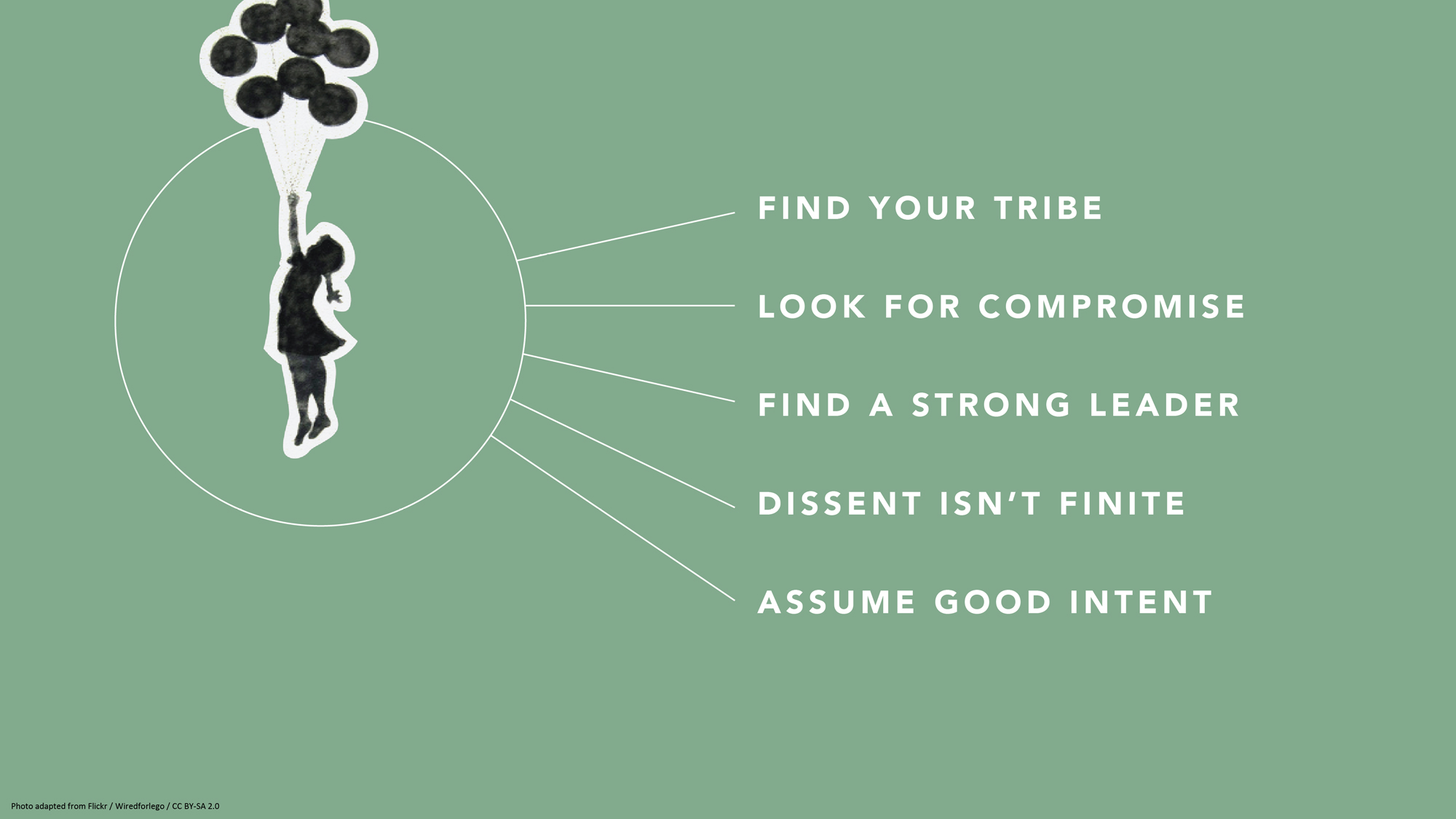
With fonts, settle on just one or two, and make sure they match the tone of your presentation. “You don’t have to stick to the fonts that you have in PowerPoint,” or whatever program you’re using, says Jurczynski. “People are now designing and sharing fonts that are easy to install in different programs. It’s been an amazing breakthrough.” Experiment. Try swapping a commonly used font like Arial for Lato or Bebas , two of many lesser known fonts available online. Most important: “Use a big enough font, which people often forget to do,” advises Jurczynski. Your text has to be both legible and large enough to read from the back of the room, he recommends — about 30 points or so.
BEFORE: Weak and hard-to-read font, muddy colors
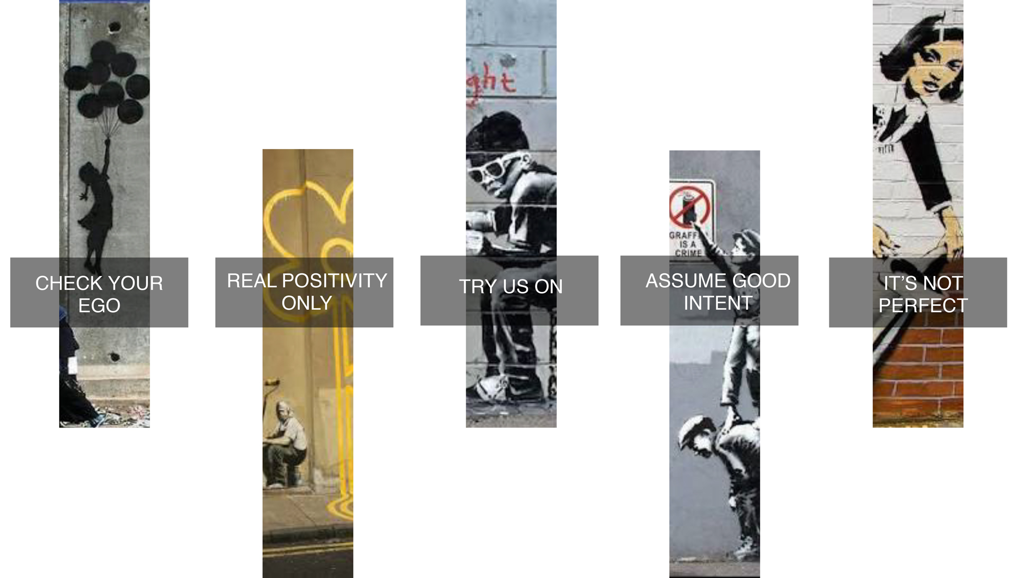
AFTER: Strong font, color that’s striking but not jarring
3. Don’t settle for visual cliches
When you’re attempting to illustrate concepts, go beyond the first idea that comes to your mind. Why? The reason it appears so readily may be because it’s a cliché. For example, “a light bulb as a symbol for innovation has gotten really tired,” says Jurczynski. Other oft-used metaphors include a bull’s-eye target or shaking hands. After you’ve come up with your symbol or idea, he advises people to resist the lure of Google images (where there are too many low-quality and clichéd choices) and browse other free image sites such as Unsplash to find more unique visuals. One trick: If you do use stock, amp it up with a color overlay (as in the pic at the top of this article) or tweak it in some other way to counteract — or at least muffle — its stock-i-ness.
One potential source of pictures is much closer at hand. “If it fits the storyline, I encourage people to use their own images,” says Jurczynski. “Like one TED Talk where the speaker, a doctor, used photos of his experience treating people in Africa. That was all he needed. They were very powerful.” Major caveat: Any personal photos must support your speech or presentation. Do not squander your audience’s precious time by showing them a gratuitous picture of your children or grandparents — beautiful as they may be.
BEFORE: Fake-looking stock photo to illustrate teamwork
After: eye-catching photo of nature to illustrate teamwork.

4. Don’t get bogged down by charts and graphs
Less is also more when it comes to data visualization. Keep any charts or graphs streamlined. When building them, ask yourself these questions:
What do I want the audience to take away from my infographic?
Why is it important for them to know this?
How does it tie into my overall story or message?
You may need to highlight key numbers or data points by using color, bolding, enlarging or some other visual treatment that makes them pop.
Maps are another commonly used infographic. Again, exercise restraint and use them only if they enhance your talk. “Sometimes, people put a map because they don’t know what else to show,” says Jurczynski. He suggests employing labels, color schemes or highlighting to direct your audience where to look. He adds, if you have the skill or know an artist, “you may even consider a hand-drawn map.”
BEFORE: Yikes! What’s important?!? AFTER: The takeaway is clear
5. don’t be scared of blank slides.
It may seem counterintuitive, but at certain points in your speech or pitch, the best visual is … no visual at all. “At the beginning, I was not a fan of blank slides,” says Jurczynski. “But the more talks I’ve seen, the more a fan I am of them, because sometimes you want all the attention on yourself and you don’t want people distracted by what they see in the slides. Or, you might use them to give the audience a visual break from a series of slides. Or maybe you want to shift the mood or tempo of the presentation.”
The blank slide is the visual equivalent of a pause, and most stories could use at least one. And with blank slides, Jurczynski has one main “don’t”: “You cannot use white blank slides, because if you do, people will see it and think something is broken.”

6. Do remember to practice
The easiest way to figure out if your slides really work? Recruit a colleague, friend or family member, and run through your entire presentation with them. Sometimes, people can get so carried away with rehearsing their delivery and memorizing their words that they forget to make sure their slides complement and synch up with what they’re saying.
“Even if you have the best visual s in the world, you need to practice in front of someone else. Once you start practicing, you may see, ‘I’m talking about a sad story, but on the slide behind me, I have something funny and that doesn’t make sense,'” says Jurczynski. “Or, ‘Oh, this could be a good place for a blank slide.’”
About the author
Amanda Miller manages curation for partner events at TED.
- business advice
- data visualization
- idea visualization
- presentation literacy
- public speaking
TED Talk of the Day

How to make radical climate action the new normal

3 strategies for effective leadership, from a former astronaut

Feeling unseen by your boss? Here’s what you can do

Let’s stop calling them “soft skills” -- and call them “real skills” instead

There’s a know-it-all at every job — here’s how to deal

The 7 types of people you need in your life to be resilient

Perfectionism holding you back? 3 ways to shift the habit

The unseen forces that can cause your great new idea to crash and burn

Have you quietly quit? Your next step: Go to the neutral zone

6 ways to give that aren't about money

A smart way to handle anxiety -- courtesy of soccer great Lionel Messi


7 Zoom mistakes you might still be making -- and how to raise your video skills

Want to speak from the heart? Answer this question first

Before your next presentation or speech, here's the first thing you must think about

The 2 kinds of praise we all need to get at work

- Get started with computers
- Learn Microsoft Office
- Apply for a job
- Improve my work skills
- Design nice-looking docs
- Getting Started
- Smartphones & Tablets
- Typing Tutorial
- Online Learning
- Basic Internet Skills
- Online Safety
- Social Media
- Zoom Basics
- Google Docs
- Google Sheets
- Career Planning
- Resume Writing
- Cover Letters
- Job Search and Networking
- Business Communication
- Entrepreneurship 101
- Careers without College
- Job Hunt for Today
- 3D Printing
- Freelancing 101
- Personal Finance
- Sharing Economy
- Decision-Making
- Graphic Design
- Photography
- Image Editing
- Learning WordPress
- Language Learning
- Critical Thinking
- For Educators
- Translations
- Staff Picks
- English expand_more expand_less
PowerPoint Tips - Simple Rules for Better PowerPoint Presentations
Powerpoint tips -, simple rules for better powerpoint presentations, powerpoint tips simple rules for better powerpoint presentations.

PowerPoint Tips: Simple Rules for Better PowerPoint Presentations
Lesson 17: simple rules for better powerpoint presentations.
/en/powerpoint-tips/embed-excel-charts-in-a-slide/content/
Simple rules for better PowerPoint presentations
Have you ever given a PowerPoint presentation and noticed that something about it just seemed a little … off? If you’re unfamiliar with basic PowerPoint design principles, it can be difficult to create a slide show that presents your information in the best light.
Poorly designed presentations can leave an audience feeling confused, bored, and even irritated. Review these tips to make your next presentation more engaging.
Don't read your presentation straight from the slides
If your audience can both read and hear, it’s a waste of time for you to simply read your slides aloud. Your audience will zone out and stop listening to what you’re saying, which means they won’t hear any extra information you include.
Instead of typing out your entire presentation, include only main ideas, keywords, and talking points in your slide show text. Engage your audience by sharing the details out loud.
Follow the 5/5/5 rule
To keep your audience from feeling overwhelmed, you should keep the text on each slide short and to the point. Some experts suggest using the 5/5/5 rule : no more than five words per line of text, five lines of text per slide, or five text-heavy slides in a row.
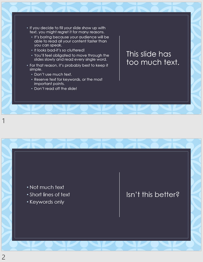
Don't forget your audience
Who will be watching your presentation? The same goofy effects and funny clip art that would entertain a classroom full of middle-school students might make you look unprofessional in front of business colleagues and clients.
Humor can lighten up a presentation, but if you use it inappropriately your audience might think you don’t know what you’re doing. Know your audience, and tailor your presentation to their tastes and expectations.
Choose readable colors and fonts
Your text should be easy to read and pleasant to look at. Large, simple fonts and theme colors are always your best bet. The best fonts and colors can vary depending on your presentation setting. Presenting in a large room? Make your text larger than usual so people in the back can read it. Presenting with the lights on? Dark text on a light background is your best bet for visibility.

Don't overload your presentation with animations
As anyone who’s sat through a presentation while every letter of every paragraph zoomed across the screen can tell you, being inundated with complicated animations and exciting slide transitions can become irritating.
Before including effects like this in your presentation, ask yourself: Would this moment in the presentation be equally strong without an added effect? Does it unnecessarily delay information? If the answer to either question is yes—or even maybe—leave out the effect.
Use animations sparingly to enhance your presentation
Don’t take the last tip to mean you should avoid animations and other effects entirely. When used sparingly, subtle effects and animations can add to your presentation. For example, having bullet points appear as you address them rather than before can help keep your audience’s attention.
Keep these tips in mind the next time you create a presentation—your audience will thank you. For more detailed information on creating a PowerPoint presentation, visit our Office tutorials .
/en/powerpoint-tips/three-tips-for-beautiful-powerpoint-presentations/content/

- Free Brand Audit
Powerpoint Do’s and Don’ts
by Michelle Stevens

Believe it or not, but PowerPoint, the ever present presentation tool, has been with us for nearly three decades. As anyone who has ever sat through a particularly dull slide deck can attest, there is a fine art to building and exhibiting a compelling presentation that keeps an audience’s attention. Here are a few tips to make your next PowerPoint something special:
DO: Stay Concise
The biggest rookie PowerPoint mistake is to copy and paste all your information verbatim into the slides.
Not only is this incredibly boring, but no one is going to have the time or inclination to read a wall of text. Don’t turn a presentation into a book.
There’s no hard rule, but a good general principle is to limit yourself to five words per line and five lines per slide.
DON’T: Overdo the Special Effects
After years of updates, PowerPoint is extremely full featured at this point.
But, while it can be fun to play with all the bells and whistles, too often they just end up being distractions,
Avoid overusing animations, flashy transitions, jarring sound effects, busy backgrounds, unnecessary drop shadows, ornate fonts, or any other effect that doesn’t make your information clearer.
DO: Use Humor
Because the format is so well established and we’ve all seen thousands of them, even the best powerpoint presentations can struggle to engage audiences.
Don’t treat a presentation like an open mic night at the comedy club, but the occasional comic, snappy pun, or amusing anecdote will liven things up, make your arguments more memorable, and prevent monotony from setting in.
DON’T: Just Read the Slides
Your audience, presumably, can already read. They don’t want to have the words on the screen read back to them word for word. Your slides should support an oral presentation, not just reiterate it.
Know the material well enough that your bullet points will jog your memory of the finer details that need to be addressed.
DO: Look Up!
Even if you aren’t just reading from the slides and are just referring to them, you should still look up now and then to maintain eye contact with the audience– how else will you know if they are still awake?
DON’T: Rush
Give your audience ample time to read each slide, but don’t delay so long as to lose their attention.
Also, don’t start speaking as soon as the next slide loads. Give the audience a few moments to scan the slide and get ready to hear what you have to say about it.
Likewise, don’t hit the next slide as soon as you finish discussing the current one. Give readers time to digest the information, and check out the room to see if they look ready to move on.
DO: Be Bold and Direct
Use bold colors and sharp contrasts, not only because it will enhance legibility but because it imparts emotion and energy into your presentation.
Similarly, when it comes to fonts for presentations, bigger is almost always better. A point size of 18 is just about the bare minimum. Shoot for something closer to the mid to upper 20s. Also, bear in mind, sans serif fonts are considered more legible at big sizes.
DON’T: Over Rely on Clipart
Especially in creative fields, people will notice clip art that doesn’t quite fit. Pull images and video from the web that are highly relevant and help drive your point home in an appealing way.
DO: Save Handouts for the End
There’s some debate about this one. Some authorities believe following a handout will improve audience recall, but many believe it just pulls awareness away from the presenter.
Attendees already have the constant threat of smartphones to distract them. Don’t give them anything else that might overshadow the main event.
Be the center of attention at all times. Make your case and make it well, and then provide supplementary materials for people to look over at their leisure.
DON’T: Overuse Statistics
No one needs to see all the raw data that went into your presentation. They want you to synthesize that information for them.
Slides overloaded with too many facts and figures will be tuned out. Besides anyone who needs all the granular details will ideally be able to get them on your website or handout materials.
If you have a stat you think is vital to the story you are telling, try to at least format it in a visually interesting way like a simple chart or graph.
DO: Use Bullets and Numbered Lists
Humans process information better when it’s organized in discrete chunks. Take out information and break it down into major sections, and then break those down into subsections.
Information should flow in an orderly fashion and be extremely easy to understand and digest.
Progressively released bullet points (that pop up one at a time) can also be useful for helping the audience keep track of where you are in the presentation.
DON’T: Be Afraid to Take a Pause
You don’t have to run through your slides unceasingly. Some presenters prefer to leave questions to the end, but others allow questions at any time.
But, if a question arises that causes a digression, consider hitting the letter “B” on the keyboard. This will pause the presentation and clear the screen,
If you leave the current slide up many eyes will stay fixated on it even as you are discussing something totally different.

15 Do’s and Don’ts for PowerPoint in the Classroom

PowerPoint is an amazing tool for teachers. It can help you inform, entertain and engage your students. However, not all PowerPoint presentations are created equal. Some will make you want to poke your eyes out and make an appointment for root canal for fun.
My first year of teaching (2002) the assistant principal handed me a box of chalk and a blackboard to use. I still have the chalk dust under my nails and up my nose. When the SMART Board became available in my school and I and could use PowerPoint about ten years ago I thought I’d died and gone to heaven!
And I proceeded to make some of the most awful presentations imaginable. My poor students! The more I learned the worse it became. A fellow teacher showed me animations. The next day I’m lucky a kid did not have a seizure as I presented jumping, disappearing, twirling words and pictures ad nauseam.
A few clear guidelines on what to do and what not to do when designing your presentations will vastly improve your results. Avoid glaring colors, walls of words and complicated graphs. Keep your slides clean, legible and a backdrop to your lecture.
Let me quickly dispel a couple of theories. NO ONE CAN MULTITASK. You can try and do two things simultaneously, but your brain can only do one thing at a time. Trying to multitask can actually hurt your brain, according to Forbes .
What this means is that students cannot listen to what you’re saying, read what’s on the PowerPoint, take notes, look at the pictures and make sure their hair looks good all at the same time.
The amount of stimuli a student is subjected to has a direct effect on their ability to absorb, understand and remember information. This is known as Cognitive Load Theory.
The primary motive of most teachers is to inform and incite learning. To do this in an effective manner requires having these ideas top-of-mind as we plan.
Let’s cover some caveats and guidelines for your PowerPoints.
Don’t do this…

1. No Death By PowerPoint
I don’t think anyone has actually died from a brutal PowerPoint, but your presentation surely will. An endless array of slides being clicked on as you drone on is not conducive to exemplary pedagogy. Even if you sing, dance and do a stand-up routine instead of droning the students will be distracted from your performance by what’s happening on the SMARTBoard.

2. No walls of text
Teachers are notorious for displaying one or more paragraphs of content on each slide. The idea is to give students something to take notes from. This can work; students will write what you have fed to them. They will fill their notebooks with ink.
There are two problems with this method. Number one, many students write word-for-word without without mentally computing the information. Secondly, their cannot focus on copying notes and listen to you at the same time.
Instead, try relegating just a word, phrase or question on the slide. Don’t speak while they write it down. Kids will have to listen to you in order to define the word or answer the question.
3. Too many visuals
This problem harks back to the Cognitive Load theory mentioned earlier. A slide that is too visually stimulating is often a bad idea. Can you occasionally create a slide filled with pictures, photos and colors? Yes, but include a simple slide before the busy one to allow content absorption, them follow up with the “popping” slide.

4. Small pictures, fonts, graphs or maps
I was guilty of this on a regular basis.
Me, “Class, according to the map where did the first battle take place?”
Class: “I can’t see the names on the map; it’s too small.”
Me. “No, it’s not, but if you can’t see come up to the front and look.”
Reality check, many students don’t wear their glasses. Also, we’re normally in the front near the presentation. Stand at the very back of the room to see what that view is like.
5. Too many bullet points
The purpose of bullet points is to succinctly display information. Too many bullet points defeats the whole purpose. It forces you to use a smaller font as well. Keep it down to three or four, or refer to the 25-word rule.
6. Reading from the PowerPoint
Don’t do this. It makes you redundant and superfluous. Think about when when your students a PowerPoint presentation as an assignment. What is it like when they present by simply reading what they wrote on each slide. Awful.
I have to assume you don’t need the notes on the slides as a cheat sheet. Most teachers know their content. A brief phrase is all you need to jar your memory as to what you wanted to say. If there are statistics or details to remember put them in the notes portion of the slide.
7. Glaring colors combos
Do you think that orange, yellow and purple work well together? Perhaps on a tie-dye shirt, but not for visual aids. It’s best to keep the color pallet crisp with contrasting dark and light. This makes for easy reading and no jarring distractions.
8. Intricate graphs

I think the slide above says it all.
Do this instead…
9. keep it streamlined and simple.
Think about a black cocktail dress; it’s simple but stunning. Your PowerPoints should be black cocktail dresses, or a tailored grey suit if you’re a man. They will be both visually appealing and, most importantly, effective teaching tools.
10. Keep it clear
Always look at your presentation through the eyes of a student. If there is ANY way to misread or misconstrue something they will.
I remember comparing the Civil War to a bad break up, trying to make connections for the kiddos. To illustrate the point of view of the south I asked them to imagine:
Imagine your significant other turned out to be the opposite of everything you ever wanted. S/he was a bully and wouldn’t let you see your friends. He pushed you around and took your money. So you break up.
Then the law tells you that you must reunite with this awful person and were forced to reunite with them. How would you feel?
Many of them had a lot to say about that. I congratulated myself for making a good connection for the kiddos. Until I read a student’s essay on the Civil War:
The North and south had bad marriage. It got physical. Even though they hated each other they couldn’t get a divorce. The law made them stay together. This was good because nobody had to pay child support.
Not exactly the results I was looking for. Clarity is a necessity.
11. Save the memes for Instagram
Anything that can distract kids will. One photo or picture per slide will suffice. Memes and gifs should be kept to a minimum. I love a good gif and can’t help but use them sometimes. But it’s not good practice if your goal is a focused class.
12. Under 25 words
There’s an arbitrary rule in town, created by yours truly. No one slide should contain more than 25 words 90% of the time. Follow a concrete guide such as this and you’re sure to improve your slides.
13. Ask a question on each slide
Type a question on your slide and nothing else. I mentioned this above as one way to utilize a presentation. It could be the same question on every slide.
For instance, when I taught the Roaring Twenties each slide had a different change that took place during the decade. The question on every slide was: It this a political, economic or social change? Students were learning content and reviewing key social studies terms.
Another example are the MAIN causes of World War I. For each cause there is one word on the slide: Militarism, Alliances, Imperialism and Nationalism. The question for each was the same: How would this cause a war?

14. Add a short video
Enhance your presentation with a short video whenever possible. Find one that reiterates what you are teaching or hones in on one aspect of the lesson. It’s good for differentiation, reinforces content and breaks up the PowerPoint. Be sure to ask at least one question about the video so that students actually have to pay attention.

15. Try using one picture for your background
This is quick, easy and effective. Instead of scrounging around for appropriate photos and pictures for every slide find a nice one and use it as your background. Then create a text box for your question or phrase for each slide. This helps to ensure that there’s not too much text, because you want most of the background picture to show.
I know some of these suggestions are controversial. Maybe you’re yelling at your screen as you’re reading this.
“Are you kidding me? If it weren’t for my funny and engaging PowerPoint presentations my students would be asleep or on their phones!”
That’s fine. Just remember why you’re creating the presentation; to reinforce learning. If you create your PowerPoints looking at it through your students’ eyes the presentations will rock!
Teach and Thrive
A Bronx, NY veteran high school social studies teacher who has learned most of what she has learned through trial and error and error and error.... and wants to save others that pain.
Recent Posts
Leadership Showdown: Alexander the Great vs. Julius Caesar
Who was more impressive: Alexander the Great or Julius Caesar? Let us check them out. Alexander the Great (356 - 323 BCE) built an empire from Greece to India. He helped begin the Hellenistic Age of...
The Imperfect Mirror: Reflecting on How Biases Shape Historical Studies
History is the study of our past. It is not a neutral recording of information. Our different points of view play a fundamental role in how we remember history. We imperfectly remember events....
Prezentt Blog
The do’s and don’ts when giving a powerpoint presentation.
By Lauren Clarke
One of the most useful skills to have in life is the ability to stand on stage, in front of the audience and give a great presentation.
However, even experienced presenters tend to make the some rookie mistakes when giving a PowerPoint presentation.
To avoid making such mistakes, we have compiled some simple tips – the dos and the don’ts when giving a PowerPoint presentation.
Prepare, Prepare, Prepare
We cannot over-emphasise how important preparation is when giving a PowerPoint presentation. Know your topic that you are delivering, forwards and backwards. Write down the major points that you want to deliver to your audience on your slides as well as on your cue cards. By doing so, the chances of you digressing into other topics are very slim.
Start off your PowerPoint presentation with a catchy introduction to get your audience interested or even curious about your topic of presentation. Get them engaged and wanting to stay on to find out more about the rest of the topic that you will be presenting.

Once you have the audience’s attention, keep the momentum going by branching out from your introduction. Avoid reading and looking at your slides all the time and try to engage your audience by asking closed questions that require the audience to reply by a show of hands. You could also include your personal experiences relating to your topic of presentation; who does not like to listen to real life events! End your presentation with a great wrap-up and a summary of your presentation. Do include your contact details for those audiences who want to know more or have questions for you.
Another way to get organised for your presentation is by using Prezentt. Upload your slides and content and remember to share the link with your audience on the day of the presentation. By sharing your slides in real time with your audience, they will be more engaged in your presentation. Not only that, you will save countless hours of administration time and cost, and will effortlessly improve the interaction between you and your audience.
Posture and Body Language
How you present yourself in front of the audience says a lot about you and your personality. From your posture and body language, the audience will roughly know how dull and boring or how exciting and full of zest your presentation will be. Your body language is an essential tool of any public speaking.
Stand up straight, avoid slouching and regardless if you are using a microphone or not, always speak with clarity. Try to make eye contact with audience members during your presentation to increase audience engagement.
Pace Yourself
It is very common to have the moderator or event manager informing you on how long your presentation should be when giving a PowerPoint presentation. Normally, you will be informed prior to the presentation date as you will need to prepare your slides and get organised. With the time allocated to you, try to pace yourself and avoid pacing aimlessly. Eventually, the audience will focus on your movement instead of your presentation.
Do not speak so quickly that the audience cannot comprehend what you have just said, but don’t speak so slowly that your audience falls asleep or walks out of the room either!
Try Prezentt for Free
Get started with a no-obligation demo!
Request DEMO
Ineffective Slides and Visuals
Poorly prepared slides can ruin a good PowerPoint presentation, so it is worth the time and effort in getting your slides right. The most effective presentation visuals do not have to be flashy, they just have to be brief and consistent.
Avoid cluttering your slides with text in tiny font sizes. It is a waste of time when your audience is not able to read your slides if you use font size 12 or when your slides contain too many words. Also, do not use animation like an animated emoji or a dancing clown, as it will only distract your audience.
Ignore the Audience
If you think that giving a PowerPoint presentation is all about you, you might need to rethink your priorities. Do not ignore the audience and always remember why they are there in the first place. Without the audience, you would end up giving your presentation to an empty room!
Ignoring the audience happens sometimes when speakers are afraid or have stage fright – they just want to get the presentation over and done with! They rush through the presentation and don’t deliver their message effectively. Pay attention to your audience and they will listen to you.

Read your Slides Out Loud
Have you ever seen an actor on stage performing while holding a script in his hand?
Ideally, a presenter won’t simply read out the entire presentation from their notes but you may find it useful to use Cue Cards, just in case you lose your chain of thought.
What you should not be doing is reading your slides out loud, word for word. You audience can read your slides clearly, so what is the point in giving a presentation to your audience if you are going to read your presentation from your slides? It sends a message to your audience that you are lazy in preparing your slides and you don’t really know your topic. If you are familiar with the flow and content of your presentation, you won’t be reading the slides.
In addition, if you’re simply reading the slides from your PowerPoint presentation, you’ll end up having your back facing the audience most of the time. This is a big mistake. The audience wants to see your face and not your back so this is very distracting. Remember that presentation slides are meant to improve your talk!
While there are plenty of other dos and don’ts when giving a PowerPoint presentation, this is a short list of the basic ones which you should be able to implement when giving your next presentation.
Remember that when giving any kind of presentation, it all comes down to one thing: valuing your audience and being worthy of their time. When you continue to focus on providing the best to your audience, you will find yourself giving a great presentation every single time.
Leave a Reply Cancel reply
You must be logged in to post a comment.
Get started by taking a tour of our demo


- Aug 9, 2021
The DO’s and DONT’s of PowerPoint Animation

From a simple slide transition to complex builds, PowerPoint is capable of rendering a huge range of animations that can do almost anything. But most people have never even experimented with PowerPoint animations, let alone mastered the art.
So to get you started with this powerful (but advanced) PowerPoint feature, check out our list of the most important DO’s and DONT’s of PowerPoint animation.
What to do before adding animations
Before you even click on the Animations tab, start out by thinking about the presentation you are working on.
Start with questions like:
Who is the audience for this presentation?
What is the format? Is it online or in-person?
Does the content need animations?
The reason to start with some background is to help assess if you should even add animations, and if so, the best way to do it.
For example, if the audience is a board of directors, flashy animations may be seen as getting in the way of core content, or cause unnecessary challenges in a presentation that's more about the conversation than anything else. In this case, you might want to skip animations altogether.
If it's a virtual presentation, you may want to dial them back to their most basic format, as complex animations can render slowly over stream, causing your carefully plotted animations to look choppy and rough.
If your content is weighty and serious, animations might be seen as too lighthearted to be appropriate.
In each of these cases, a little upfront thinking can save a lot of time on the back end.
Now that you've decided if and how you want to use animations, let's get into some more detailed questions.
PowerPoint Animation DOs
Do start with slide transitions.
As we discussed in a previous article , slide transition effects are intuitively named to do just what they say – animations between slides. They are the first thing that will animate on your slide, and the first place most people should look when starting with PowerPoint animations, so it makes sense for them to be at the top of our list.
This oft-overlooked feature instantly adds polish and sophistication to your deck, even if you don’t animate anything else. We’re particularly fond of the fade transition for the way it subtly dissolves between your slides, even fading your first slide in. While this may not seem like much, try comparing a deck with a fade transition applied to every slide versus the same deck with no slide transition at all, and you’ll see that the stiff changes in the one without fades starts to feel more like clicking through the pages of a PDF compared to the polished feel the fade deck provides.
To apply slide transitions, simply click “Transitions” from the top menu, highlight the slides you wish to apply the transition to, and choose your effect.But be careful, a lot of the slide transitions can be heavy-handed and will make your audience weary if they have to view them on too many slides in a row.
If you want to take your slide transitions to the next level, check out our blog on the Morph animation .
DO punctuate with emphasis
PowerPoint animations are great for adding emphasis to important moments. In particular, choosing one “AHA” moment and giving it some punch will leave an impact on your audience, without the fatigue that comes with too much motion.
For example, if you have a slide with a main idea or key takeaway, you can remove any animation from the preceding slide, then animate in a word, phrase, or mark to subtly reinforce that “if you remember nothing else, take note of this.” Like any other design element, assigning drama to an object with PowerPoint animations lets you create moments of contrast.
DO add meaning with animations
Maybe your slide doesn't end with a bang, like an infographic meant to communicate some kind of flow and process. Instead of wowing them at the end, using movement or emphasis throughout a slide can add a layer of communication that you get to show, rather than explain. This can even sometimes free up superfluous text or other elements from cluttering your visual design. This is also a great example of visual storytelling, where the elements on your slide help communicate your message without explicitly saying something.
PowerPoint Animation DONTs
Don't overdo it.
Between this and our other blogs about PowerPoint animation, we’ve mentioned many times that it’s best to go easy on the number of animations and slide transitions you use. Another way to say this is that the animations you add should be very intentional: they should serve specific purposes within your design, rather than something you add purely for visual flair.
If you’re adding animations (or other design elements) because you are worried your audience might get bored, you’d be better off looking at your content rather than adding more things to look at. The act of simply keeping track elements flying in and out can tire your audience as much as anything else. A small bit of animation at the right moment will feel so much more considered, and leave a stronger, more confident impression.
DON’T let animation sabotage you
Imagine this: you worked hard animating the perfect slide. The animation is tasteful but impactful, you’ve even learned how to group objects on your slide together to cut down on the total amount of elements animating in. But then you hand the slide to a teammate to finalize the content, and they (accidentally) ungroup your text boxes. Now, your boss is giving a presentation with broken animations and none of the sizzle she wanted in the PowerPoint slides.
Essentially, think about who is working on the presentation and how it will be delivered before you get too bogged down in animations. If others will be working on the slides, you need to keep that in mind as you design your slides. If it’s printed, the printer will show your slide the way it looks in regular design mode, with all the elements sandwiched together. And if it’s a remote presentation, animation can appear choppy when shared over many of the popular online meeting platforms.
Each of these cases requires a different approach to using animation. So before you go too far, make sure you take the time to ask how the deck will be presented.
DON’T be afraid to experiment
We’ve spent a lot of time telling you a little animation goes a long way, which is absolutely true. But that doesn’t mean you shouldn’t click around and explore all the possibilities that PowerPoint animation offers. PowerPoint has a few animation tricks that, when mastered, can enrich your story beyond simply adding visual flair. Essentially, think about ways that PowerPoint animations can enhance your story, not just the visual appeal of your slides. But most importantly, practice and see what feels right, rather than peppering your team’s deck with new effects and seeing how they react in the moment.
PowerPoint animations are an essential storytelling tool
PowerPoint animations tend to be 1) never used or 2) overused. As a result, they are seen as ineffective and too often overlooked. But the fact is that adding some simple PowerPoint animations can be a great way to elevate any presentation into something that stands out. Used with care and intention, animations can also be a great way to help tell your story. So the next time you are designing some slides, try out a few of our PowerPoint animation DOs (and remove the DONT’s), and see for yourself just how much of a difference they can make.
Update (03/24): we’ve revised this article to add some new details on best practices for PowerPoint animations
Looking for more information about presentations and beyond? Check out our resources for expert advice and tested strategies.
Presentation Design 101
Presentation Training
Storytelling
PowerPoint design
PowerPoint tips and tricks
About the author
Danielle John is the founder of VerdanaBold. She has more than 25 years as an award-winning designer and creative lead, directing the visual expression and production of thousands of high-value new business pitches, C-level presentations and internal presentations for major global brands. When she's not busy at VerdanaBold, she can be found antique shopping and spending time with her husband and two kids.
Related Posts
VerdanaBold Webinar
Data Visualization Secrets: How To Choose The Right Chart or Graph
The three steps in data storytelling: Visualize the data
SUBSCRIBE TO OUR NEWSLETTER
PowerPoint tips and tricks, new presentation design ideas, and other bold ideas, delivered directly to your inbox.
Home Free PowerPoint Templates Free Do’s and Don’ts PowerPoint Template
Free Do’s and Don’ts PowerPoint Template
Download free do’s and don’ts powerpoint template & google slides.
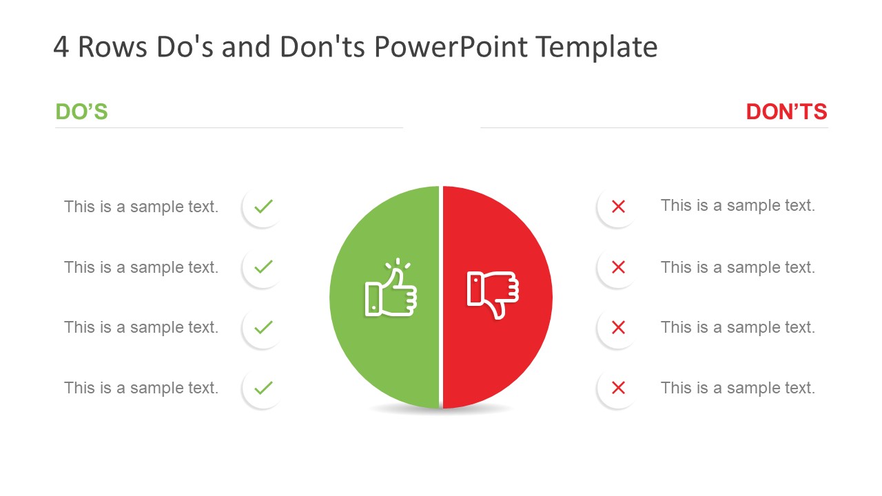
The Free Do’s and Don’ts PowerPoint Template is a presentation tool for comparison topics. These are two free slides of PowerPoint with four and five rows comparison presentation to choose from. This template is designed to display the do’s and don’ts of any project or process. For example, mistakes which should not be repeated or the guidelines which must be followed for smooth process flow. These free layouts of comparison tables enable users to list down positive and negative elements of business activity. Like clearly explaining the steps to take or not during an ongoing process.
The Free Do’s and Don’ts PowerPoint Template provides two contents layout with circular comparison graphic in the middle. This graphic shows 2 halves of circle to demonstrate two opposite. These could be the comparisons between right and wrong, pros and cons etc. Here, the green semi-circle contains a thumbs up icon and red has thumbs down. Because green color symbolically portrays positive, good, and affirmative action. While red is the color for danger, to display negatives or unacceptable terms. Further, the rows on both do’s and don’ts slide contain symbolic icons for bullet point representation. Such as green check marks under do’s and red cross mark under don’ts.
The free PowerPoint is useful in both business and casual presentation. Since users can add these slides to display acceptable behavior in a data table. For instance, listing healthy and unhealthy food items to present on social media. The editable PowerPoint template of do’s and don’ts includes a collection of icons, shapes, and text placeholders. The users can change colors and shapes for a personalized outlook. Like changing the shape style or adding special effects in format menu. The premium subscribers can take advantage of 4 slide do’s and don’ts PowerPoint template with assorted background template.
- 100% Editable PowerPoint Templates & Google Slides.
- Compatible with all major Microsoft PowerPoint versions, Keynote and Google Slides.
- Modern 16:9 Aspect Ratio.
- Scalable Vectorial PowerPoint Shapes and PowerPoint Icons.
- Instant Access and Download.
- New Templates every week.
Google Slides Preview
Our PowerPoint Templates are compatible with Google Slides. Take the most of every platform using the tool you like.

Home Collections Analysis Dos and Donts
Free Dos And Donts Presentation Templates
Teach both do's and don'ts with our pre-made, editable free dos and donts powerpoint templates and google slides themes, effective tools for comparing topics. it includes checklists to show what's right and helps to highlight key points with bright colors and eye-catching icons. free templates for all your needs don't wait, get your free templates now.

- Simple checklists and tick marks: Make your "dos" and "don'ts" crystal-clear at a glance.
- Bold green checks and red Xs: Visually reinforce your points, no words are needed.
- Multiple formats (4:3 & 16:9) and orientations (portrait & landscape): These slides adapt to any screen, big or small.
- Royalty-free and 100% editable: Customize them with your own content, without worrying about copyright.
- Free slides available: Try before you buy! See how our powerful free templates can transform your presentations.
- Perfect for everyone: From business people to students to anyone who wants to communicate effectively.
- Ideal for any occasion: Boardroom pitches, classroom lessons, workshops – these slides conquer them all.
- Simple and clear: No more text overload! Our slides are designed to be easy to understand at a glance.
- Visually engaging: Infographics, checklists, and bold colors keep your audience hooked and help them understand the positive and negative aspects .
- Time-saving: Drop the blank canvas! Get started quickly with pre-designed slides.
- Versatile: Adapt our templates to fit any topic or presentation style.
- Confidence booster: Deliver your message with clarity and impact, knowing your slides are top-notch.
We're here to help you!
What are dos and donts powerpoint templates.
Dos And Donts PowerPoint templates are a great way to create presentations that help people learn about proper behavior and etiquette. These templates provide visuals to emphasize certain dos and don'ts in different situations.
Where can we use these Dos And Donts Slides?
You can use these Dos and Donts Slides in any presentation, classroom, or workplace meeting. You can also use them to help engage an audience in a discussion about etiquette or to help teach proper behavior in various situations.
How can I make Dos And don'ts PPT Slides in a presentation?
Start by creating a table with two sections to explain Dos And don'ts. Determine the points and the core idea that you will use. Suppose you want to create slides by yourself. Visit Tips and tricks for detailed instructions.
Who can use Dos And Donts PPT Templates?
Anyone can use Dos And Donts PPT Templates. The templates help create presentations and infographics that communicate importantly do's and don'ts of any topic. They are ideal for business presentations, school projects, or other communication projects.
Why do we need Dos And Donts PowerPoint Slides?
Dos and Donts PowerPoint slides effectively communicate important safety and compliance information to employees quickly. They provide a visual aid to remind employees of the proper procedures and safeguards.
Where can I find free Dos And don'ts PPT Templates?
Many websites offer free Dos And don'ts PPT templates. Slide egg is one of the best PowerPoint providers. Our websites' uniquely designed templates help explain the consequences of not following the proper precautions.
- Draft and add content
- Rewrite text
- Chat with Copilot
- Create a summary
- Copilot in Word on mobile devices
- Frequently asked questions
- Create a new presentation
- Add a slide or image
- Summarize your presentation
- Organize your presentation
- Use your organization's branding
- Copilot in PowerPoint for mobile devices
- Draft an Outlook email message
- Summarize an email thread
- Suggested drafts in Outlook
- Email coaching
- Get started with Copilot in Excel
- Identify insights
- Highlight, sort, and filter your data
- Generate formula columns
- Summarize your OneNote notes
- Create a to-do list and tasks
- Create project plans in OneNote

Create a new presentation with Copilot in PowerPoint
Note: This feature is available to customers with a Copilot for Microsoft 365 license or Copilot Pro license.
Create a new presentation in PowerPoint.
Select Send . Copilot will draft a presentation for you!
Edit the presentation to suit your needs, ask Copilot to add a slide , or start over with a new presentation and refine your prompt to include more specifics. For example, "Create a presentation about hybrid meeting best practices that includes examples for team building.”
Create a presentation with a template
Note: This feature is only available to customers with a Copilot for Microsoft 365 (work) license. It is not currently available to customers with a Copilot Pro (home) license.
Copilot can use your existing themes and templates to create a presentation. Learn more about making your presentations look great with Copilot in PowerPoint .
Enter your prompt or select Create presentation from file to create a first draft of your presentation using your theme or template.
Edit the presentation to suit your needs, ask Copilot to add a slide , organize your presentation, or add images.
Create a presentation from a file with Copilot
Note: This feature is only available to customers with a Copilot for Microsoft 365 (work) license. It is not currently available to customers with a Copilot Pro (home) license.

With Copilot in PowerPoint, you can create a presentation from an existing Word document. Point Copilot in PowerPoint to your Word document, and it will generate slides, apply layouts, create speaker notes, and choose a theme for you.
Select the Word document you want from the picker that appears. If you don't see the document you want, start typing any part of the filename to search for it.
Note: If the file picker doesn't appear type a front slash (/) to cause it to pop up.
Best practices when creating a presentation from a Word document
Leverage word styles to help copilot understand the structure of your document.
By using Styles in Word to organize your document, Copilot will better understand your document structure and how to break it up into slides of a presentation. Structure your content under Titles and Headers when appropriate and Copilot will do its best to generate a presentation for you.
Include images that are relevant to your presentation
When creating a presentation, Copilot will try to incorporate the images in your Word document. If you have images that you would like to be brought over to your presentation, be sure to include them in your Word document.
Start with your organization’s template
If your organization uses a standard template, start with this file before creating a presentation with Copilot. Starting with a template will let Copilot know that you would like to retain the presentation’s theme and design. Copilot will use existing layouts to build a presentation for you. Learn more about Making your presentations look great with Copilot in PowerPoint .
Tip: Copilot works best with Word documents that are less than 24 MB.
Welcome to Copilot in PowerPoint
Frequently Asked Questions about Copilot in PowerPoint
Where can I get Microsoft Copilot?
Copilot Lab - Start your Copilot journey

Need more help?
Want more options.
Explore subscription benefits, browse training courses, learn how to secure your device, and more.

Microsoft 365 subscription benefits

Microsoft 365 training

Microsoft security

Accessibility center
Communities help you ask and answer questions, give feedback, and hear from experts with rich knowledge.

Ask the Microsoft Community

Microsoft Tech Community

Windows Insiders
Microsoft 365 Insiders
Find solutions to common problems or get help from a support agent.

Online support
Was this information helpful?
Thank you for your feedback.
- PDFelement for Windows
- PDFelement for Mac
- PDFelement on Mac App Store
- PDF Reader for Windows
- PDFelement for iPhone/iPad
- Get from App Store
- PDFelement for Android
- Get from App Google Play
- PDF Scanner for iPhone
Cloud & SDK
- Document Cloud
- PDFelement Pro DC
- PDFelement SDK
Online PDF Tools
- PDF to Word
- Compress PDF
- Word to PDF
Educational Users
- Annotate PDF
- Combine PDF
Personal Users
- Convert PDF
- Organize PDF
Professional Users
- eSign PDFs Legally
- Extract Data from PDF
- Password Protect PDF
PDF Solutions for
- Chat with PDF
- AI PDF Summarizer
- AI PDF Translator
- AI Content Detector
- AI Rewrite PDF
- Proofread PDF
- Add Bookmarks to PDF
- Explain PDF
- Mac Software
- OCR PDF Tips
- Online PDF Tips
- Edit PDF like Word
- PDF Converter Tips
- PDF Compressor Tips
Why PDFelement
- Customer Stories
- PDF Software Comparison
- Contact Support
- PDFelement for iOS
- InstaScan for iPhone
Explore More
- Reviews See what our users say.
- Free PDF Templates Edit, print, and customize free templates.
- PDF Knowledge PDF-related information you need.
- Download Center Download the most powerful and simple PDF tools.
- Download Download Pricing Pricing
5 Ways To Add a Strikethrough in PowerPoint
Here, you will learn the different ways to add strikethrough in PowerPoint.

- Extract PDF Annotations
- How to Annotate PDFs on Linux Easily
- Weava Extension
- Free Markup Tools
- Annotate PDF on iOS
- PDF Annotator
- PDF Annotation Apps
- PDF Annotators
- Markup a PDF
- The Ultimate Guide to the 10 Best Cross-Platform Note-Taking Apps
- Add a Strikethrough in PowerPoint
- Add PDF Stamp
- Take PDF Notes on Windows
- Attach PDF Files
- View Comments in PDF
- delete all comments in pdf
- Measure in PDF
- Export Comments from PDF
- Annotate PDFs Online/Offline the Smart Way
- Add Lines to PDF
- Draw Lines on PDF
- Add Shapes to PDF
- Get the Most Out of Adobe Measure Tool: A Practical Guide and Alternative Tool
- How To Adjust PDF Scale Ratios for Better Object Measuring
- Apple Pencil to Annotate PDF Documents
- How to Circle Something in PDF
Just like in Microsoft Word or Excel, you can add a strikethrough in PowerPoint . You can use it to show that items are no longer needed or a piece of information is no longer accurate. It's a great indicator that your listeners or viewers will easily understand. The best thing is that there are multiple ways to do this.
In this article, you will find 5 different ways to add a strikethrough in PowerPoint. Furthermore, you'll learn how to add a strikethrough in presentations turned into PDFs using Wondershare PDFelement .
In this article
- Use the Strikethrough Shortcut in PowerPoint
- Use Strikethrough in PowerPoint Home Tab
- Activate Strikethrough in PPT Quick Access Toolbar
- Strikethrough Powerpoint in Mini Toolbar
- How To Add Double Strikethrough in PowerPoint
- How To Remove Strikethrough In PowerPoint
- When To Use Strikethrough in PowerPoints
- How To Do Strikethrough on Text in PDF
Part 1. How to Strikethrough in PowerPoint: 5 Methods
Here are five different ways to add a strikethrough to text in Microsoft PowerPoint.
Method 1. Use the Strikethrough Shortcut in PowerPoint
It is common knowledge that you can use keyboard shortcuts to make text bold, underlined, and italicized. But the keyboard shortcut for strikethrough is not well-known, perhaps because it varies from program to program. See the steps below to find out how to add strikethrough in PowerPoint using keyboard shortcuts.
Method 1.1. Short Method
- Highlight the text you want to strikethrough.
- Use the PowerPoint strikethrough shortcut: ALT + H + 4.
Method 1.2. Long Method
Perhaps you want to do other things besides adding a strikethrough. Or maybe one of your H or 4 buttons is broken. You can use this instead.
- Press Ctrl + T or Ctrl + Shift + F to open the Font dialogue box.
- Press ALT + 4 to activate the strikethrough feature.
- Press Enter to apply the changes.
Method 2. Use Strikethrough in PowerPoint Home Tab
You can also add a strikethrough to the text using the ribbon in PowerPoint. You can find this option in the Home tab ribbon. Here is a quick guide on how to do that.
- Select the text in the PowerPoint that you want to strikethrough.
- Click Home in the ribbon.
- Select Strikethrough under the "Font" section.
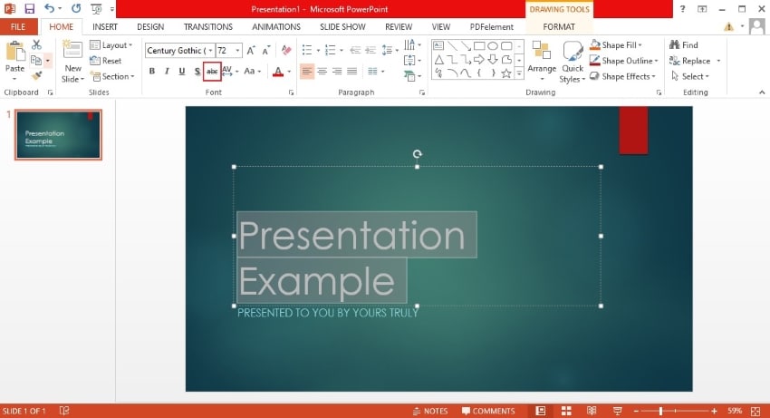
Method 3. Activate Strikethrough in PPT Quick Access Toolbar
As the name suggests, the Quick Access Toolbar in Powerpoint lets you access tools you repetitively use more easily. If you find yourself using the strikethrough option frequently, use this method. Follow the steps below.
Method 3.1. Quick Method - Put Strikethrough in PPT Quick Access Toolbar Using Right-Click
- Right-click the Strikethrough option under "Font" in the Home tab.
- Click Add to Quick Access Toolbar.
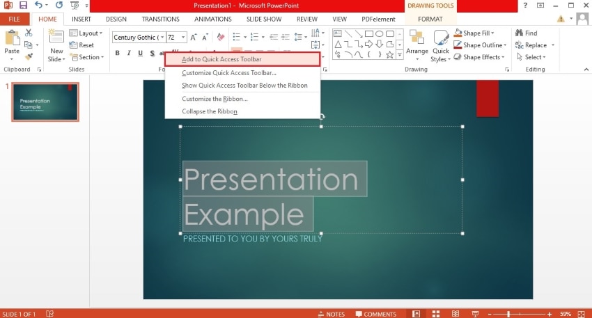
Method 3.2. Long Method - Put Strikethrough in PPT Quick Access Toolbar Using Right-Click
Suppose the quick method did not work. Follow these steps instead.
- Click the down arrow at the right-hand side of the Quick Access Toolbar. This toolbar is typically found at the top left corner of the interface.

- Click More Commands.
- A dialog box will pop up. Below "Choose commands from...", click Home Tab.
- Click Strikethrough > Add.
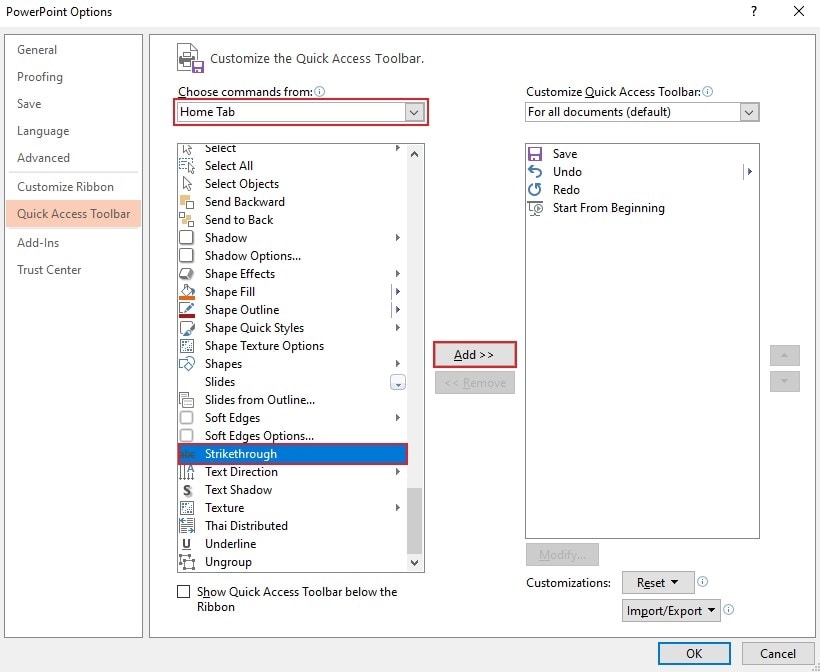
- Click OK or press Enter on your keyboard.
- Select the text you want to strikethrough and activate the feature using the Quick Access Toolbar.
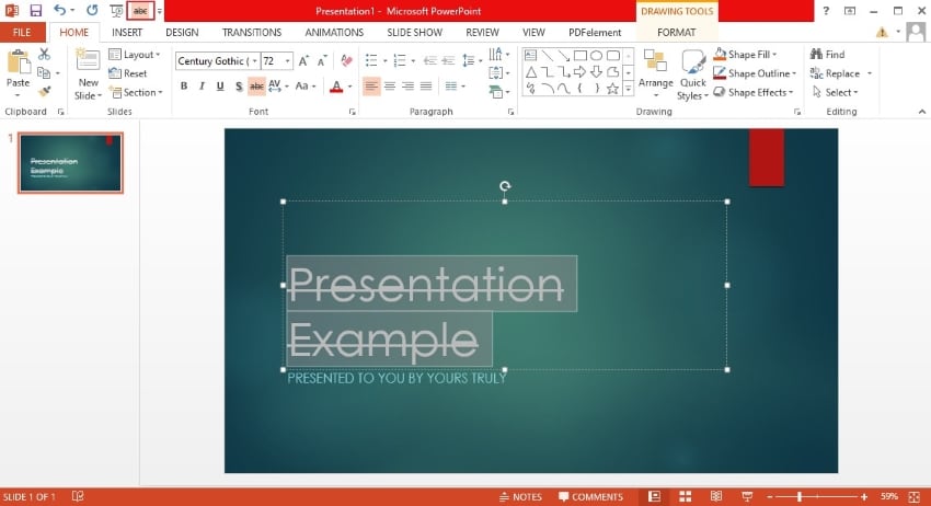
Method 4. Strikethrough Powerpoint in Mini Toolbar
To strikethrough text, you can also use the mini toolbar that appears when you select it.
- Highlight the text in the PowerPoint that you want to apply strikethrough to.
- Right-click the text.
- Click Fonts.
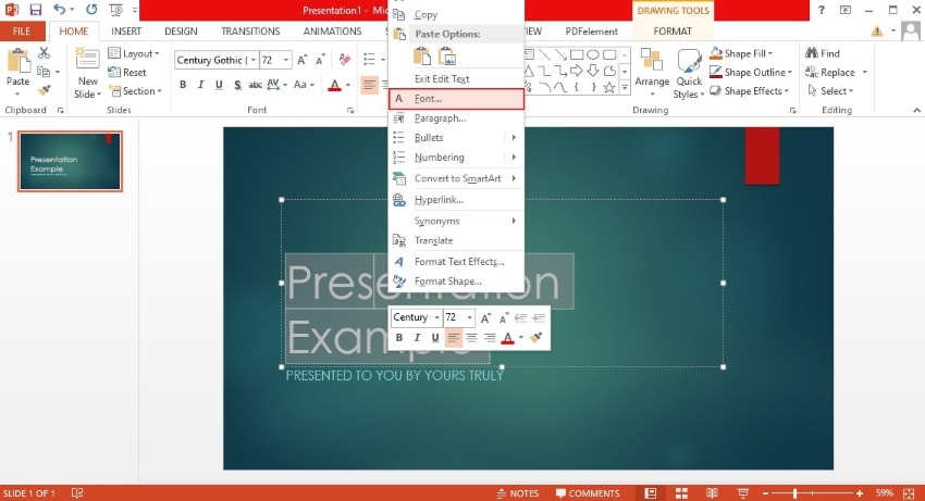
- The Font Dialogue box will appear. Click Strikethrough > OK.
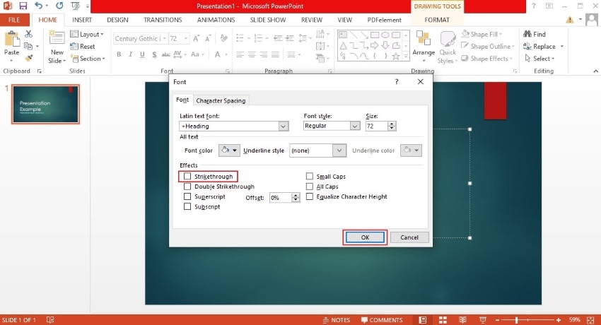
Method 5. How To Add Double Strikethrough in PowerPoint
If you want to emphasize that the text is no longer relevant, you can use double strikethrough. Two lines are more noticeable and prominent than just one. Below are the steps to using double strikethrough in PowerPoint.
- Highlight the text that you want to format.
- Click the Font Dialogue Box launcher in the Home tab.
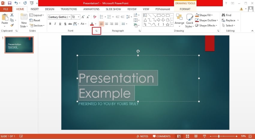
- Click Double strikethrough.
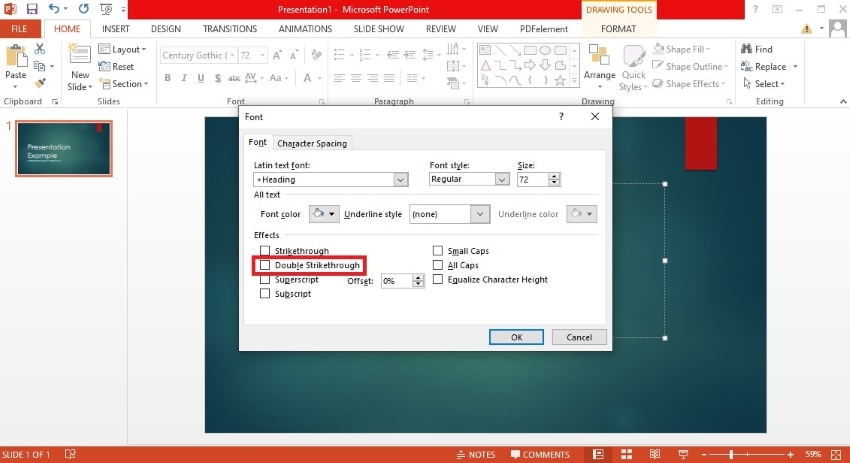
Part 2. How To Remove Strikethrough In PowerPoint
So, that is how to strikethrough in PPT. But how do you remove it? It's just as simple. All you need to do is select the text and follow any of the methods that could apply strikethrough. For illustration, let's use the strikethrough option in the ribbon.
- Select the text that already has a strikethrough.
- Click Strikethrough under the "Font" section in the ribbon on the Home tab. If it's a double strikethrough, click the button twice.
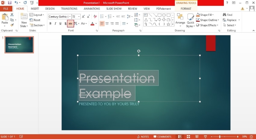
That is one way to remove strikethroughs in PowerPoint. You can also use keyboard shortcuts, the Quick Access Toolbar, or the mini toolbar.
Part 3. When To Use Strikethrough in PowerPoints
When is it a good idea to use strikethrough in PowerPoints? Here are its best use cases.
- Correcting Errors or Inaccuracies
In your presentation, you may be highlighting some mistakes, misinformation, or inaccurate data. You can use a strikethrough in PowerPoint to emphasize that these are not correct. By crossing them out, you can tell the viewer not to believe in them without even saying a word.
- Providing Context or Showing Progress
Does the text describe a task that has been finished? You can add a strikethrough to indicate that. Is it the old name of a revamped product? Is it a belief that has been proven wrong by new knowledge? You can apply a strikethrough to them and add the updated version next to them. By doing this, you can utilize a strikethrough to provide context or show progress.
What is the tone of your presentation? Does it lean more towards the casual side than the formal side? If so, you can throw in some jokes and a bit of sarcasm in there. Making your listeners laugh is a very effective way to prevent them from being bored. You can use strikethrough to indicate that what's written was initially meant seriously. But then, it was humorously contradicted or amended. Here's an example:
Original Text: "I'm a morning person."
Revised Text with Strikethrough: "I'm a morning person." "Just kidding, I hit snooze 10 times."
Those are some scenarios when you can add a strikethrough to text in a PowerPoint presentation. Now, what if you had converted the presentation to a PDF before you realized you could do that? Do not worry. You can use PDF tools to apply strikethrough to the text.
Part 4. How To Do Strikethrough on Text in PDF
Wondershare PDFelement is a sophisticated PDF editor available on most platforms. It can open PDFs or just about any document. That said, you can use Wondershare PDFelement to apply strikethrough to text in PDFs .
Follow these steps to apply strikethrough to text in PDF using Wondershare PDFelement.
- Open your presentation or document with Wondershare PDFelement.
- Click Edit > Edit All.
- Select the text you want to apply strikethrough to.
- The Properties tab should open. If it did not, right-click on the text > click Properties.
- Select Strikeout.
You can use the same method to remove the strikethrough.
Bonus information: You can use Wondershare PDFelement for presentations using the AI Read mode. Alternatively, you can use the convert feature to convert the PDF file to PPT using AI .
Adding a strikethrough in PowerPoint is an easy task. You can choose from 5 different methods. Choose whichever you find the easiest. You can use this when correcting information, crossing out items from a list, or telling jokes.
You can also apply strikethrough to text in PDFs. The best tool for that is Wondershare PDFelement, which can open any document. It has powerful editing features and even offers OCR for scanned files. You can also use it for presentations or use the converter to turn the file back to PPT. Wondershare PDFelement is a very versatile tool that you can always count on.
You May Also Like
- Annotate PDF on iPad and iPhone Easily
- PDF Annotator vs. Wondershare PDFelement: Which is the best PDF annotator?
- How To Markup a PDF Like a Pro
The Spinoff

Society about 11 hours ago
Help me hera: is it too late to yell at my ex.

- Share Story
We ended on good terms last year, but I saw them recently and, well, turns out I’m furious. How do I deal with my rage?
Want Hera’s help? Email your problem to [email protected]
Last year I ended my first and only long-term relationship after a good few years together. It was a mutual decision made on good terms, though we are no longer in touch.
Since then I’ve moved on, helped by therapy and some other really lovely relationships.
The problem: I saw my ex while out and about the other day, which didn’t seem noteworthy at the time. But now! I can only describe it as feeling all the anger and frustration I felt at them, but never properly expressed, coming out at once.
And it’s pointless! I have no one to be mad at – I’m not about to get in touch just to be grumpy. That wouldn’t be fair. But I am also already sick of just seething when I would really like to just get it out and then forget about it!
Do I just have to go down to my local void and yell into it?! How do I get past this?
Fuming in Foxton
[PS I’m not actually in Foxton. This was just catchy and anonymous]

The longer I live, the more emotionally sophisticated everyone seems to get. Our collective standards get higher with each passing year. The problem with high standards is they’re impossible to live up to. It doesn’t matter how self-actualised you are.
Anyone embarking on a long-term relationship can never be truly prepared for what’s to come. Every relationship is a strange and ultimately haunted castle, the shared reality of which is impossible to convey to anyone beyond the ramparts. When you break up with someone, that shared reality vanishes. And there’s nowhere left for all the feelings to go.
You sound a little surprised by your own anger. But you also say this is your first long-term relationship break-up, so I want to reassure you this is extremely par for the course. The aftermath of a break-up always lasts longer than you think. The second you finish congratulating yourself on how wise and enlightened and emotionally stable you are, you’re guaranteed to be overcome by a rage so powerful you could burn down a heritage church with your naked eye.
Unless your break-up was triggered by an earth-shattering betrayal, it’s normal for the anger to arrive belatedly. In the first months after a break-up, there’s so much tedious weeping and administration that you just don’t have the capacity to be properly mad. Especially if you’re trying to end the relationship on good terms. It’s also normal to feel so overwhelmed with the pathos of it all that you prematurely offer apologies or forgiveness you’re not actually ready to dispense. Then six months later, when you think you’ve turned a corner, the anger arrives.
This belated anger is particularly frustrating because, as you say, there’s nothing you can do about it. You can’t call your ex and let them have it, because they no longer have an obligation to sit through a PowerPoint presentation itemising their flaws, or even to care about your hurt feelings. Not to mention that they probably have an equally long list of complaints regarding your personality defects that you may not want to hear.
Anger, in its purest form, can feel a lot like clarity. But I’m here to tell you you’re not thinking straight. You’re still suffering from extreme emotional jetlag. I’m not saying your anger towards your ex is unjustified. But it’s probably not the whole picture. In fact, the first year after a break-up is too soon to attempt any kind of genuine friendship, unless you’re a lesbian and it’s an important part of your cultural heritage. Reacting too soon in anger is like burning a bridge you don’t know you’re only halfway across. It’s a lot easier to rekindle a friendship later, when you haven’t laid an official complaint against your ex at the Human Rights Commission.
The first year after a break-up is rough. Often there’s nothing you can do but be patient. That doesn’t solve the problem of what to do with all your horrible feelings. I wouldn’t suggest buying a foam bat and taking it out on inanimate objects. There’s been some interesting psychological research that suggests that smashing car windshields with a baseball bat doesn’t offer catharsis, it only increases your desire to smash car windshields with a baseball bat. But there’s no point berating yourself for feeling mad either.
I think you have to strike a precarious mental balance between simultaneously allowing yourself to believe your ex is a spineless human worm who destroyed your life and would do everyone a favour by falling down the village well, while also secretly knowing that you’re an unreliable narrator whose perspective isn’t currently to be trusted.
More Reading
That doesn’t mean you can’t be immature. This exact situation is what friends are for. Go out with your friends who liked your ex the least, and have a good rant about all their bad habits and undiagnosed personality disorders. Go for a long walk in the rain while listening to Korn. Institute an official sulking period, and block out a month or two in your calendar. Sit by the window in your bathrobe like a scorned king in exile, wishing pestilence upon everyone.
And know that, eventually, the feeling will pass. But in the meantime, if you run into your ex at the supermarket, keep that shit to yourself. I think you’ll be grateful in the long run.
Best of luck,
Want Hera’s help? Email your problem to [email protected] . Read all the previous Help Me Heras here .

IMAGES
VIDEO
COMMENTS
There you have it - 16 PowerPoint dos and don'ts for creating memorable, professional PowerPoint presentations. Apply the dos to make high-impact slides, and avoid the don'ts for mistake-free presentations. Put these PowerPoint best practices into play and watch your ordinary slides transform into extraordinary visual stories.
7. Add graphics and videos. One benefit PowerPoint provides as a visual aid for presentations is the ability to embed multimedia elements. Adding graphics or videos to your slides can make them more visually appealing and also provide important information.
8 Do's And 8 Don'ts Of PowerPoint Presentations When it comes to the do's and don'ts of designing PowerPoint presentations, understanding the key elements can make all the difference. Whether you're aiming to inform, persuade, or engage, the way you design your slides plays a pivotal role in how your message is received.
Take a pause after you ask a question or make a strong statement. Spare your audience a moment to think, reflect, and ponder. Or leave a gap of silence right before you present something exciting to build suspense and anticipation. No one expects you to go on talking for 10-15 minutes without a pause.
Dos and Don'ts. Don't confuse your PowerPoint with your presentation. Your presentation includes your speech aiming to reach a goal with your audience (i.e. persuade, inform, educate, etc.). YOU are your presentation. Whether you accept the fact or hide in the dark, YOU either make or break your presentation.
10. End with a summary slide. It's a good case practice to go through your key points and list the final benefits in a summary slide, at the end of your presentation. The most important sections of your presentation are the beginning and ending. The beginning is when you will grab the attention of the audience.
Here, he shares 6 specific tips for creating the most effective slides. ( Note: All of the examples below were taken from the actual slides of TED speakers.) 1. Do keep your slides simple and succinct. "The most common mistake I see is slides that are overcrowded. People tend to want to spell everything out and cover too much information ...
Avoid paragraphs, quotations and even complete sentences. Limit your slides to five lines of text and use words and phrases to make your points. The audience will be able to digest and retain key ...
Presentation Don'ts 1. Don't Use Too Much Text. You're not writing a book — your slides are meant to be observed for several seconds with minimal effort from the viewer. You have a limited hold on your audience's attention. Don't risk being boring via information overload and keep text at a minimum.
with-powerpoint-10-dos-and-donts.aspx 1. Make sure everything is legible 6 feet way when the presentation is viewed from your own PC. This includes texts in the main body and those accompanying the figures/tables. 2. Hold up your end with compelling material. In a way, PowerPoint's ease of use may be its own worst enemy. However simple and engaging
Follow the 5/5/5 rule. To keep your audience from feeling overwhelmed, you should keep the text on each slide short and to the point. Some experts suggest using the 5/5/5 rule: no more than five words per line of text, five lines of text per slide, or five text-heavy slides in a row.
DO: Stay Concise. The biggest rookie PowerPoint mistake is to copy and paste all your information verbatim into the slides. Not only is this incredibly boring, but no one is going to have the time or inclination to read a wall of text. Don't turn a presentation into a book. There's no hard rule, but a good general ...
Whether you are a seasoned presenter or have your first one coming up, consider these Dos and Don'ts for better PowerPoint presentations: DON'T use complex sentences or text-heavy slides. It is hard for your audience to hear what you are saying when they also are reading your slide. DO use simple language with a large easy to read font.
Dominic from http://dominiccolenso.com here with some top tips on Power Point's do's and don'ts. When I say Power Point I mean any presentation software incl...
In this video series a range of tips and tricks to improve a PowerPoint presentations are demonstrated. This video briefly covers a great selection of Do's a...
DO: Keep it Concise. The biggest mistake most people make when creating a slideshow is to paste all of their information verbatim onto the slides. Not only is this incredibly boring, but no one has the desire to read all of that text. The general rule of thumb is to limit yourself to five words per line and no more than five lines per slide.Â.
6. Reading from the PowerPoint. Don't do this. It makes you redundant and superfluous. Think about when when your students a PowerPoint presentation as an assignment. What is it like when they present by simply reading what they wrote on each slide. Awful. I have to assume you don't need the notes on the slides as a cheat sheet.
In this video, I shared 10 powerpoint presentation tips; 5 Dos and Don'ts that will make your presentation slides better. These powerpoint tips and tricks ar...
Don't speak in a monotone voice that lulls your audience to sleep. Vary your tone, pitch, and pace to keep your audience engaged and attentive. Use gestures and body language to emphasize key ...
The Don'ts. Ineffective Slides and Visuals. Poorly prepared slides can ruin a good PowerPoint presentation, so it is worth the time and effort in getting your slides right. The most effective presentation visuals do not have to be flashy, they just have to be brief and consistent.
Well, that's about it, a short list of do's and don'ts for creating and delivering effective presentations. If you're someone who worries about the design side of PowerPoint, and are looking for an easy solution, we've got you covered. Check out SlideBazaar's collection of pre-built PowerPoint presentation themes and templates.
The DO's and DONT's of PowerPoint Animation. From a simple slide transition to complex builds, PowerPoint is capable of rendering a huge range of animations that can do almost anything. But most people have never even experimented with PowerPoint animations, let alone mastered the art. So to get you started with this powerful (but advanced ...
2 Be Minimal. Using a minimal design composition is one of the unique presentation ideas. The trick is to have just enough information and visual details for the viewer to feel comfortable seeing the slides. A minimal design can instill calm and awe in your audience when done right.
The Free Do's and Don'ts PowerPoint Template is a presentation tool for comparison topics. These are two free slides of PowerPoint with four and five rows comparison presentation to choose from. This template is designed to display the do's and don'ts of any project or process. For example, mistakes which should not be repeated or the ...
Free Dos And Donts Presentation Templates. Teach both do's and don'ts with our pre-made, editable Free Dos and donts PowerPoint Templates and Google Slides Themes, effective tools for comparing topics. It includes checklists to show what's right and helps to highlight key points with bright colors and eye-catching icons.
Select the Copilot button in the Home tab of the ribbon. Enter your prompt or select Create presentation from file to create a first draft of your presentation using your theme or template. Copilot will replace your current presentation with a new one. If needed, save a copy first and rerun the steps above. If you already have a copy, confirm ...
1. Visme. Let's start with the best app for presentations you can use to design your presentation. Visme is a cloud-based graphic design software that allows designers and non-designers alike to create beautiful and professional presentations, infographics, social media graphics and more.
Press Ctrl + T or Ctrl + Shift + F to open the Font dialogue box. Press ALT + 4 to activate the strikethrough feature. Press Enter to apply the changes. Method 2. Use Strikethrough in PowerPoint Home Tab. You can also add a strikethrough to the text using the ribbon in PowerPoint.
Institute an official sulking period, and block out a month or two in your calendar. Sit by the window in your bathrobe like a scorned king in exile, wishing pestilence upon everyone. And know ...